It’s difficult to compare two charts in the ‘Compare’ tab when both charts have different min/max on the y-axis.
1 Like
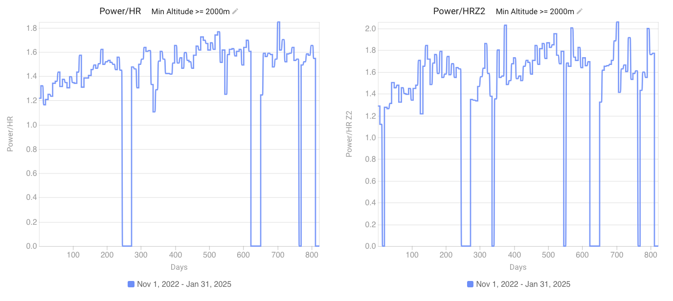
This gets me too - I have altitude-minimum filtered charts and if I have a stretch of time where there are no activities that meet the filter or similar, I get zeros for that section and then I have a very wide ranging y-axis that squishes all the “interesting” data points into a narrow vertical range so it is difficult to “see” the slope of the line
I would love the ability to set the y-min and y-max for charts
An example probably shows it best, I’ll try to paste in a chart - both of these would be more illustrative if I could set a y-min at 1.1 or similar
1 Like