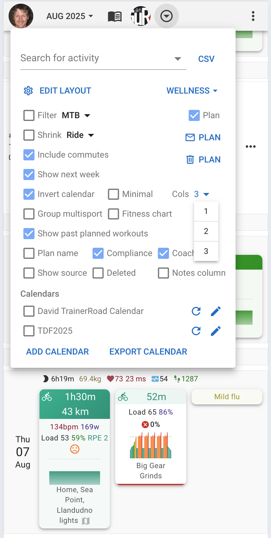
I don’t know if this is new, but I really don’t like the squished activities next to each other on the same row in the mobile calendar view.
One of my favorite things about this app is the overview of workouts with intervals power chart, so I can have a quick glance on what I did each day. If I do multiple workouts in the same day, squishing them next to each other makes it harder to see the chart clearly. See example below.
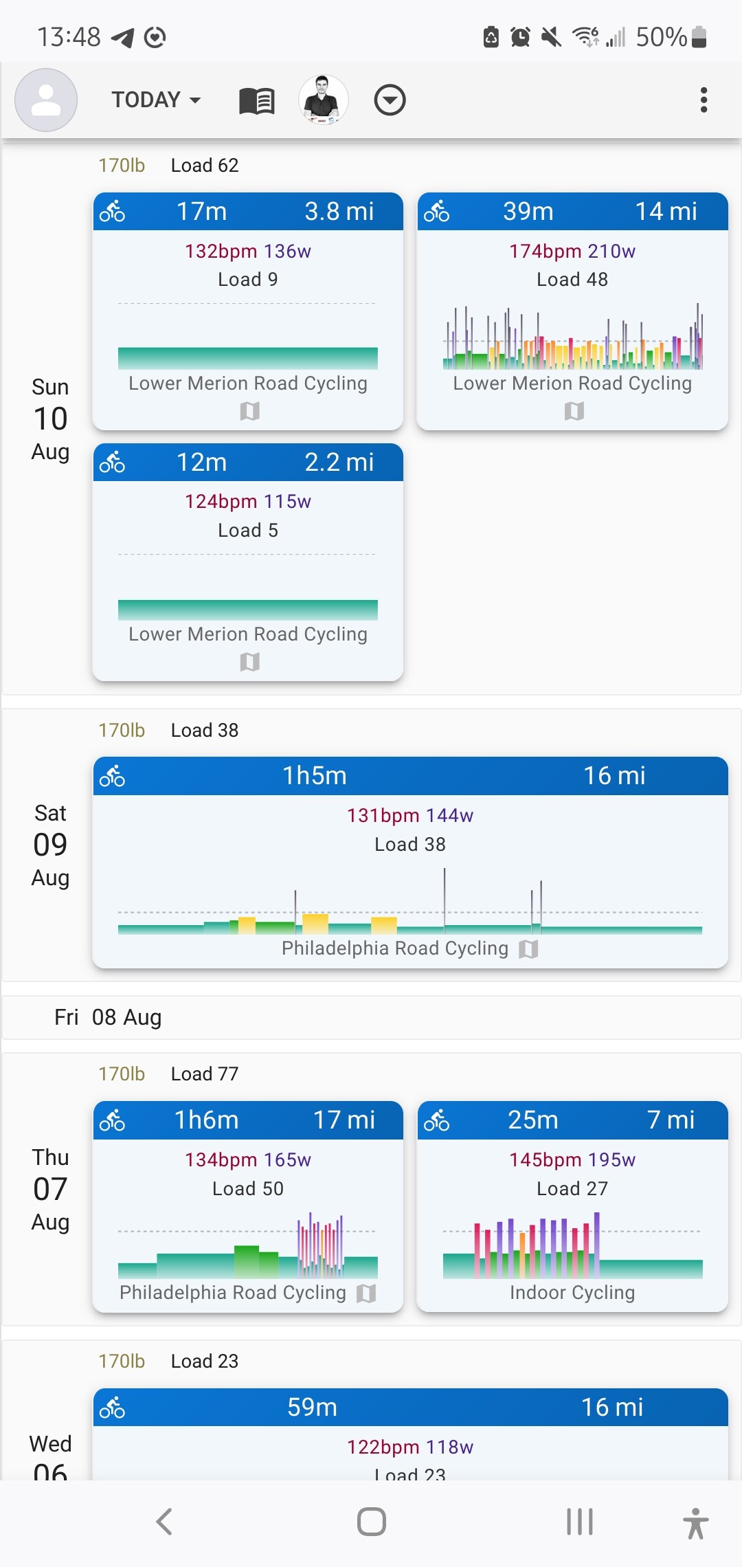
I don’t know what the preference of other users is, so maybe having an option for “condensed” vs “comfortable” view could solve it? Or maybe just keep the view with one activity in each row, and if somebody selects the “Minimal view” option (that already exists), they can have this condensed view with multiple activities in one row.
Thanks!