I notice some odd plot behavior for run activity that I had to pause for few minutes and then run again.
Please find the Garmin connect plot compared to the Intervals.icu plot.
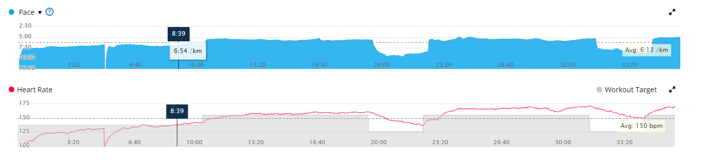
Intervals.icu leaves the pause in the chart if it is “short” so you can see where you stopped. Thats why it looks a bit different. I should probably try make the lines disappear for that part at some point.
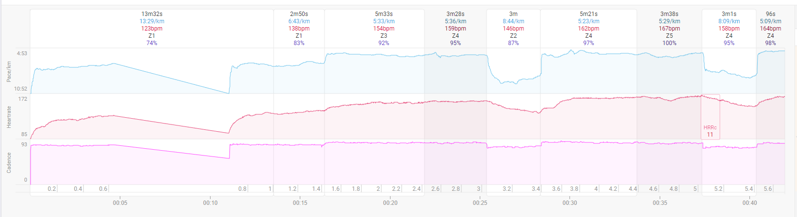
What is the idea to have the pause taking real estate from the activity plot? Maybe some indication of pause, or option to hide it if for some reason it existent has benefit to someone.
Well Intervals.icu started with cycling then then a couple of minutes stopped or paused is quite reasonable to be left in the plot since the activity is much longer and you were getting a rest. Might need to rethink that a bit for shorter activities.
Okay, Thanks.