Can we hear about the new logo? =)
I was wondering as well. Must admit I loved the previous one so much.
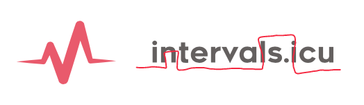
Thanks. I sent the old one to Stéphane Lizeray to include in his HealthFit app and was informed that basically there was no way that was making it into his beautiful app 
So I used https://looka.com/ to generate one.
1 Like
Oh man the old one was way more suitable and tailored for the project that is built on different graphs. The new one has a lot of small details that turn into visual garbage in small sizes.
Please make logo great again 
4 Likes
I think the new one is ok, but I do like the old one.
4 Likes
I will see what I can do. I was in a bit of a hurry.
1 Like
Agree with the comments above. Pretty sure they is somebody able to design one for you on this forum. What about a logo contest? 
7 Likes
Logo contest is a great idea!
4 Likes
I’m a graphic designer, and Intervals.icu subscriber—I can see the potential to get a brand solidified now that could last a few years. One thing I often struggle with is the name, though—I’ve had two dozen online chats with other athletes over the last six months where I talk about this great new training software but it’s so confusing talking about intervals (a type of workout) and intervals (the software). I resort to typing “intervals.icu” now, but even then I usually have to follow up with a sentence or two about how it’s not just for interval training, it’s a direct replacement for Trainer Road, Golden Cheetah, etc…it gets tiring!
2 Likes
Ooh changing the name is a big deal. Quite a lot of people know about Intervals.icu already. But you have a point. What do you guys think of this?

14 Likes
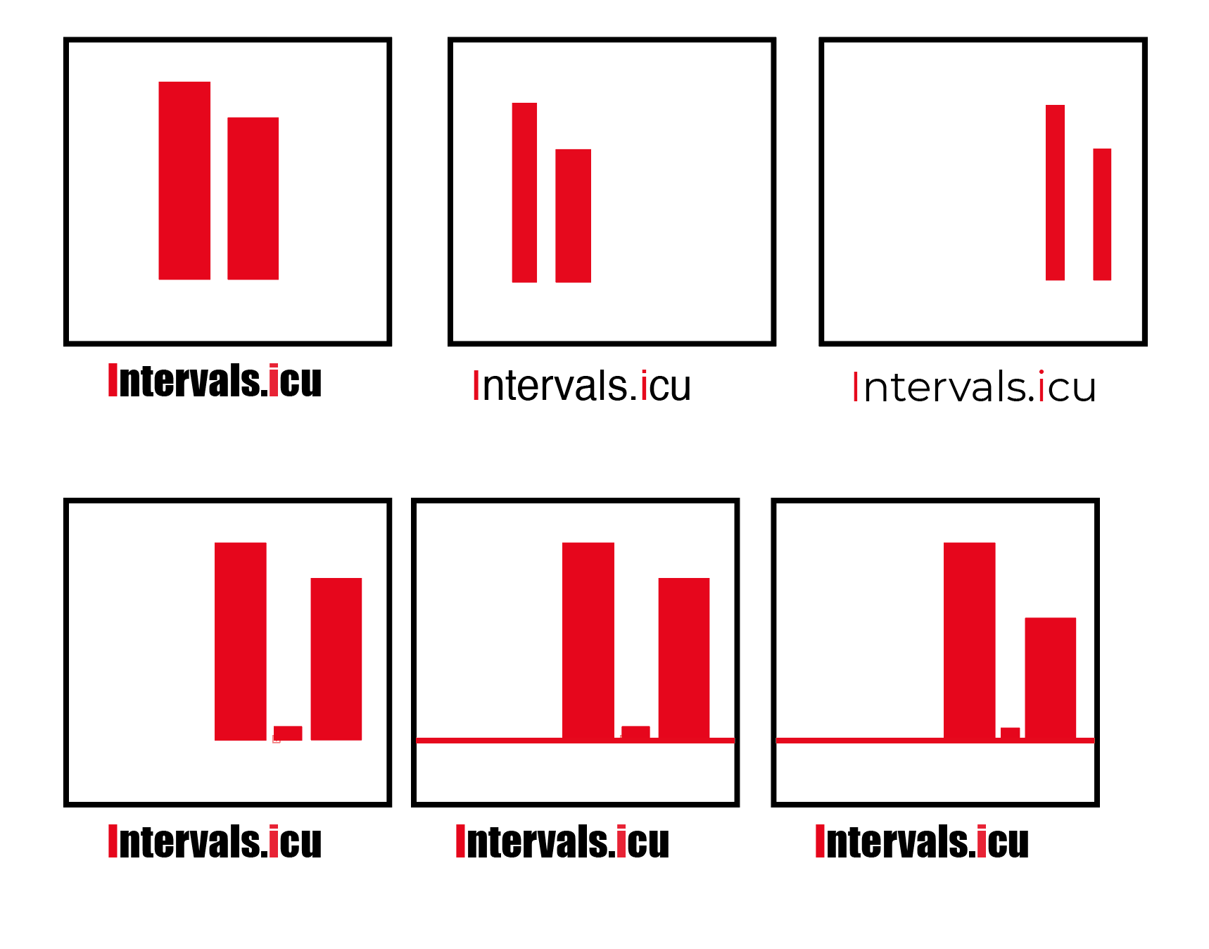
I dig it! maybe you could do something with the letter “i” within the logo. But I like it as it is
2 Likes
I definitely prefer it to the current / provisional logo. But I think I may still prefer the original!
This may be a rubbish idea - I’m no graphic designer - but maybe you could “use” some of the letters in intervals.icu to convey a set of intervals (high/low whatever). Something like:
1 Like
looks great 
I mean it’s absolutely none of my business, but I think the logo is the minor issue here. From a marketing/branding perspective I would strongly back up @Jeffrey_Werner concerns and I would like to add that going by a name that underlines the least useful and reliable feature your otherwise magnificent product offers is … how do I put this … worth thinking about, even if it already is branded and well known in the cycling community. Long term goals, right?
3 Likes
Sure this is just me an my weird phantasy, but this new logo reminds me of a pair of spread legs…
1 Like
For me it looks too much like Heart Rate / health / something like this logo. I would also prefer a bit a stronger red. I quite like the font you used, but the spaces between later seems a bit weird (e.g. rv is really close, int is really spaced). I like a bit less the difference line thickness of the logo.
But I am not a logo expert, not a designer and I do not pretend to have a expert opinion 
I tried to do something with the double I of Intervals.icu. But I was in a rush, and I am not fully convinced & it would need more work. But maybe it is helping you
2 Likes