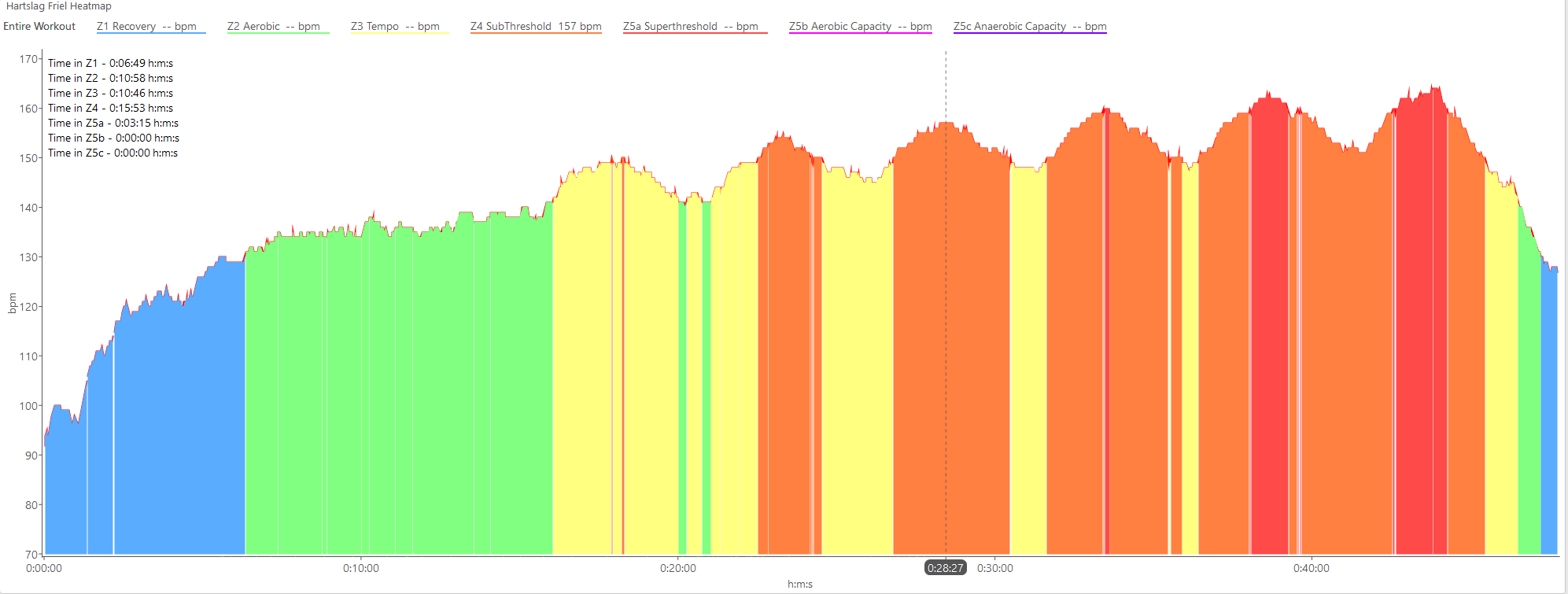
HR Zone Colored Graph over time
4 Likes
I do have this on the todo list. The bands would be horizontal because I already have code to do that from the power chart.
5 Likes
Is there a way to join the developer crew of intervals.icu? I would be keen to do so and I bet if there are other engineers they might feel inclined as well! 
Tx. Maybe one day when I can get the code neat enough! It wasn’t designed to be what it is now from the start so some bits need some work. There are also complications in that I need to be very careful with everyones data.
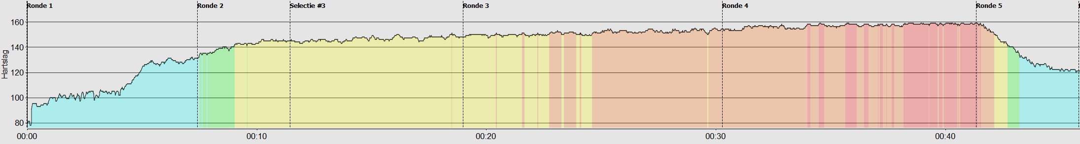
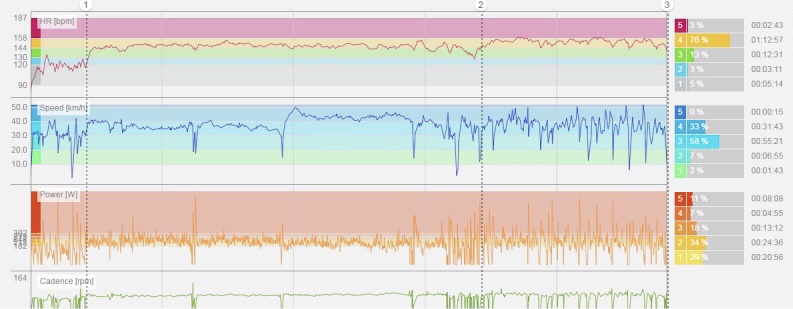
Horizontal colours is way more clean than vertical colours imo. Vertical will be way too cluttered with thin lines all over the place. The whole point is to make it easy to read. For details it is better to use numbers/percentages.
I think the way David has already done the colours for 30s power is very very nice.
Polar’s flow chart is similar to David’s, but maybe even better. Nice with the percentages to the right of the chart as well.
3 Likes