FYI This chart doesn’t seem to be working at present - 5/11/21. I also checked it on another I follow and same empty chart. Thanks.
Yes, I’m seeing an empty chart too.
Same here. Currently empty.
I have fixed this for deployment Thurs AM (GMT+2). Tx for the reports.
3 Likes
Hi David,
I consider the idea behind this graph very powerful: Looking at the HR-Power relationship as an indicator for progress !
I am wondering however why you choose to plot the maximum HR for a specific power-bin. (Rather than average HR, median HR, 90% percentile HR,…)
I would think that the maximum is highly likely to be an outlier (for example if it turns out to be the minute after a very hard short effort or at the end of an exhausting ride, … )
Curious to get your ideas on this.
It doesn’t use the max HR but the average HR for each bucket.
Each ride has a power vs HR curve created by breaking the ride up into 1 minute segments, adjusting for HR lag and calculating average power and HR for each segments. These are the data points used for the decoupling related charts on the activity power page. Only segments with 100% moving time are kept.
The traces for the comparison chart are created by bucketing the power-HR segments for all matching activities into power buckets and averaging the HR.
Hope that makes sense!
2 Likes
I’m totally fine with the current axes, but I’d like an option to compare HR at given power.
So in pop-up I could see two datapoints with the same power (x) value but different heartrate (y) values.
2 Likes
I’m back looking at data after a long break, and really like this chart, and many of the other changes that have been made.
I’m seeing some weird data in mine, and from looking at the activity that seems to be causing it I don’t see anything obviously wrong with the data. I found the ‘bad’ ride by changing the date range until I found a change that would have or not have the drop at 260 watts.
How can I go about confirming that the workout in question (Feb 19th) is really the problem, and what could be wrong with the data?
edit - Also another question regarding how multiple rides from a time period are agragated - is this the average for all rides? (ie something like all 1 min buckets of 160 watts averaged for time adjusted HR) When I increase the time period to 1 year as above what does that mean?
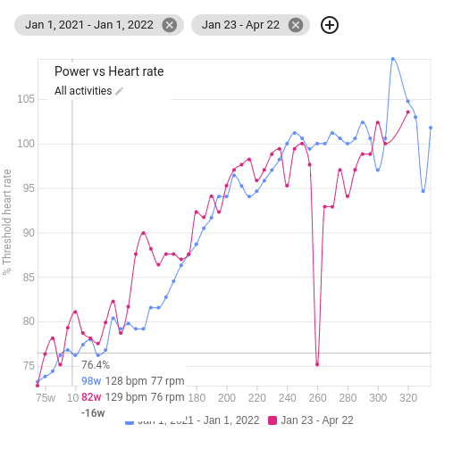
That activity has a lot of broken HR data towards the end. If you Actions → Settings you can tick the ignore HR box and it will be left out of the compare data set (I just did that now).
Intervals.icu computes power vs HR data by breaking the activity into 1 minute buckets with average power, HR (adjusted for lag) and cadence for each. Buckets with stopped time and other dodgyness are discarded. This is stored in 5w increments. So for 200-204w your avg HR (for all 1 min buckets with this power) might by 142 and there were 32 minutes (buckets) in that range.
The compare page calculates a weighted average of each power bucket for all the activities.
Your power vs HR lines are not nearly as straight and linear as mine. Not sure why that should be?
1 Like
Thanks David, I appreciate you help with this and the continued development of the site.
I am curious about this as well! Have not been following a plan for a quite a while, and have been doing lots of aerobic work in the 150-170ish watts range, so that may explain some of the flatness in that area, as this range is likely highly over-represented compared to the other ranges. Some rides are literally 2 hours at a single wattage in that range.
I guess another thing that could affect this is doing mostly TR workouts, in ERG mode. I could see that artificially ‘quantizing’ the powers that I ride significant time at, which could leave some ranges with very little data, and therefore more variability.
I am very interesting in the power/HR relationship around LT1, as that relates to the efforts in the longer rides that I do. I will be playing around with this more going forward.
If I wanted to design a ‘test ride’ for this graph, would it be better to have slowly and continuously increasing power, or have steps? For the range of power I’m most interested in, I would likely do something like 140-190 over 1 or 2 hours. Since you take the 1 minute buckets, I’m thinking a ‘slow’ continuous increase would be the way to go, as that would keep all the buckets consistent with each other. Given the 5 watt quantization, maybe something 2-3 watts/minute or less would be considered ‘slow’???
Sounds like slow would work. You can see the individual minute points for a ride on the ride power page.
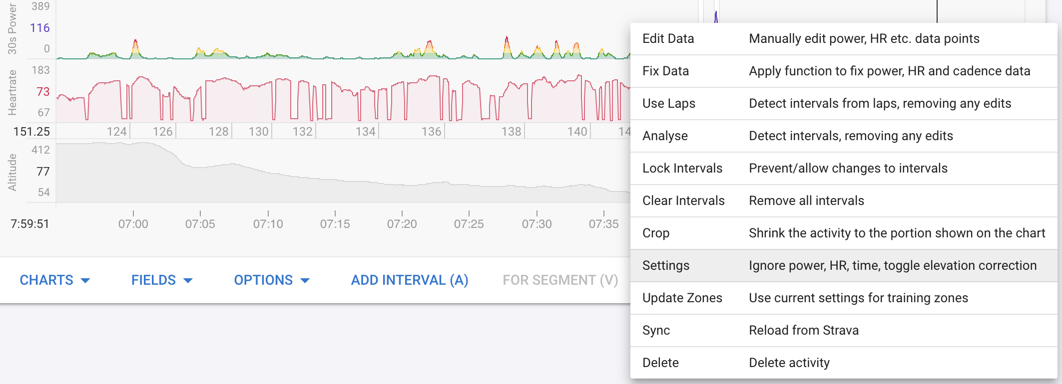
I chose 1 minute after a little experimentation. Seemed long enough to not be too noisy but granular enough for the per activity decoupling charts. The data is precomputed and stored with each activity so its not easy to make this configurable.
2 Likes
Could you add an option to smooth out the lines (best fit) and/or choose a power range? That would make it easier to read
1 Like
Hi @david, I love this chart to track my improved efficiency. However, it does not work well in the higher power ranges for me. I think this occurs for me because I do a lot of microinterval trainings, then the bucket of 1 minute is way too short since the heartrate is not stable enough. Any ideas?
Hmm not sure what to do about that. This really does need 1m buckets because HR takes a while to respond and so bad data can be tossed.
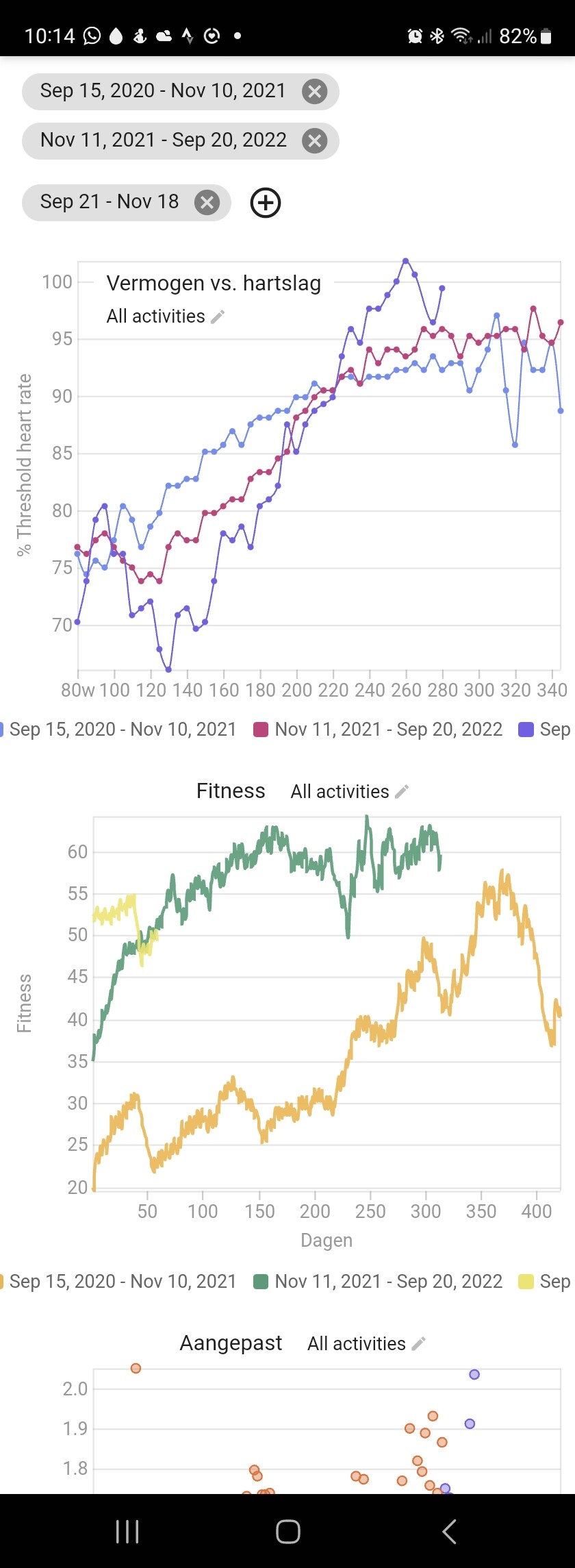
Hi David, would it be possible to configure the Y axis to be simply Heart Rate please?
The reason for the request is that I’ve changed my HR settings at some point in the past and so when trying to compare my Year on Year fitness I’m getting a skewed view. I don’t think my max HR has actually changed … just that I’ve altered the setting at some point.
Actual example - a point on the chart showing that I’m -14w this year to last. 248w in 2022 vs 234w in 2023 for 169bpm vs 166 bpm. So actually 3bpm slower in 2023 (presumably because I’ve lowered my max HR at some point). If I find 169bpm in 2023 on the chart the associated power is actually 247w … so just 1w lower.
It would therefore be really useful if there was a 3rd chart option of pure HR for those of us who’ve changed our HR settings in the period we’re trying to compare.
Thanks, Justin.
1 Like
I have just added that. Tx.
4 Likes
Absolutely love that and thanks for the responsiveness David. Much appreciated. ![]()
1 Like
Is there any way to change the colors for the years? It’s now kind of confusing as the same year shows in different colors in different charts. Thanks!
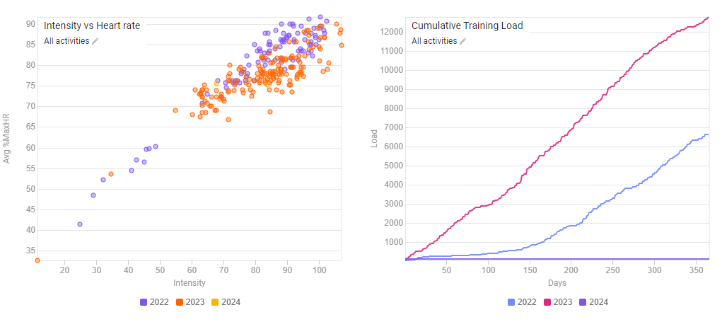
I think you can solve that by re-defining the time periods.
Leave all the charts in place, delete the years, and then add them again. Should be the same color then.