I’m training for some long mountain trail races I have coming up later this year. So, I’ve started supplementing my normal training with hill climbing sessions on my treadmill at up to a 15% incline. Much of it is power walking, but my pace sometimes drops below 10 min/km.
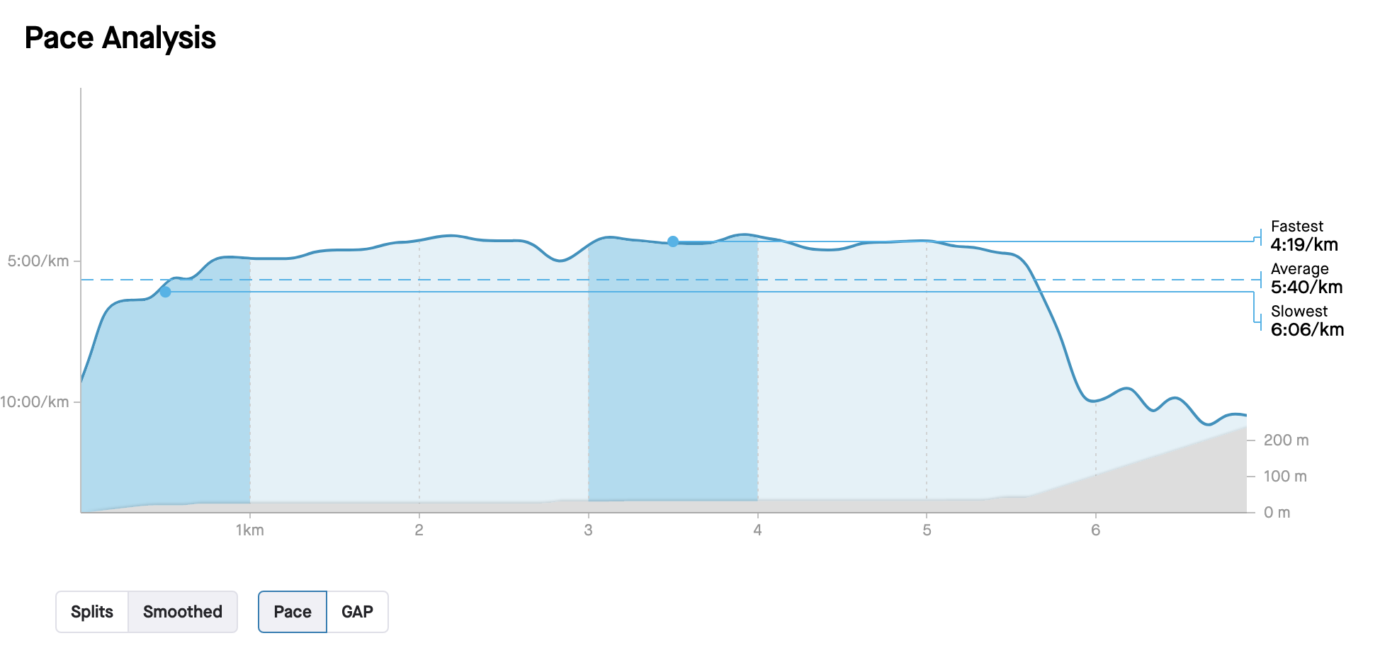
I’ve noticed that the y-axis for pace cuts off at 10 min/km. Here’s one example: Intervals.icu
Is this just for display purposes or does this also affect the global activity averages calculated by intervals.icu? If so, is there any way to change this myself?
In the default pace charts, there is no cut off that I’m aware off. The scale auto-adjusts to the max and min from the pace stream.
Maybe you are using a chart shared by someone else?
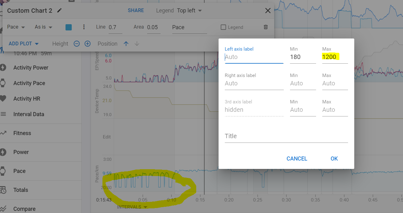
You can set the min and max values for the Y-axis yourself.
Note that for Pace charts you need to add the min max values in seconds and inversing min/max will mirror the chart horizontally.
If you use a stream that was originally in m/s and converted to pace, you will need to set the limits in m/sec.
The data was retrieved automatically from Strava. The default graphs in Strava, Zwift and Garmin Connect all display the pace correctly, without cutting it off at 10 min/km.
It doesn´t matter where the data originates from and what the charts in other apps display. They all get the same data stream. What does matter, is how the chart in Intervals is configured. Is it the default one or are you using a custom one?
It’s the default one.
Sorry, I thought it was obvious what I was referring to. I also thought my activity was publicly visible via the link I shared in my original post, so didn’t elaborate. But it seems not?
Exactly. Hence my original question.
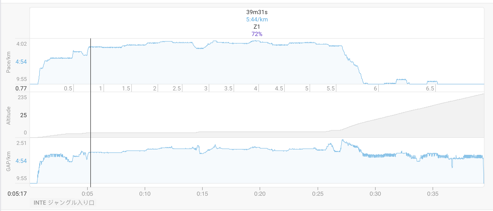
I can see a lot of fluctuations in the GAP towards the end of the activity. I was struggling to see the miniature pace reading on Zwift on my phone and swivel the dial on my treadmill to the correct speed while walking uphill, so did attempt to make multiple corrections to the speed. Certainly not as much as is showing, but it’s also possible there was a poor connection somewhere, so noisy data was sent.
Perhaps intervals.icu is just dealing with that noise differently, while the other apps are just smoothing the data?
This is no big deal. I just want to understand exactly what’s happening for future reference.
It isn´t cut off, it´s auto-scaled.
Create your own pace and GAP charts with a fixed Y scale and you should see what I mean.
Set for example 180 and 720 seconds as max and min.
The slowest pace will always ‘look’ cut off because it is pace. A speed of 0 m/s makes for an infinite pace of min/km.
Edit: There is actually a cut-off to avoid the infinite problem. The cut off is at 18min/km. You can see it when you set 20min (1200sec) as limit. Anything slower then 18min/km will be considered stopped when displaying pace.