The PrusaSlicer application is for 3D printing, different topic. But they have the same issue of presenting loads of super detailed things to power users while also catering to newbies.
They introduced a system where there is a 3- way button on the screen at all times which selects simple-advanced-expert modes.
These simply remove or add elements. I.e. the same settings page will have a handful of options in simple mode, and a metric s… ton in expert mode.
This way users can start out easy, and when they feel like it, quickly check out more advanced settings. Also pretty straightforward to implement.
No idea if that transfers to intervals.icu well, just a heads up.
Simple UI improvement suggestion: request to have multi-day and single-day notes appear the same in the calendar view. Right now multi-day notes appear above the date, whereas single-day notes appear below the date. Thanks!
Hello @david and @eva
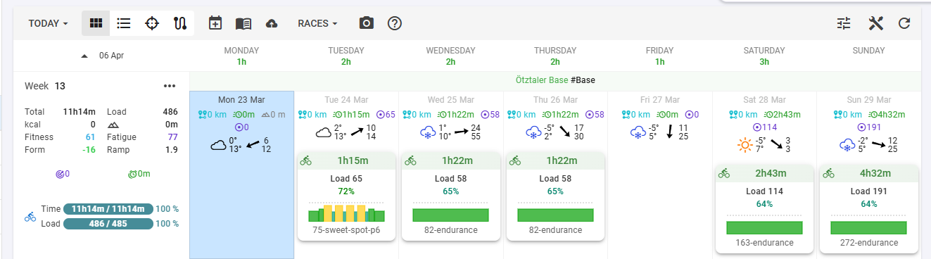
I wanted to make an update of the Calendar wiki page, but before I begin - it’s really time to fix the UI - more features, more options, more confusion.
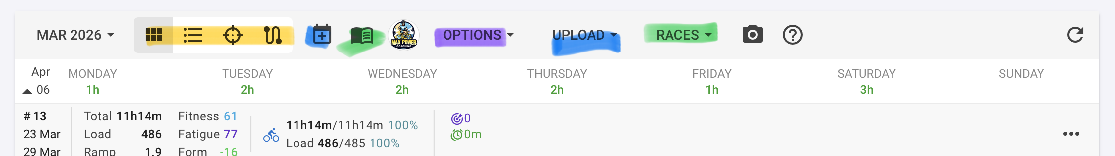
If you look at the calendar page - there are tab switcher, buttons dropdowns …
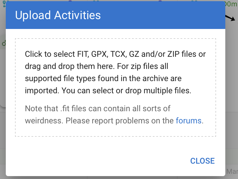
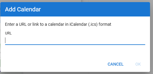
Then there seem to be three dropdowns, but actually only two are “real” dropdowns. Clicking on Upload opens again a modal - but now without the (x), now it has a CLOSE button. And it can’t be moved around.
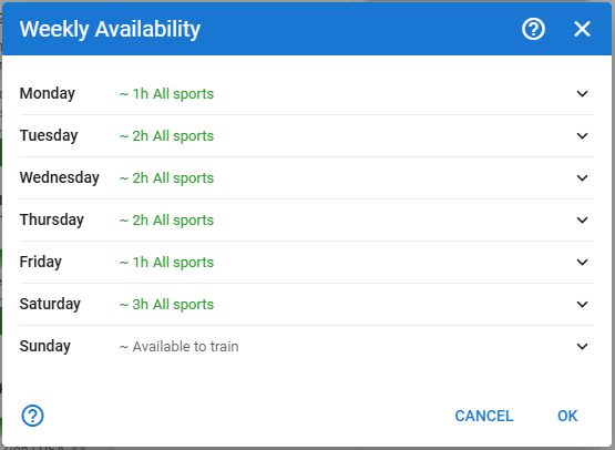
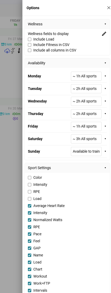
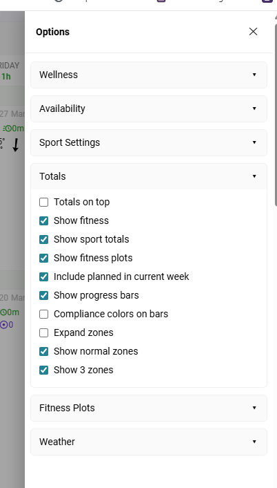
4b. Wellness and Availability seems to be dropdowns, but Availability opens now a modal. This now has Cancel and Ok, TWO Question-mark-buttons, which lead to the same forum page, and an (x) at the top. But it can’t moved around again.
4c. Edit Layout is great, but you always have to click three times to configure multiple sections of the calendar page.
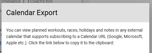
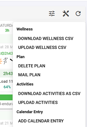
4d. The csv download directly downloads activities as csv, but if you want to download wellness csv, you have to open Wellness dropdown and then can download wellness csv - good hidden feature.
4e. Clicking on Edit Layout and Availability and the Plan (Mail / Delete Plan) Buttons will close the Options dropdown - Wellness and the two Calendar Buttons won’t close the Options dropdown.
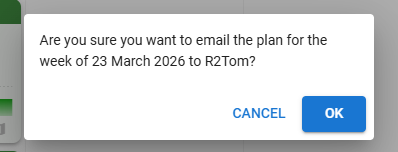
4f. If you click Mail Plan or Delete plan: this is really wild - it opens now a modal without any header, but the OK button now is BLUE, on all other modals above the OK button is the same style as the cancel button
There are more inconsistencies, but I leave it with that.
This was just the UI and the inconsistency on one page. Could we please fix this?
Some ideas for improvements, please consider to implement something like this
Use same style for every modal (either use the (x) at the top, or CLOSE button, always a blue header, and so on), but be consistent between all modals. This should apply to all pages.
Same “styled” buttons should do the same behaviour (a dropdown button shouldn’t open a modal)
Remove the complexity, my suggestion is refactoring the Menu bar, for example like this:
3a. The Upload dropdown was replaced with a button
3b. The Options dialog is a tune button on the right side
3c. Maybe even remove the upload button and the add calender entry button and put them into a single dropdown (see 4 and 6 - Tools dropdown)
Put the Actions from the Options to a new Menu Dialog or Actions dialog (Download Activities CSV, Download/Upload Wellness CSV, Mail Plan, Delete Plan)
Instead of Modal settings, put that in a single slide over, and group them. As a Mockup I did this for Wellness and Availability and also put the Edit Layout options into that slide over.You can toggle the groups and so on, and you have options in one single place.
I didn’t put any efforts in styling the Options and Tools dialog. It’s just a quick sketch. But I think you get what’s the idea. Of course the same logic should apply to all other pages later on.