@david@eva sorry for the long post, but I think it is critical for the success of the platform.
First, thank you you for creating such an amazing platform with so much functionality. Unfortunately, the functionality is a double-edged sword if the UI/UX is not super tight.
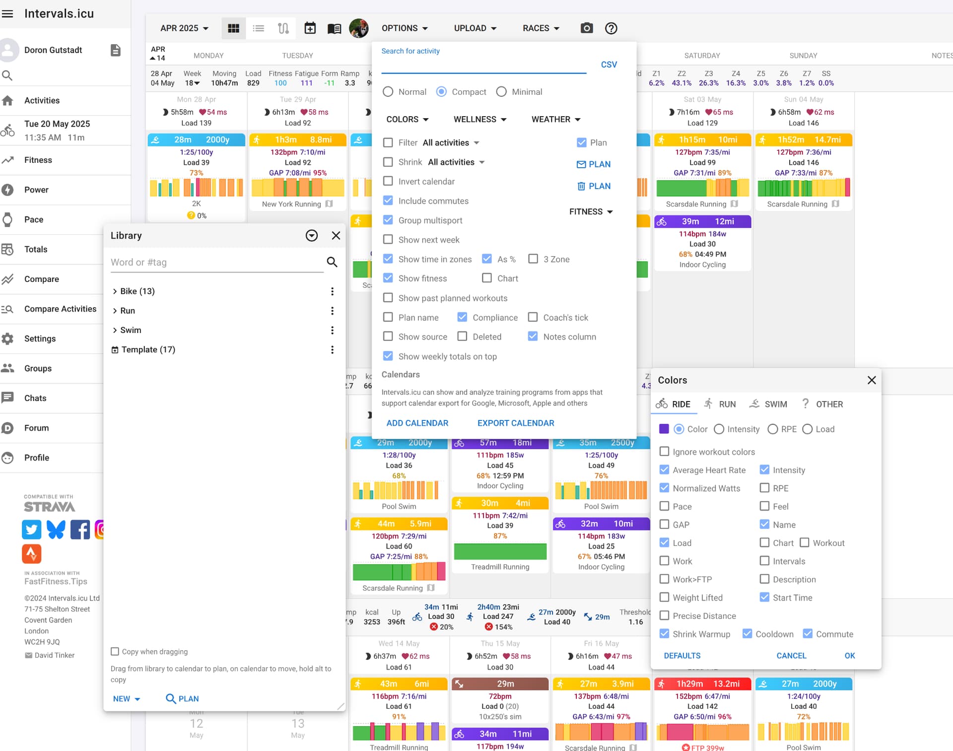
I enthusiastically recommended Intervals.Icu to multiple people and the consistent result was rejection due to the overwhelming UI. It is very difficult for people to understand what the hell is going on when there is so much to choose from.
Look at the screenshot below, It may work for a sophisticated user that has been on the platform for a long time, but it is very outputting for a new user. It’s just too complex.
So I would like to suggest a few changes that IMHO could make it easier for people to get on the platform and hopefully help broader adoption. I think it is much more important than yet another back-end functionality feature.
The underlying principle of the UI should be that the default is super-simple and with minimum configuration it just works. Look at the configuration screen of TP - it is very simple and easy to understand.
The UI needs to be consistent across the board. If you have some menus on the top with drop-downs, some on the bottom with links, some on the settings screen and some in pop-up screens - it confuses the user and hard to remember and find the functionality they are looking for.
The UI should be easy to navigate. You MUST get rid of all these pop-ups and either consolidate into a single modal screen (i.e. blocks interaction with the screen behind it) or create another “drawer” on the right, similar to the one on the left, as a container to all the configuration options. It would be best if you consolidate all these disparate configuration UIs (including the “Settings” screen) into one consistent place with tabs to logically organize.
The functionality should be easy to find. Consolidation (point #3 above) is a prerequisite, then you can add a search bar.
Lastly, cleanup all the weird inconsistent UI in various places in the app. e.g. why is the map a pop-up rather than another tab in the workout screen? The bespoke UI for setting up filters on top. Etc.
Sorry if I’m coming off as judgmental. I think it is a wonderful and powerful platform but the UI is very weak in comparison. I hope this is helpful, please feel free to contact me directly if there’s anything I can help with on this front.
Those are all very good points. The platform wasn’t designed but grew with whatever I could get done in my spare time. Now I am full time on the project and @eva has joined we will be able to address these sort of issues. We are currently busy with a huge library upgrade (4 years is a an era in the JavaScript world). When that is done we will be on it.
I totally agree that a UI refresh could help improve usability, especially for new users. That said, I strongly believe Intervals.icu’s greatest strength lies in its flexibility and the sheer depth of data access it provides.
One idea that might satisfy both worlds would be a dual-interface approach:
A “Standard View” for casual or less technically inclined users—clean, simplified, and focused on high-level insights with minimal cognitive load.
And a “Power User View” for data nerds like many of us—where every chart, field, and metric is fully exposed and customizable, down to milliseconds if needed.
This way, newcomers aren’t overwhelmed, while long-time users can continue to do deep dives and squeeze every bit of insight from their data.
It’s crucial that a UI overhaul doesn’t come at the cost of reducing this flexibility. Intervals.icu is one of the few tools that lets you really dissect your performance data in full detail, and that’s something worth preserving.
But knowing David, I’m sure he’ll strike a smart balance—he’s probably just as much of a data geek as the rest of us
Comparing Intervals with TP is not really fair to the level of analytics available in Intervals. WKO should be included in the comparison as Intervals is capable of doing what both applications (TP and WKO) can do (most of the features). I’ve been using Intervals from (almost) day 1, and have seen the changes over time, yet I still forget about certain features, charts, and more. I’m often reminded on it when certain threads pop up.
That said, I do agree that Intervals could have a basic view with minimal features as default, for the beginner, so that it only shows the basic/critical information. This was suggested above as Standard view and Power User view. Perhaps the compact, minimal and normal toggle options could be used to link the various levels of information. I don’t know what’s physically possible or not, as I’m not a programmer/developer.
For me, I’d like to see the possibility of having a template view the coach uses to be replicated on athletes, so they get the same/similar layout. The header template is an example of being able to save and select various configurations. This would make discussions easier for the athlete to understand when the coach references a chart or two.
Fair enough. TP does not have anything like the depth of functionality Intervals.icu does, so perhaps bad example.
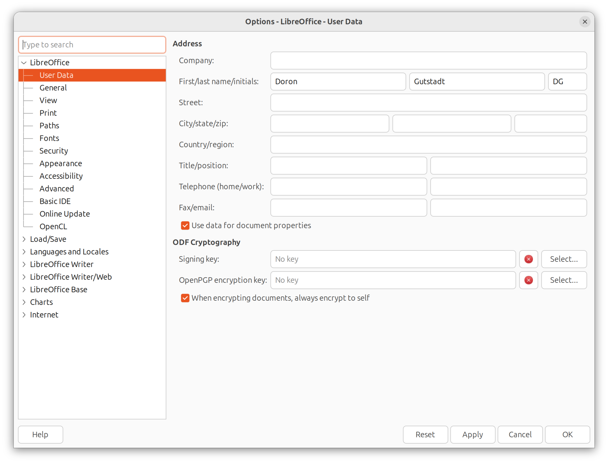
So here’s a different example below, the configuration screen of LibreOffice (open source equivalent of MS office). Gazillion options, but super clean and easy to navigate and find stuff. There are plenty of other examples for clean UI that holds lots of complexity.
Sorry to be argumentative, but I actually don’t think its a good idea to have 2 UIs - simple and advanced. What if you only want some of the functionality of the “advanced” view but not all of it? Not to mention it makes the developer’s life much harder to maintain two UIs.
Much better to implement good UI/UX practices to clean up the mess and enable showing/hiding complexity and support all levels of sophistication.
Just my view based on almost 30 years of building user-facing software.
Very good points indeed @Doron_Gutstadt and I completely agree with you that the UX is way too complex and inconsistent at the moment. Those are one of the reasons I’m currently sitting in the intervals.icu development team (yes, we are team now instead of just one person) No need to be sorry of “coming off as judgmental”, you are absolutely right in pointing these issues and you have been heard.
Like @david said, we are currently working on updating the front-end, but after that, I’m going to to be addressing all of these problems you mentioned and I’m more than happy to listen all of your pains and suggestions. I really liked the suggestion of right-side drawer for options instead of dialogs.
I will also add not to forget about cost, what you have to pay to get TP and WKO far exceeds the cost for Intervals.icu. The updates and improvements to TP and WKO have been minimal and lag far behind the updates we get from David and Team. TP and WKO have stagnated and are not worth the cost.
I moved over to Intervals from TP and WKO having used them for well over a decade and not given it a second thought. Intervals offers so much more in one place than TP and WKO ever did. TP stagnated massively and WKO5 was a UI disaster after WKO4 (which I liked). Now with Intervals, everything is in one place and I don’t have to balance/sync between an app and a platform. Added to this, TP and WKO ATL/CTL would go out of sync as they’d calculate TSS differently which was never fixed.
I have no issue with the Intervals UI. Being a tech person/developer, I’m happy just to have data thrown at me. I can understand that for less technically minded people it may be more challenging but I really wouldn’t change much being selfish!
Also, to be CLEAR: I very much appreciate Intervals.Icu, and what it offers us, for a reasonable price - compared to other platforms. Thanks again for everything @David and your colleagues.
The amount of information is not necessarily the problem, but rather the way it is organized. One example of how this can manifest is the number of clicks required to perform a simple task, among other things.
@david and @eva are doing an excellent job with the site, and the expansion of the feature set makes me optimistic about its future. I’ve tried to attract less data-driven cyclists to the platform, similar to @Doron_Gutstadt.
I found that less technically inclined and ’power user’ cyclists stuck to the site because of the complex functions they desired, like the workout editor, and recent changes that removed hurdles, like syncing to Zwift.
These users find a user-friendly way to accomplish tasks and learn to rely on that approach. I don’t think it’s necessary to create two distinct user interfaces, as most users will only interact with the functions they need. Perhaps the default configuration could be straightforward and allow users to enable more complex features as they progress.
I’ve often had to explain where to find specific settings or functions. The discoverability could be improved. For example, what’s the difference between charts and activity charts in the activity view? Why are there two menus for interval fields, one for the list and one for the header above the charts? This complexity hinders users who don’t want to learn the distinctions. Even I, who use the platform a lot, sometimes forget which menu is which.
Agreed that this is the main thing to be improved.
Those using Intervals since a couple of years sort of ‘grew’ into it and assimilated bit by bit. Newcomers have lots of problems to find settings and often think that a certain config can’t be done, simply because the way to do it is no longer intuitive.
New user here so probably noob error, but. Is there a way to keep a selected training plan in the training calendar so it updates into Zwift or head unit etc? I select a plan after a search, make sure start date is correct then when I log in to icu next time the plan has disappeared and I have an empty training calendar ahead? Thanks.
Similar to the comments above, I’d like to see a layered approach, with a ‘pretty’ top level view that shows your key metrics, upcoming workouts etc. Something like whoop.
Then you can dig down through the layers, firstly basic configuration, then the more complex stuff hidden away in advanced menus.
The desktop probably doesn’t need to change that much, but for mobile (which I would imagine it a high proportion of usage) a substantial change is needed.
While I like and pay for Intervals, in my opinion WKO was worth the cost.
I don’t have to pay for TP. Free TP gives me sync to WKO and a great archiving service.
$126.75 one time fee for WKO5, almost 6 years ago.
I can’t easily replicate a few WKO analytics in Intervals. For example meanmax(cadence), meanmax(heartrate), and a couple other things. Conversely Intervals has the seasonal power-vs-heartrate compare function I can’t easily replicate in WKO5.
Long ago I customized WKO layout and graphs.
On the other hand Intervals on my iPhone provides all the basic post-ride analytics I use in WKO, so I use Intervals after a ride.
But sometimes I ask questions that are more easily answered on WKO5.
I prefer my graphs in WKO (colors, scaling, overlays) but recent additions to Intervals has closed the gap. Intervals white background makes my eyeballs burn, but it’s so convenient having quick analytics on my iPhone.
All the analytic platforms are overkill for most people. I’ve achieved some of my highest fitness results using basic principles and simple on-the-bike data. It’s fun looking at numbers and data but easy to lose the plot.
My Intervals subscription renewed 4 days ago. Happy using both Intervals and WKO5, and will continue for some time to come.
Just another point on TP for someone who has been using it as a coach for 15+ years. There are many things in the UI that are easier in Intervals than TP… yes, TP is cleaner, but it’s clunky as heck. The workout builder is horrible (no text option)… the analytics and ability to KEEP settings in Intervals (whereas in TP they disappear after you save the workout). I love this platform and if the following was improved I would drop TP in a heartbeat:
Ability to comment on a workout before it’s completed (this is a huge gap from a communication standpoint)
Ability to have a standard set of custom metrics/charts across athletes or athlete types
Ability to create a workout with tags on an athlete calendar and move to library (and retain tags)
Athlete UI vs. Coach UI (there seems to be little distinction now)
Hats off to @David for building a phenomenal platform and one I hope to fully adopt after 1 & 2 are met. I can live without the other two.
Maybe I am only missing it due to oversight (by many-year i.icu User):
Ability to have a standard set of custom metrics/charts across devices (computer(s), tablet, etc)