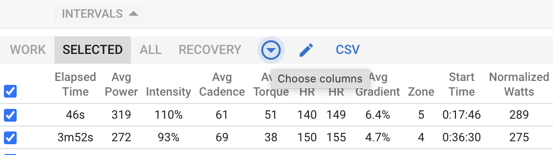
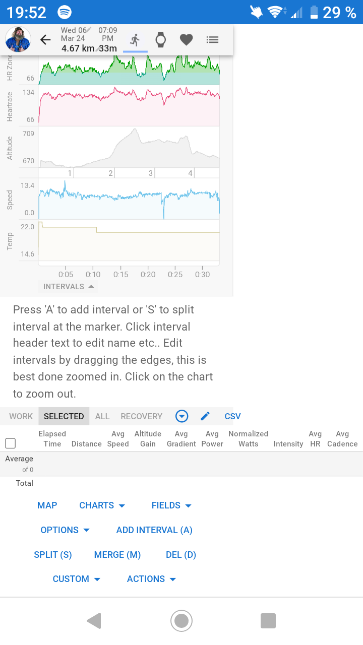
Hi, in the web app on the phone the interval table is wider than the screen width. Moving the finger along the chart results in moving the whole element to the left. The screenshot shows the page zoomed out. The initial width covers only the width of the chart.
It’s not an app though, and not optimised for mobile devices.
You can select the view desktop version in your mobile’s browser settings or try landscape mode.
@David I’m also having this trouble on Desktop. If I scroll over to the right, I have to reload the page in order to see the page content again on the left.