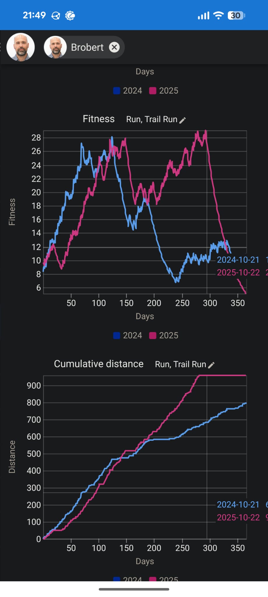
As explained in the title, when trying to see the data that is near the end of a season in the Compare page (on mobile), the tooltip goes out of bounds to the right, making it impossible to read.
I’d like the legend tooltip to appear on the left side of the vertical line whenever needed. I hope it’s easy to fix.
I’ve added a screenshot so my explanation is clearer!
1 Like
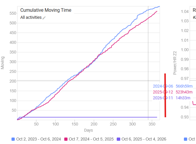
I noticed the same behaviour on desktop yesterday.
Fixed already? It’s not going to the left but it’s not cut anymore.
It falls of te screen in portrait on mobile (Android - Brave) but it’s there in landscape view.
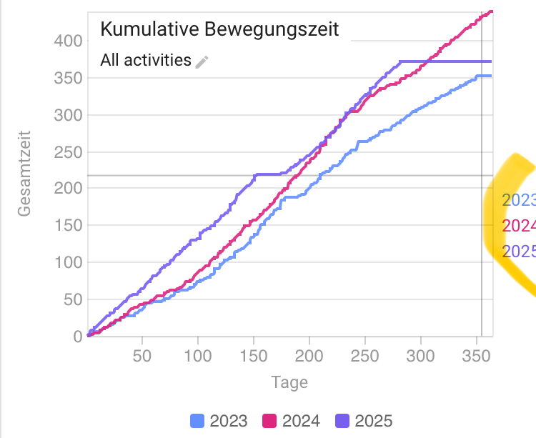
A couple of days ago I noticed that the label was cut on the edge of the graph area (red line in the screenshot), and that seems to have changed now. Or I’m just going banana’s 
But I’m pretty sure because I was looking at cumulated time for last season. I always start a new season on the first Monday of October.
And off course, it would be much nicer to move the label to the left in those cases. And not let it spill over in to the graph on the right.
1 Like