Go look on the Power page:
There is an ideal power curve that is unique to the data that you have in your activity history.
The thin line is the modelled curve, while the darker line is “your” data.
Areas above/below the curve can be identified.
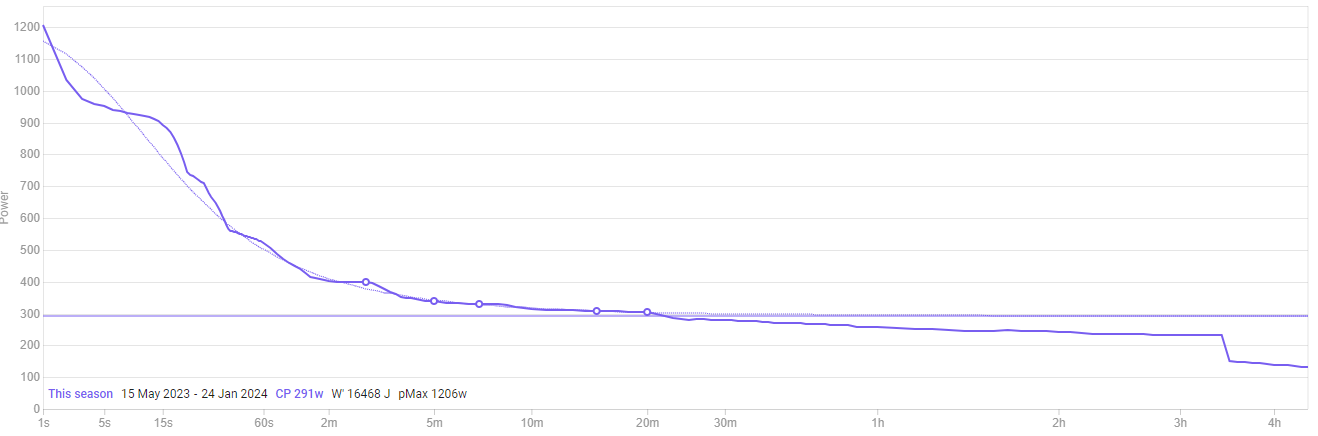
It’s important to understand that this data is unique to you.
Whatever you “feed” in terms of best efforts across the duration (x-axis), is what you will see.
Also, watch this WKO5 tutorial on the power duration curve, which explains a lot more than a typed response could.
