I’ve been reading lately about training, power training, etc. It would be lovely to include some overlay over the actual plotted curve, some sort of “ideal” curve to see how over or under our curve is at each moment.
Below it there are some charts and histograms to get an approach, but the “ideal curve” would be a nice addition, along with something like an index to see which athelete you are: all-rounder, sprinter, etc…
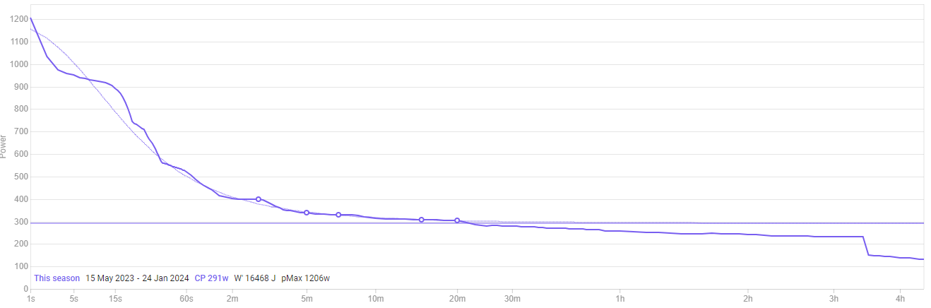
There is an ideal power curve that is unique to the data that you have in your activity history.
The thin line is the modelled curve, while the darker line is “your” data.
Areas above/below the curve can be identified.
It’s important to understand that this data is unique to you.
Whatever you “feed” in terms of best efforts across the duration (x-axis), is what you will see.
Also, watch this WKO5 tutorial on the power duration curve, which explains a lot more than a typed response could.
my naive thoughts , if you training for Sprint/TT , probably your power curve will be higher in the last end , and bigger in longer duration , less higher on the end. And you want that .
Now , if your long duration and middle duration is too close, and you are a "longer duration athlete " , you want more space btw this two. The same for sprint athlete but in other way. (sorry my english , no google translator here)