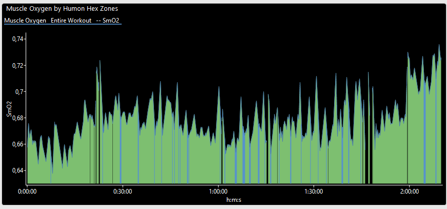
I have a NIRS (Humon Hex) and I think that the graph that you see in intervals is not very interpretable, I explain: With muscle saturation you work with zones, the MoxZones application differentiates the Recovery, Steady State, Approaching Limit and Limit zone, I have been looking and these zones are represented in the FIT file with a number, this number corresponds to a color Recovery-Blue, Steady State-Green, Approaching Limit-Orange and Limit-Red, in the Fit it uses the number 1, 2, 3, 4. Would it be possible to make it look like in the image? Thanks

I have “custom histograms” on the todo list. It will be possible to add histograms (and other charts) to the activity power and HR pages with custom binning etc… Then you will be able to build this chart. Eventually Intervals.icu will be very much more programmable that it is now.
2 Likes