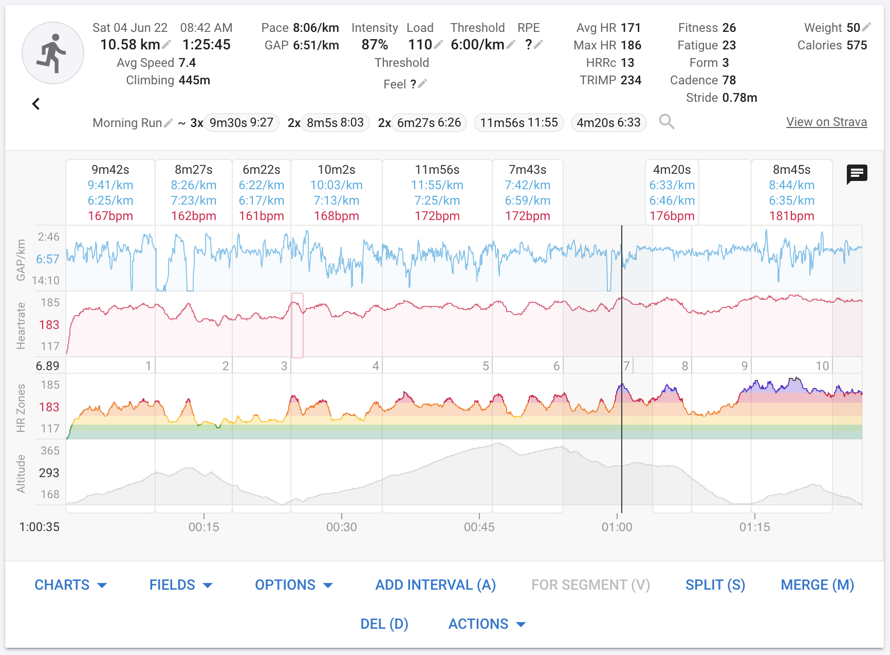
You can now add “HR Zones” to the activity timeline chart. Click “Charts” and look for “HR Zones” in the list. This displays your heart rate coloured by zone. The y axis uses a log scale to accentuate the higher zones (similar to the “30s Power” trace).
It would be nice if you could ad the 30s power average as a line in that graph( mayb toggle on and of). That way one could compare zones (HR and Power). Maybe the option to take the delay in to account?
I would suggest the power zone numbers on the right side, but at the same level as the HR zones (HR zone 2 = Powerzone2, HR zone 3 = Powerzone 3 etc).
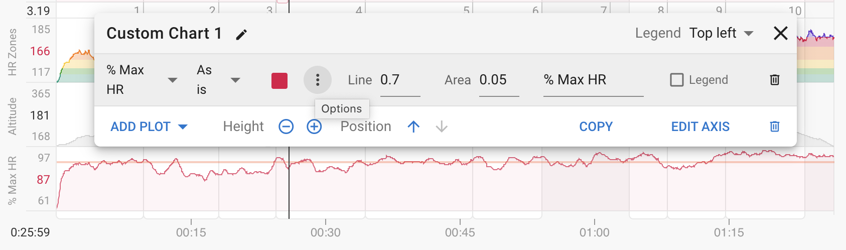
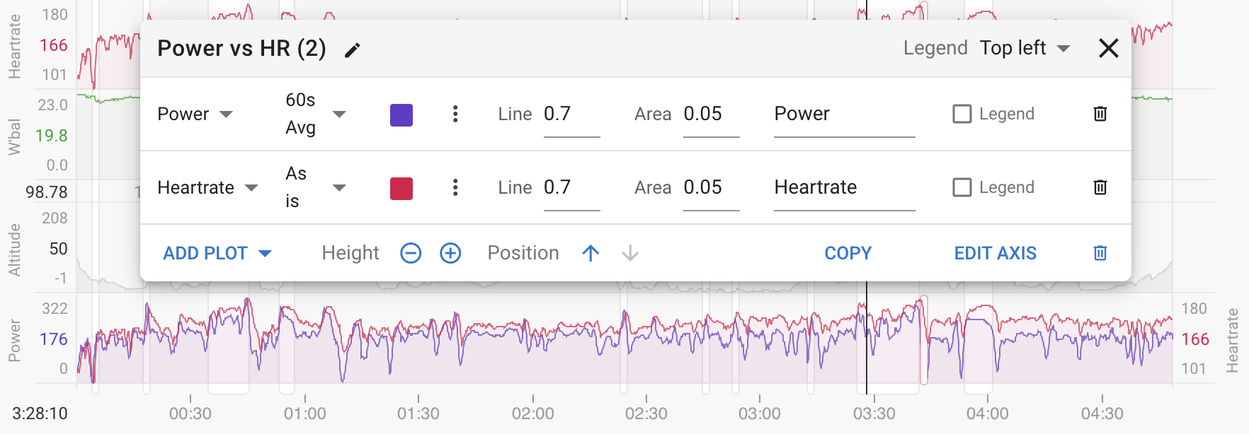
The problem there is that the exponents used to create the log scale for power and HR are different. You can create a custom chart to compare power and HR without a log scale:
I see. Too bad.
I was looking for a way to see if the zones matched. So the max zones are in fact irrelevant, and could be excluded.
But I’m not that good at math to understand the issues with the log scales.
Thanks for the quick reply, and of cours, all of your hard work.
Is it possible (how?) to change the colour of the zones by myself ? It’s nearly impossible for me to recognize difference in blue/green (Zone 1 and zone2)