Would be excellent to see HR efficiency plotted over time, maybe filtered by intensity. Maybe this is already possible!
2 Likes
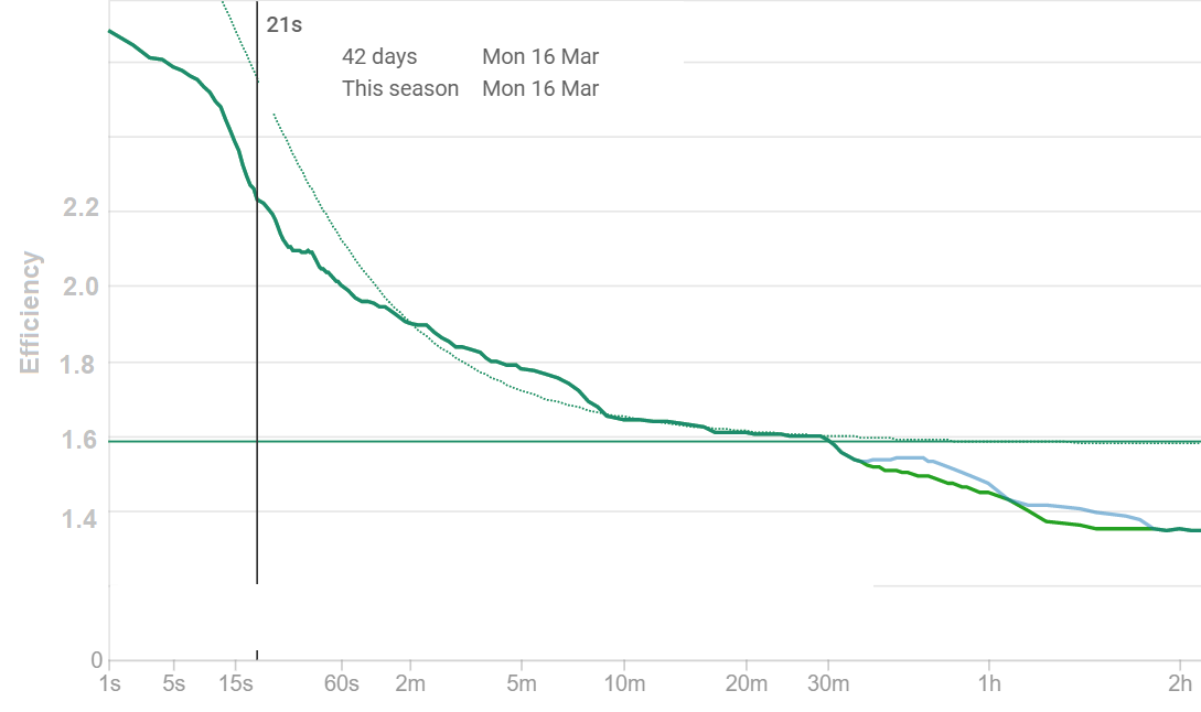
It was but I removed it as the data was very noisy. I need to figure out which efficiency values are worth plotting or how to smooth it. Maybe take the best each week? Open to ideas! Once that is figured out its easy to put it back.
1 Like
I was thinking about the same thing as it would be an awesome indicator of fitness! How about you take the best efficiency ever achieved for the given duration and plot it on a graph; then, if you exceed any best until that point, you get a notification.
Two things to note:
- i am not sure what sort of scaling should be used on the y-axis
- maybe with enough data, a fit could emerge the way it does for CP
1 Like
Perhaps take the efficiency for the best hour from each ride and possibly split them into say Endurance and Tempo and see if the data is little less noisy?
You can do this now with the new custom charts feature on the fitness page. You can plot “Power / HR” etc… I am going to be doing more work in this area soon.
2 Likes
Did this get sorted? Id be really keen to find a graph for efficiency data over time
the Power/HR graph / feature is there quite some time ago. Or are you asking for something else?
Yeah power over hr graph would be great. Not even begun to get my head around all the customisations available yet ![]()
It’s on the Compare page
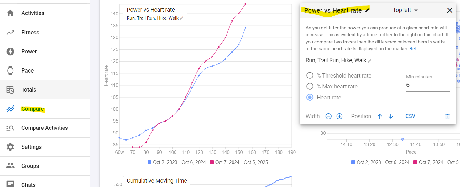
Just click on the add chart button at the bottom, do some basic setup and add the date ranges that you want to compare it for.
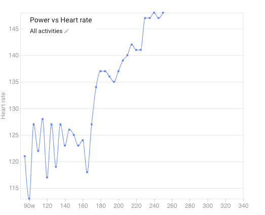
Didn’t see that at all… it doesn’t really seem to give me a particular comparison of overall efficieny score over time It also looks utterly crazy
You could do some minimal reading to understand how to use these tools…
If you see a light blue Ref link, it usually is there for a reason.
Adjust the minimal amount of minutes for the points being used to reduce outliers.
Define date ranges to compare them against each other. The more the curve moves to the bottom/right, the more power you generate for that HR, meaning that you’re improving.
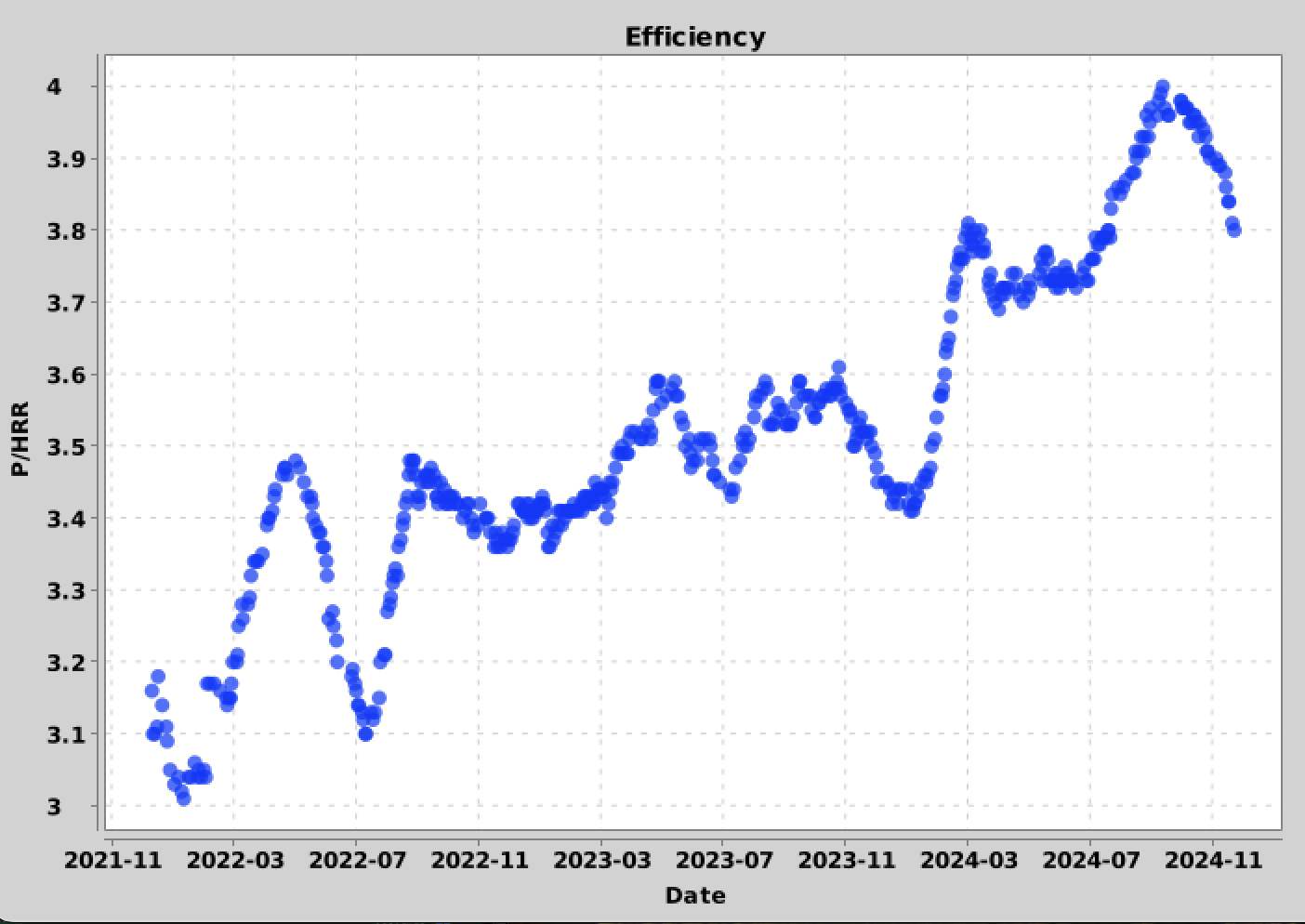
I define efficiency as ‘Power / HeartRateReserve’. Where HRR is defined as:
((maxHR - restHR)/(workoutHR - restHR)).
I have custom streams in intervals to calculate the P/HRR on an activity basis and an interval basis.
I download all my activities via the API, and I have a script which looks for relevant intervals (long enough for HR to stabilise, steady enough, …) And then calculate a moving average of the efficiency.
the output looks like this:
2 Likes
That is indeed a very powerful way for doing just about anything just like you want it done!
But it requires some skills that not all users are keen on learning.
The open API in Intervals is an absolute ‘playground’.
2 Likes