I am interested to know if my HR/ Power ratio has changed between dates and wondered in the Compare Feature would do this?
The metrics I am looking for is, has my HR Fitness improved over time. For example, I think my HR per Average Power was higher in January when compared against March etc. Will the compare feature enable this ?
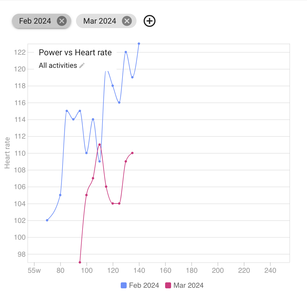
This is what I have created, is it correct, would it indicate HR Fitness is better in March compared with Feb ?
yes, the line further to the right/bottom is the one with higher efficiency. However, these curves seem to me as if they have been produced with way too few data points. What you shiuld look for would be, at least aerobically, monotonically increasing curves with a stable slope. Otherwise, I wouldn’t trust them, since they are mostly artefacts.
These are mostly indoor training rides and there should be one for every day. You are correct for March as we are only 9 days into March and there is a point for each day. I can’t explain why there are only 14 for February as I have a full months worth of data
It’s probably best to turn off the lines in those curves. The relationship between heart rate and power is more like a straight / curved line through the points, and having it wiggle around like that doesn’t show anything meaningful.
I’m not quite sure how to do that, maybe change the graph type from line to dots?
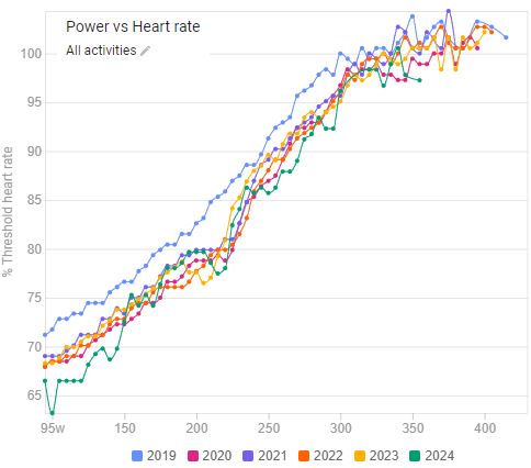
Just wait until you collect more data. Change month to month will be almost impossible to detect on this chart, there is much too much variation. For reference, here is my chart:
You can see that even with yearly data (and that is hundreds of hours), the lines are still not perfect.