I have been trying to get Intervals to process my training the way that I think about it.
I train across multiple activities and use heart rate and Trimp to assess overall load, fitness, fatigue etc.
It is the way I have measured it for many years, from SportTracks local client, to SportTracks web where I did not like the presentation, to Runalyze and now looking to Intervals as an option.
I do not use power at all, although my trainer does provide it.
I have set all of my activities to use 100% of HR info towards Fitness & Fatigue. At least that what I understand I have done.
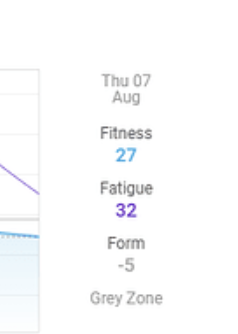
When I view through the mobile app I see what I feel I should be seeing.
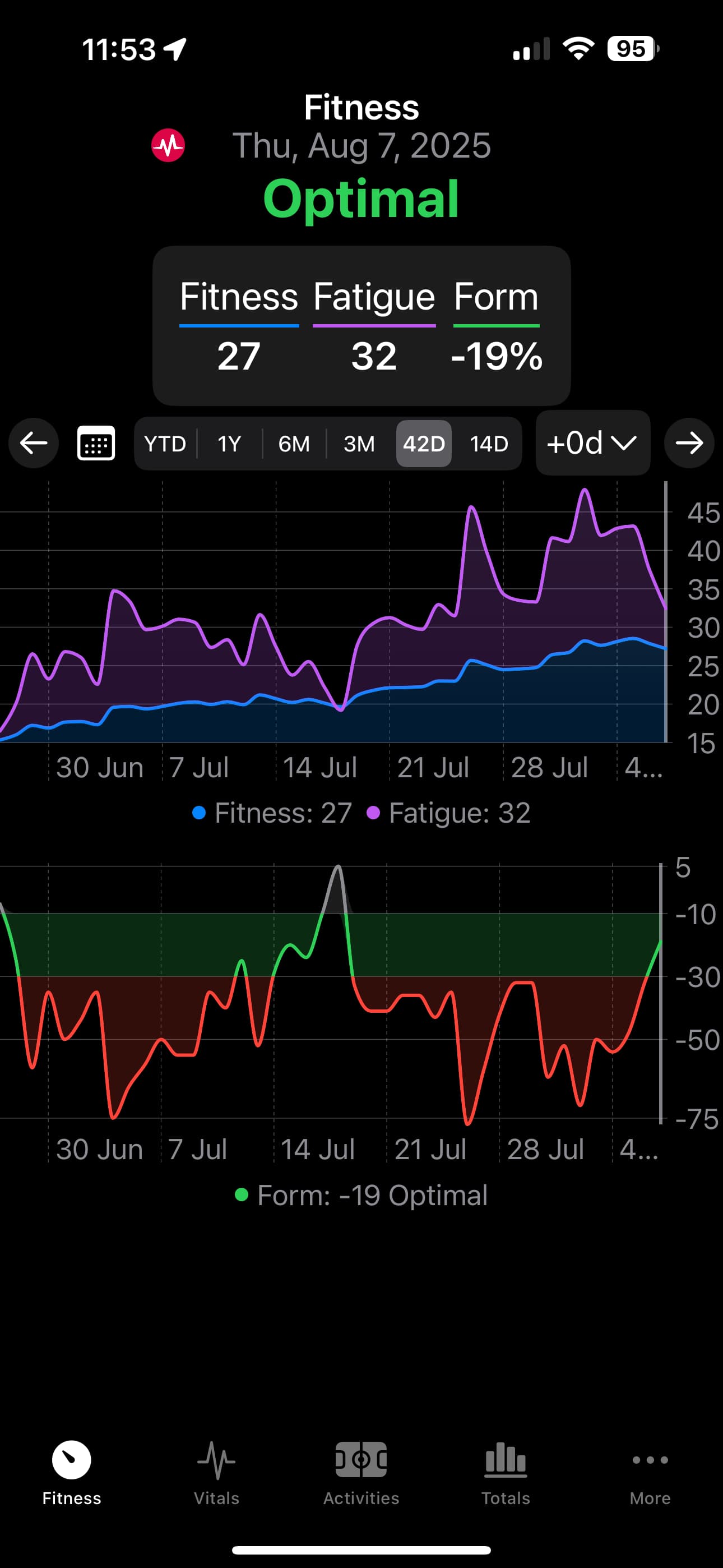
But when I view via the web I see completely different information?
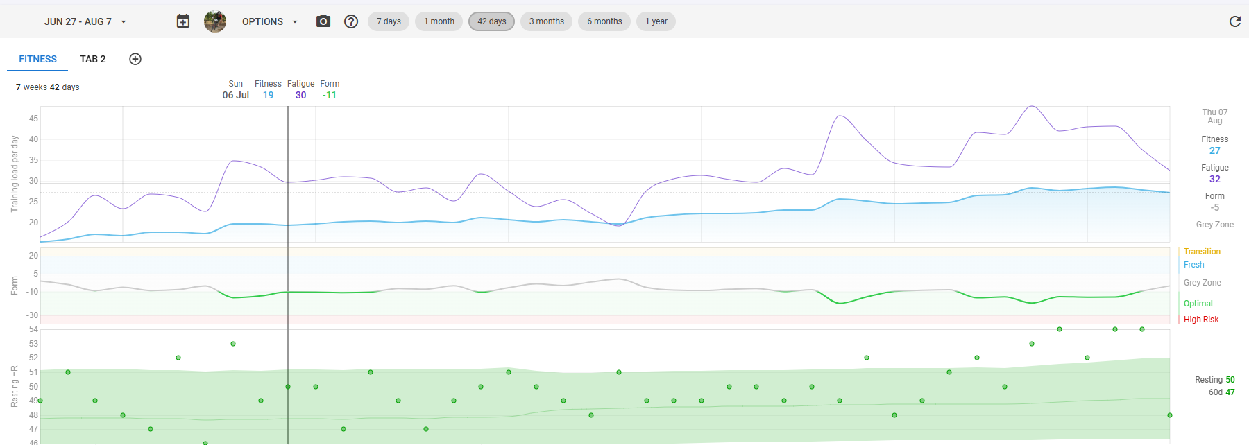
What explains the difference between the two, and how do I get them to appear as the mobile does?
Any assistance appreciated.
Thanks