Hi David,
Would it be something feasible to be able to select between NP/Normalized and raw power in power curve Intervals.icu and on Activity Power?
It would be very interesting to see/track our progression.
Many thanks in advance.
Martial
Hi David,
Would it be something feasible to be able to select between NP/Normalized and raw power in power curve Intervals.icu and on Activity Power?
It would be very interesting to see/track our progression.
Many thanks in advance.
Martial
NP is a method from Training Peaks to try and classify the effect & load of different workouts despite the same average powers. You can have both anaerobic and aerobic components in that NP. I’m not sure what value you’d get from using that instead in the power duration curve. For example, you’d be trying to take NP from an intervals workout of 30 minutes and slap that into the PDC.
I should have call it “Normalized” and not NP  I want the intervals calculation which is amazing!
You can track NP by bringing it into a custom chart and tracking by week.
I don’t think NP was intended to be thrown into a power duration curve. Its a floating mean metric based on 30-s smoothing.
As we can get our “Normalized” information on an intervals, it should be able to get it on a curve for a specific activity, as well as getting “Normalized” CP (CPN?) I believe.
I know of no established practice that advocates normalized power duration curves.
Maybe you can link to some formal literature suggesting there is value in this?
The use of a mean maximal normalized power curve is mentioned in “Training and racing with a power meter”. In the version that I have (Third Edition) it is mentioned on pages 221/222 and references figure 11.10. The authors discuss how normalised power will be a more accurate measure of your true ability for longer efforts as average power will be lower due to time spent not pedaling.
I think that a MMNP curve would be a great addition to the power page. I understand that this might be tricky to implement because as far as I’m aware the MMP curve is calculated when an activity is uploaded and then stored.
In the interest of “good statistics”, if you want to capture the “everything” in the variability associated with rides where you’re also not pedaling, I’d display the power as box plots along the specific durations on the x-axis. This will be reflected in the Activity Power tab for the activity. That will be of much more value as you can eyeball what are the outliers. Plus median powers are not affected by outliers as is average power.
For many of us who ride/race indoors these days, time spent not pedaling is of little issue.
Yes @Calum_Young is correct this would be difficult to implement because the curve for each activity is pre-computed and stored. That makes it quick to derive the best curve for any date range etc… I might be able to do this for a single ride because that could be computed on the fly.
That would be amazing. And if you have it for single rides, you can gather the curve for the power chart? ^^
Yeah except it is slow to compute. I have to fetch many of the data streams for the activity, interpolate to 1s ticks and then generate the PDC. Will have to see
But the normalized power can only be calculated for times longer than 30s?
And it’s only really useful for times over 15 to 20 minutes.
I’d certainly like to see this implemented. From memory, there’s a good webinar by Tim Cusick as to why this information is good for cyclocross riders. I’ll have to have a look for it.
Mike
@Martial_Pottier From an actionable intelligence standpoint, maybe what’s more value added is just knowing how many efforts during that session went above your critical power in terms of work and/or time duration and presented in a visual format.
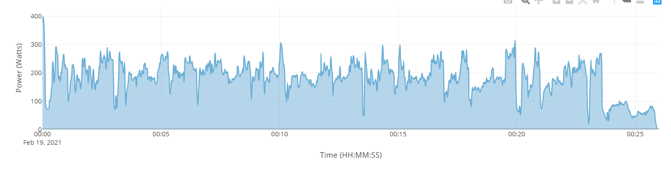
Here’s a high stochastic effort during a Zwift TTT :
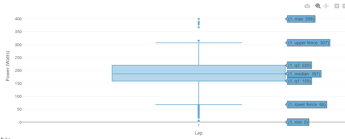
Here’s a box plot distribution of the same effort :
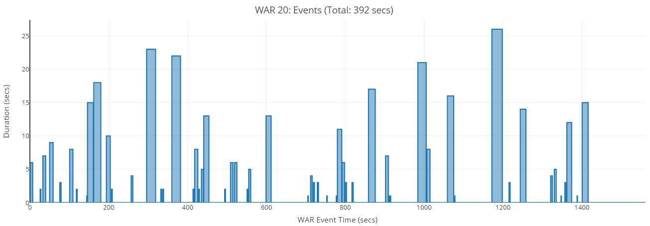
And here’s the time duration of work above critical and instances where this occured.
Maybe I’m misunderstanding, but is this what you want to ultimately extract from your normalized PDC ??
This is from the same tool used often by Dr. Stephen Seiler in his presentations.
Boxplotting the distribution of power is good statistics and probably easier to implement than what @david is being made to attempt. It would also bypass the 30s normalization requirement that is specific to NP algorithm (& arbitrarily fixed, not user defined).
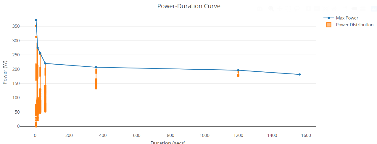
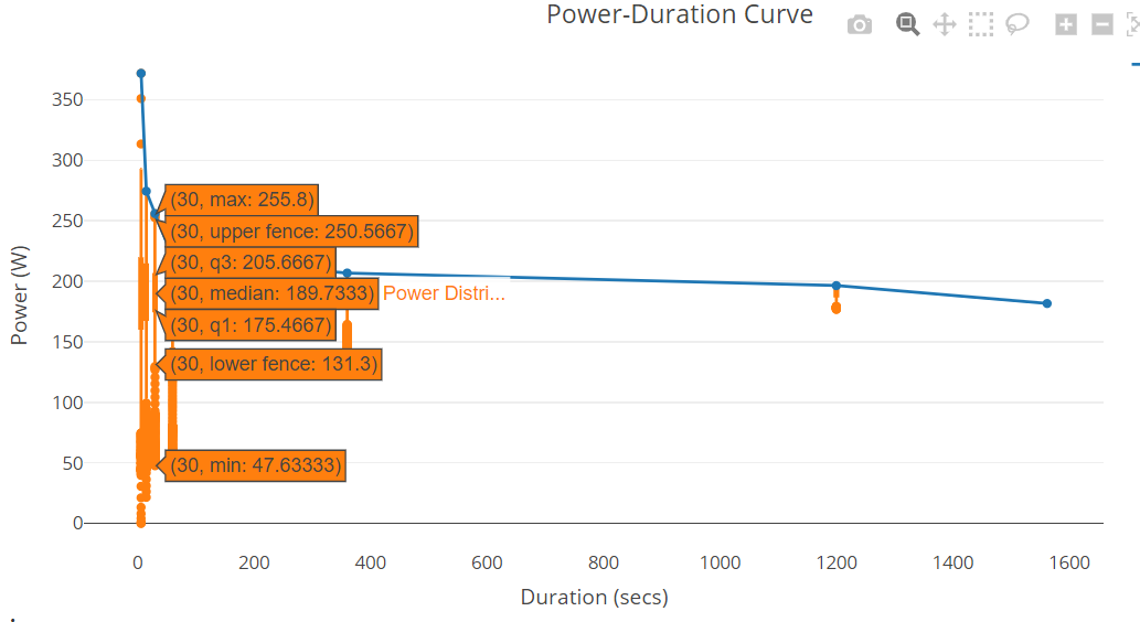
Here’s an example how PDC with boxplot would look like.
In the actual plot, hovering the mouse onto the box should show the median and interquartile values along with the max/min.
I am keen on this too. A NP power curve to look at, much like the current Power Curve. Cycling Analytics has this and is probably the only reason I am still paying to use that software.
Thanks.
Bringing this request back up, as I find myself using the Strava Sauce extension that shows peak NP for a given ride (in specified 5-10-20-30-60min increments).
When training and racing all summer (road racing), I don’t do FTP testing, but use peak 60min NP as the primary fitness indicator. So for me, the dream scenario is something like:
I was hoping to see some new developments in this space? 
Hello, is it always possible to do this ?
Because i have the Sauce extension and i don’t find a parameter to show activites with the best NP for a special time.
Thank you for your answer !!!