Different gear (helmets, socks, bike types) or parts (tyres, sprocket size) have influence on the Watts/HR and/or speed.
It would be a nice feauture to actually see in personal data if certain (expensive) purchases deliver what they claim.
E.g. a time trial helmet is stated to save 5w at 35km/h. And certain tyres 10w for instance.
Which are significant differences and should be clearly visible in the data
The current scatter plots are fantastic to spot your personal progress compared over defined periods of time.
But basically I would be interested in these same type of charts but Gear/Parts based (now Gear is just a filter. But I would like to see it as a variable)
Or is this already possible and I just couldn’t figure out how to?
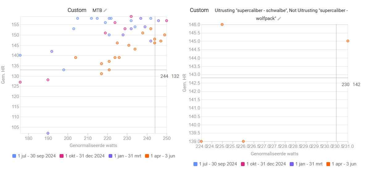
Not really. I have done so as well (2 graphs, each with different gear as a filter)
The problem I face with that is that the axles/scaling aren’t equal (or can you change that? Haven’t found that possibility myself)
E.g. x-axis is has a scale from 180 to 250 normalized watts with gear A and the other identic chart, but with gear B has a scale from 224 to 231 normalized watts.
Same goes with Y-axis (HR)
As such, it makes swift comparison quite difficult.
I rather would like to see the different gear scatter points in a single graph as is now with time periods.
“But you want to compare NP vs HR on the Compare Page for different gears? I think that‘s currently not possible in one chart.” → Yes, that’s basically what I ask.
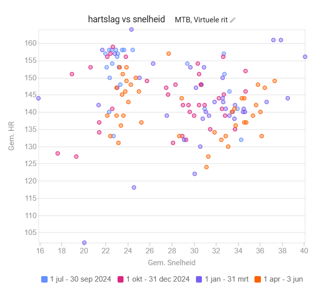
But you seem to have different gears illustrated in a single chart? Only with “ride eFTP” on the y-axis.
So you can conclude that you ride/race harder with the Willier (More frequent higher eFTPs) and you train relatively low efforts on the Kickr.
So I search for a chart like your image. Only with different measurements (e.g. Normalized power). But I can’t even recreate yours.
If you plot on the Fitness page, like @R2Tom 's example, you can use the gear filters but the limiting factor here is the X-axis which is always the dates.
Thinking a bit further, would the NP/HR (efficiency), filtered per gear and plotted over a time axis, be close enough to what you’re after?
Here’s a quick example of a chart I’m using during base periods to check Z2 progress
Fitness page worked. Thank you @MedTechCD for that pointer.
Not ideal, but certainly sufficient for now.
I could create Efficiency vs. Gear over time. (which shows me I do too much training lately as well haha)
I will play bit more with this Fitness Page.
Still think my idea would be a nice add on (also for Journalists that need to test materials over longer period of time). But for now I’m helped for sure.
So thank you both for helping and giving pointers.