Hi,
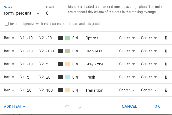
I have just created my own Form % graph as the default one is too small and can not be heightened and customised like the many other graphs available. However, I have used the % ranges from the default form graph and was wondering if this is standard for everyone? ie. Optimal range is -10% to -30%, Fresh is 5% to 20% and so on as per the table I have included.
These values are averages that work more or less ok for a large population when used as absolute values. There have been multiple discussions already regarding the % notation because people just starting out have very low Fitness numbers and then the form ranges are compressed and very tight. My take on this, is to use absolute values if your total training time is less then 8-10hr /week because there is very little chance that your fitness numbers will exceed 100 with that time availability.
Seasoned athletes doing more then 10 hrs/week may be better of with % values. Using % in this case will allow you to do more without going in the red zone. But you will need to evaluate if your body is coping.
2 Likes
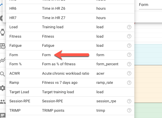
When you say change to Absolute Value do you mean change from Form% to Form (as arrowed)?
As it certainly changes my fitness chart and yes I would be probably doing close to 8-10hrs per week and slowly building volume and duration to exceed that over the next few months as I head towards a 70.3 in June’23.
Yes, that’s it. If your fitness number is 100, both are equal. Under 100, you can do more without going in the red zone when using absolute values. With fitness over 100, % setting will let you do a bit more.
It’s all not that much different for fitness values 80-120. But with very low numbers, % setting will drive you in the red zone just by getting out of your couch…
1 Like
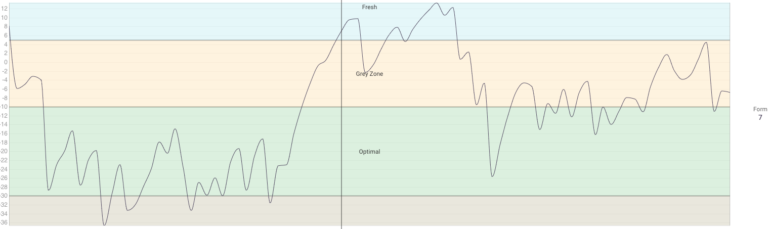
So upon changing it to Absolute Value it changes the values (down the left side) and where my fitness sits in the zones. Does this look right to you? Might be hard to answer if you don’t know my training regime but what do you think?
I can’t tell you what looks right because I don’t know how you feel. But your example is typically seen with low Fitness numbers. The difference gets smaller when Fitness goes up.
Some people find it scary when they see they are constantly in the High Risk zone, especially when new to all this.
Others just feel that this can’t be correct and blame the tool for being faulty.
The more seasoned athletes, will now what form values are ‘good’ for them and makes them thrive.
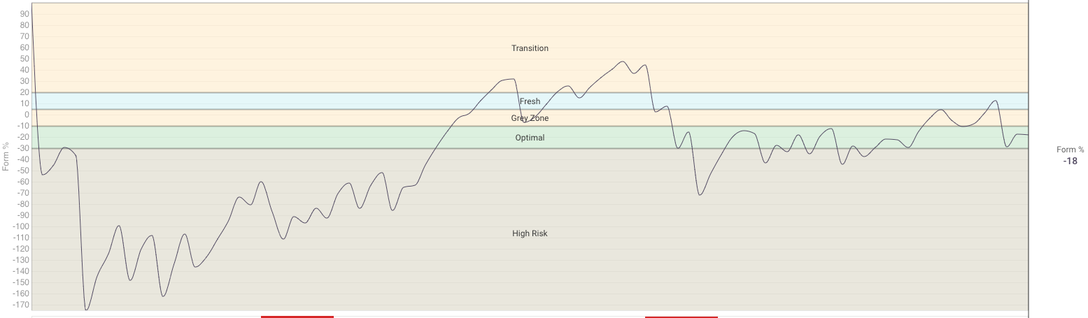
Well I can say this…The Form% which shows my training has been more in the Optimal zone in more recent times is entirely indicative of the 80/20 training philosophy I am now following whereas previously I was carrying a lot of fatigue due to too much higher intensity workouts ie. not following 80/20. So potentially both graphs could be right but the % graph is more reflective of how I have been feeling since starting 80/20 ie. more optimally.
Then, by all means, set it back to %. In the long term, it’s always better to be a bit more conservative and avoid high fatigue and/or injury.
1 Like
Thanks for your advice & feedback.
Just came here to say thanks for showing how I can quickly replicate the form graph. I’m finding that I perform so much better when my form is in the grey zone. Maybe it’s because I’m more fast twichy naturally, or maybe it’s because I have a very demanding job and can’t absorb training that “normal” people can. Either way, chasing fatigue to be in the green zone is subconscious and unhelpful, so I will make my own green zone ![]()