Hello,
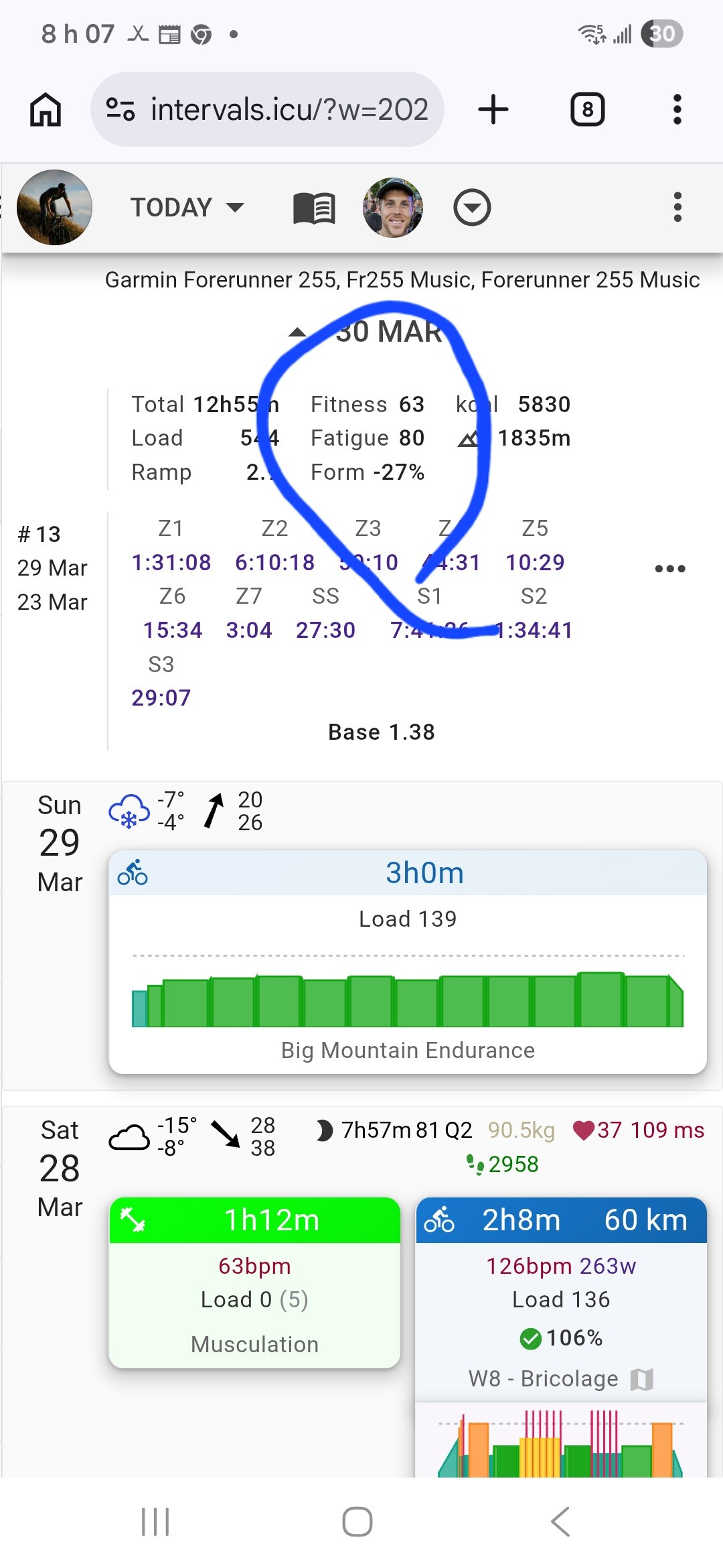
Has anything changed with the font color for fitness, form, and fatigue? Since yesterday, these parameters have been showing in black. Previously, each parameter had its own color, and I haven’t changed anything in the settings.
![]()
It’s working fine for me.
Some common troubleshooting steps include:
- What browser?
- Mobile or Desktop
- Clear the cache
I have the same issue on iPhone, Win11 Edge and Chrome
- Chrome,Edge,Firefox same problem
- desktop and browser
- it doesn’t help
I think there is some restructuring on the calendar on going, the colour of the active tab changed too.
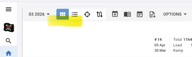
Ps: this was my post with suggestions for the calendar page, but not addressing the colour ![]()
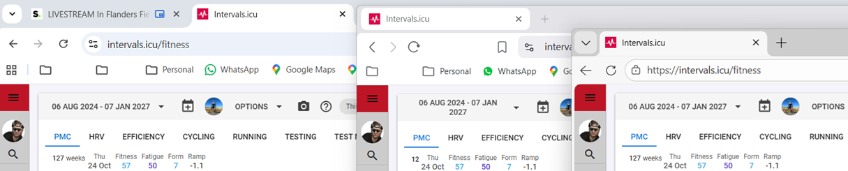
Are you referring to the summary (left side) on the calendar (activities page), or on the fitness page (PMC)?
I also see that it’s all black on the activities page (calendar).
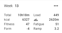
On the fitness page, it’s all coloured.
Windows 11
Chrome, Brave and Edge all shows normal, as well as Safari (iOS).
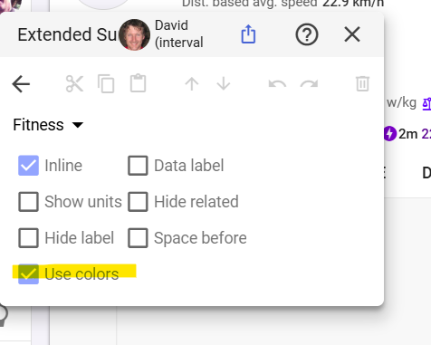
a few things are different today. I’m not sure how or where we could or should add feedback, but the “edit data” tool now has a heavier look with boulder lines and it’s making it difficult to look for numbers
Yes, I mean the left side of activity. I don’t know if it’s the result of some changes, but I think so, because I’m not the only one who’s changed.
I am having the same visual differences between the calendar and fitness pages on Firefox (iOS and MacOS26.4) and Safari (MacOS26.4)
Confirming - same here, the color visualization for form changes is gone for me too.
Looks like there’s work going on for the UX.
There are extra options for the Summary displayed, but not active yet.
Bit of patience will probably fix it.
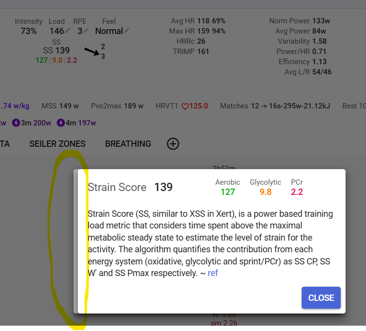
Here’s another glitch I just discovered. I have Strain Score in the summary and when I click on it, the dialog displays twice, one on top of the other:
1 Like