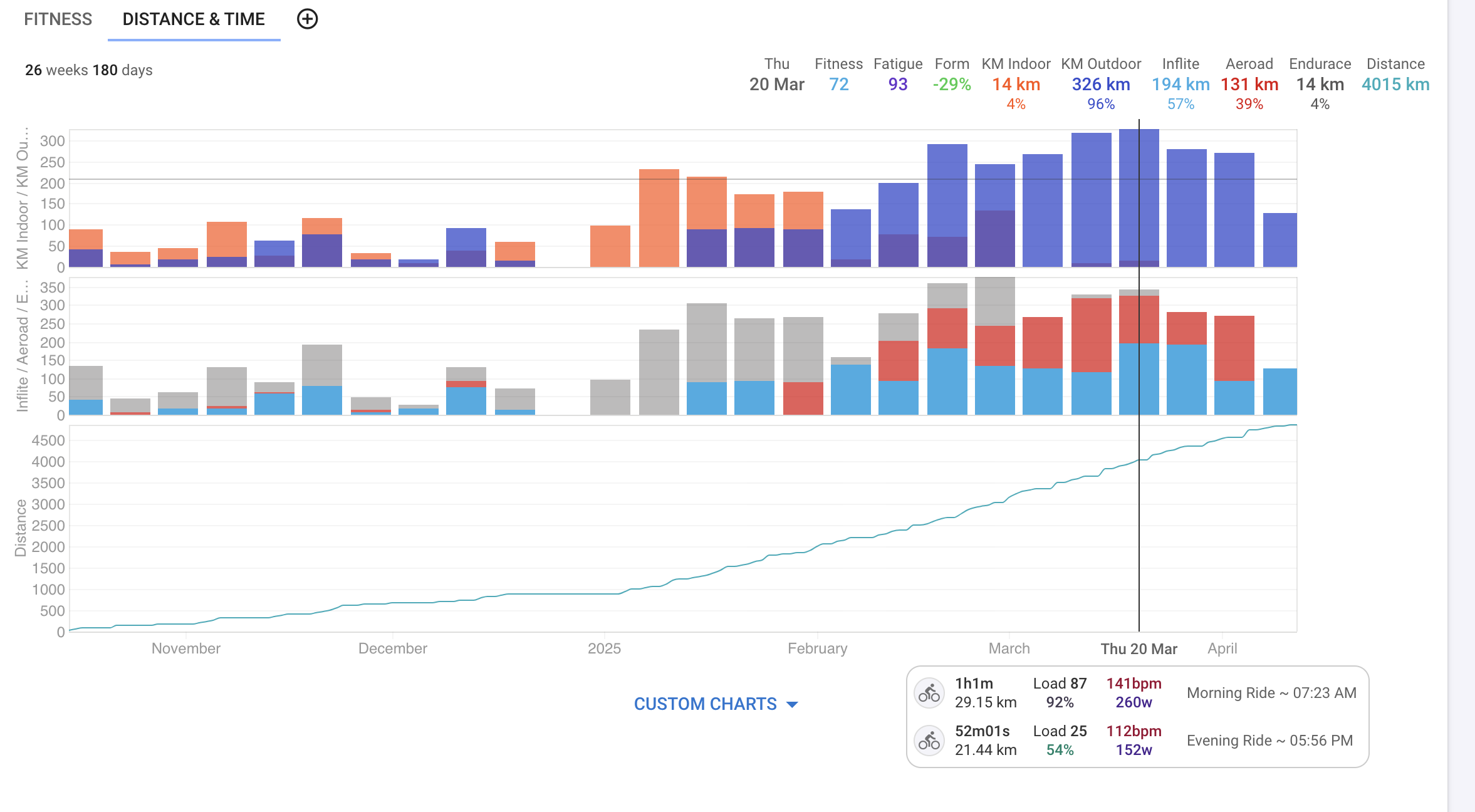
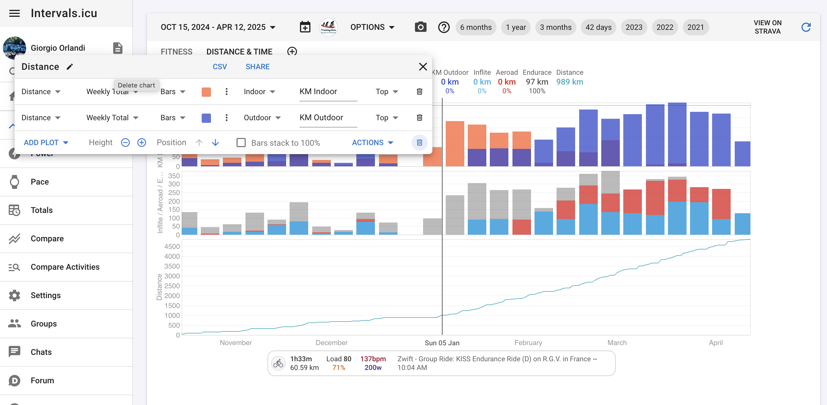
Hi, I can’t seem to figure out why the two charts are displaying the totals differently. I would like the top chart, with indoor vs outdoor kms, to show the same stacked way as the second chart, with the gear. I would imagine that the y-axis would have to match up.
The filtering and setup seems correct to me, what am I missing?
Not sure why you do have that grey color on the second chart but after some logical tinkering…Indoor and Outdoor KMS can’t be both, but gear can be both so that can be tricky.
Not sure I’m following. Both charts should add up to the same totals, and when adding up the indoor+outdoor and the bike1+bike2+bike3 from the hovering tooltip, they do indeed equal, but display-wise, they don’t stack on the indoor vs outdoor one, but they do on the gear one.
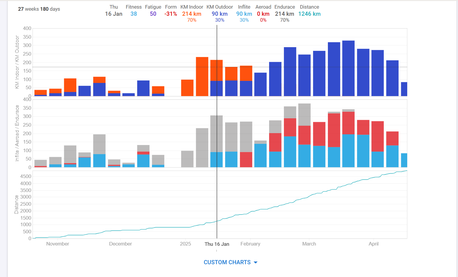
In this example, Endurance=Indoor (214km) and the Inflite=Outdoor (90km). But the outdoor/indoor bar should also be stacked, but in this case the orange bar is behind the blue bar.
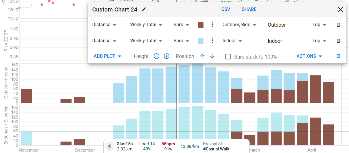
Did you try deleting and recreating the Indoor/Outdoor chart?
I tested similar thing and the bars do stack correctly in my case.
yeah sorry I was writing too quickly. All I’ve meant was that those charts are made to be easily editable in any way you want considering the data input so it can create a lot of issues. Yours looks like a bug I think
I was referring earlier to the way filters work. I’m not sure if there is a strict rule which filter is more important (how they stack up) and I can easily imagine a distance graph filtered by indoor activities and a bike type and I’m not sure if it will correctly filter out everything you want (probably not your case bc numbers are correct and only graph is a problem but just trying to explain what I was trying to say earlier)
Thanks All. @MedTechCD, deleting and readding fixed it.