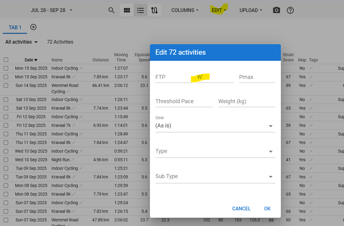
You may need to re-analyze. Check the summary of the activity if it has the entered value. If not, enter it manually because W’bal value is also historical, like FTP values.
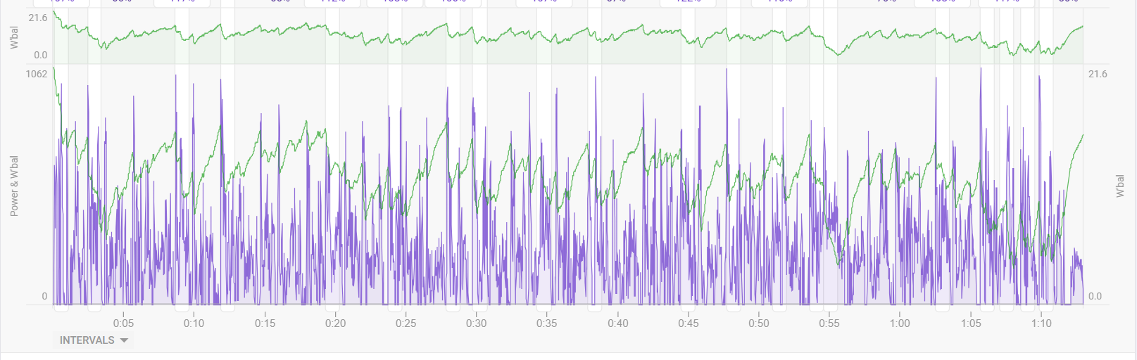
Am I right that for the Power / W’bal chart you are looking to the points where the green line (W’bal) is above the purple line (Power)? Which indicated that you are above your CP? And thus has costs a lot of energy?
No, that’s not the intention of that chart. I just like to see the Power efforts and the resulting W’ dip in one chart.
The charts shown by @Alex_J_Welburn are not from within Intervals. AFAIK, those can not be done in Intervals at this time.
Any insights how you re-evalute this data? Like I see some interesting things, like time above CP, W’ depletion ect. But for example, how do you translate this to trainings or take-aways for the following races?
Besides, what is parameter A and B? Do I need to adjust it, or it is filled by default?
Leave the A and B values - they are preset. Then add what your CP and W’ values are. CP/FTP same same for arguments sake (they are not, but that’s beside the point).
I am currently writing a paper on this - ‘UK Criteriums using the W’bal model’
You can’t really use a single race analysis to determine future training. The tool just allows you multiple ways to assess the narrative of the race i.e. did you feel like you didn’t have a sprint at the end? was this due to lots of time above CP, did you make some big efforts near the finish, did you have to use lot of W’ to move up, so could tactics be improved. Was there a move you could not respond to? etc
It’s about using the tool to frame certain questions, then using it on multiple races to see trends, do the same things keep happening? So taking a more longitudinal approach to it.
Then, is CP a limiting factor, with the ability to recover? is W’ a limiting factor? then you can make a more informed approach to training needs.