Some suggestions to improve appearance of Calendar View:
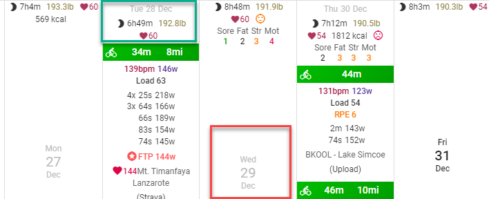
When there is no entry on a day, the date appears large and in the center of the cell, whereas if any data are present, it moves up to the top. When I look at the calendar, I find the inconsistency kind of jarring - creates a visual “bumpiness”.
My preference would be to always have the date at the top of the cell (green box), regardless of whether any data are present. I think it would just look cleaner. Obviously a personal preference.
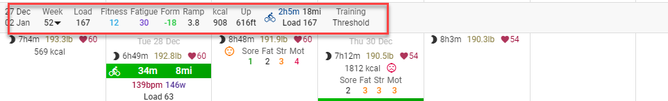
The other related suggestion is that when one uses compact view for the calendar, the totals data move in between the weeks, which somewhat counters the compactness. You can uncheck Show Weekly totals on top, but the setting is only remembered for the normal view. It always gets checked when you switch to compact or minimal.
In contrast, Show time in zones appears to be sticky across views (that is, stays where you set it as you change view).
My suggestion would be to have all the settings remembered for each view (Normal, compact, minimal) or alternatively have them all sticky regardless of view.
Hi - Another suggestion - when you add a note, it appears at the bottom of the date entry. But if the note, is more than one day long, it appears as a banner across the multiple dates. I imagine this has to do with how the calendar is constructed - but it’s odd that when I changed a multi-day note to a single day, it sort of disappeared.
Not sure if it’s worth messing with - but perhaps an option for multi-day notes to be repeated each day at bottom vs a banner that stretches over top?
Or perhaps if the don’t show on fitness box is checked it should go at bottom of each day, but if not checked - as a banner?
Just thinking out loud. I get stuck on these visual inconsistencies.
Hey, this is what I’m searching for, has there been any resolution since? I keep searching for dates on the top and missing the big middle (and having multiple activities a day logged really stretches the calendar boxes making the date often below the screen edge for me).
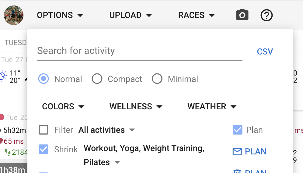
No not yet. But quite a few features have been added since this post that you can use to cleanup the calendar. Choose Options → Colors and untick “Intervals” for each sport. The skyline chart is enough info for me.
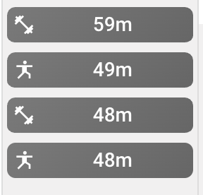
You can also “shrink” activity types like Yoga etc.: