Should follow the filter setting on the Chart config, I think

I hadn’t seen that filter, thank you so much for the help! I spent so much time in front of the screen thinking I had to do everything in the formula and I didn’t notice that. OMG!
1 Like
Did you ever find a solution for this?
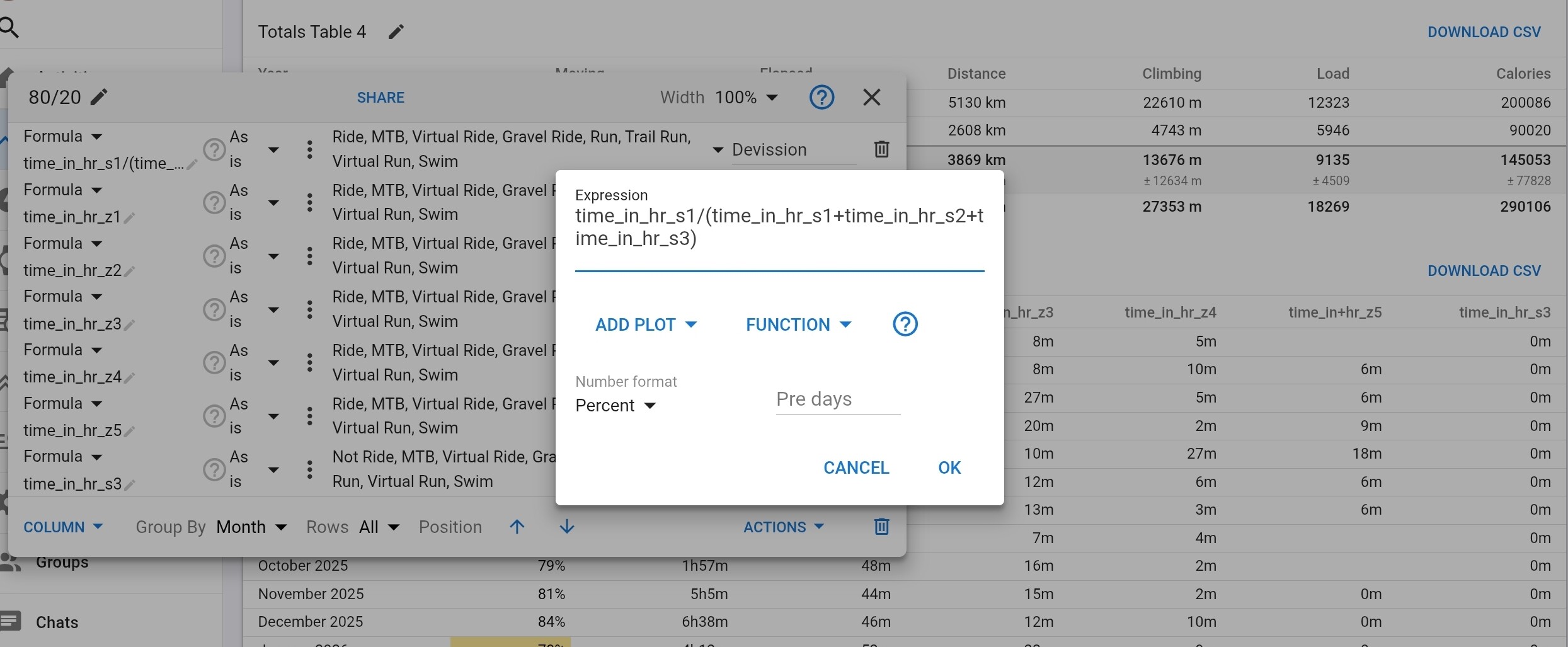
Edit: Ignore me, I’ve just found “Sum Inputs” from the other thread which works perfectly
Thanks, does that work for you when grouping by week? I’m getting numbers way over 100% when grouping by week
grouping works fine with me, weeks, month, year, custom, no problem.
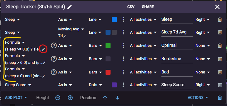
This is my favourite new feature. Instead of only one plot with sleep data in one color, I can use the formula and split the sleep data into 3 plots: if more than 8 hours (Green), if less than 6 (Red), and in-between (Grey).
I’ve been doing this with Excel charts for years. This makes for a more visually pleasing graph, and I can quickly see the days I had good sleep.

I am also playing around with a Garmin-style HRV status where if the 7-day moving average is less than the 42-day moving average, the dots turn red.

10 Likes
I never thought of that, but really like this kind of usage. Will try this too. Thx for sharing 
1 Like
I noticed that you made these nice charts public, so thank you for sharing them with the community!
This made me think it would be interesting to have a dedicated thread for showcasing custom charts, where users could share, discuss, and review creations!
2 Likes
Really nice thank you for sharing I added your two custom charts to a dedicated Fitness tab, and I took the opportunity to switch Intervals to Dark mode  Remind us how to change the “thresholds” for Sleep hours targets?
1 Like
When you edit the chart, you will see 3 custom formulas. Just edit each one and change it to whatever you prefer.
If you feel 7h30 is optimal sleep, you can change the values from 8.0 to 7.5. So the green bar formula to (sleep >= 7.5) ? sleep : null and the grey bar to (sleep > 6.0 && sleep < 7.5) ? sleep : null.
You can change the colors and make it your own.
7 Likes
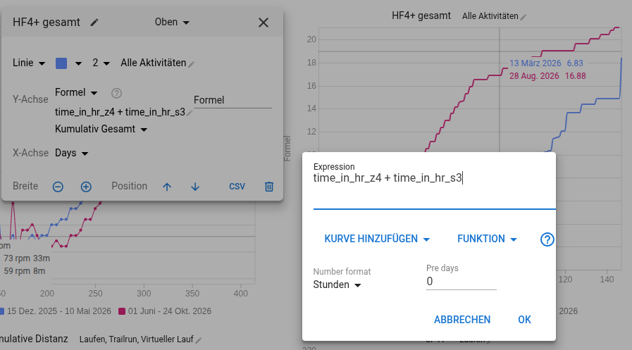
I would like to format the values in “cumulated time … hours” in my diagram “HF4+ gesamt”. The displayed values are always number formated.
Is it a know behavior or I am missing some understanding?
good to know, thanks