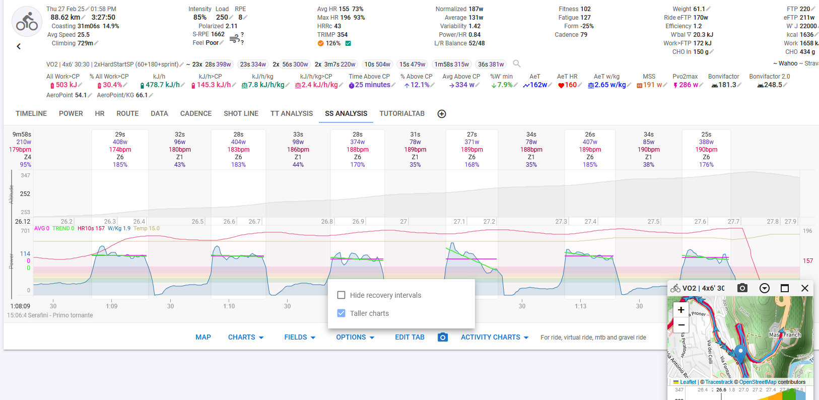
Issue: Currently, when selecting a specific section of an activity in the graphs, the axis scaling remains fixed based on the entire activity rather than adjusting to the selected segment.
Example:
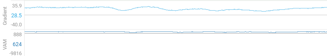
During a ski tour, ascent speeds are typically around 3–5 km/h, while descent speeds can reach 70–80 km/h.
Similarly, VAM (vertical ascent meters per hour) during ascent might be 500–800, whereas descent values can spike to 10,000+.
Problem:
If I select only the ascent in the graph, the scale still includes the max values from the entire activity (e.g., 80 km/h instead of max 5 km/h for the selected section). This makes the graph nearly useless, as the relevant details are lost due to extreme scaling.
Feature Request:
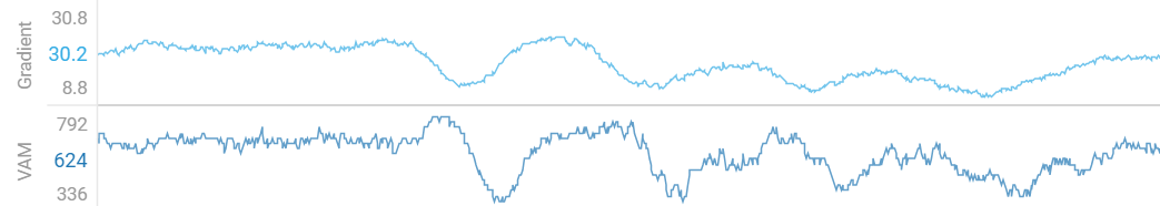
The graph’s axis should dynamically adjust to the min/max values of the selected segment instead of the entire activity. This would significantly improve readability and data analysis.
@david I know you could code 48 Hours a day with all those Feature Requests - but maybe you could have a quick look into this as I guess this should be implemented very, very quickly with D3 and would have a big impact.
Example:
// Definiere eine y-Skala
let yScale = d3.scaleLinear()
    .domain([0, d3.max(data, d => d.value)]) // Startwerte
    .range([height, 0]);

// Erstelle die Achse
let yAxis = d3.axisLeft(yScale);

// Füge die y-Achse zur SVG hinzu
let yAxisGroup = svg.append("g").call(yAxis);

// Funktion zur Aktualisierung der Achse basierend auf dem gewählten Segment
function updateYAxis(filteredData) {
    // Neue Skalierung mit gefilterten Daten
    yScale.domain([0, d3.max(filteredData, d => d.value)]);

    // Achse neu rendern mit Transition
    yAxisGroup.transition()
        .duration(500)
        .call(yAxis);
}

// Beispiel: Neue Daten setzen
d3.select("#button").on("click", function() {
    let filteredData = data.filter(d => d.category === "A"); // Beispiel für Filterung
    updateYAxis(filteredData);
});
@david - This affects both the display directly within the activity and on the Compare page.
It would be more important to have it correct within the activity, but if it worked for both, that would be fantastic! :-)))
Very good visible in every Backcountry Skiing Activity like: i66476357
This is done for the activity page. It’s actually really difficult to do on the compare page because that page always renders all the data and relies on clipping.
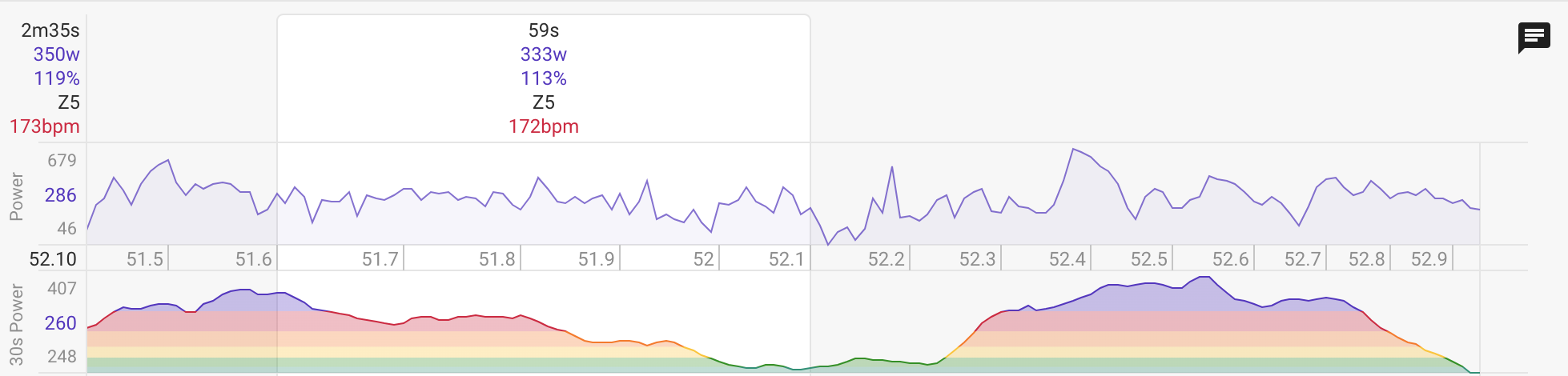
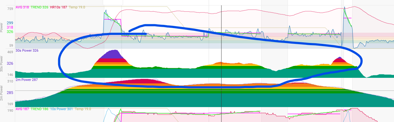
That’s fantastic! Having dynamic axis scaling on the activity page makes a lot more sense, especially for activities where min/max values can vary significantly depending on the segment.
Now, the graphs provide much better insights into performance variations throughout an activity.
Thanks a ton for implementing this—really outstanding work!
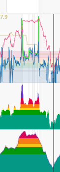
I haven’t managed to reproduce that issue. I tried with the standard 30s power chart and with a custom chart showing 30s power. Could you please try find out what causes it?
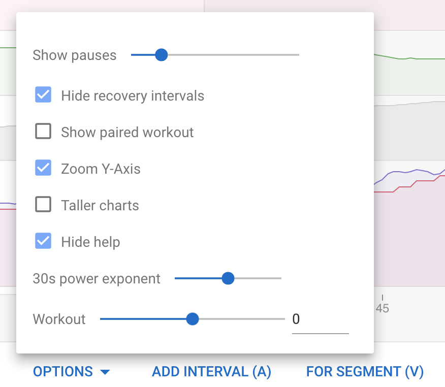
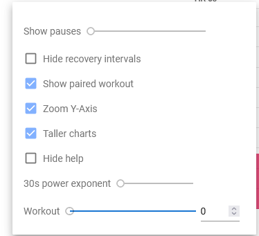
I think I found the issue. The bug happens only when using the 30s power exponent set to a custom value. When I change this setting to default, the chart works fine. For sure this specific exponent value is causing the problem.
I usually set it to 1 because it makes the chart much smoother. But it seems that this specific exponent value is causing the issue.
I have fixed this. It actually had nothing to do with the exponent. The issue was that the zoomed gradient was still using 0 as the starting watts instead of the min for the zoomed portion. The max was correct. So to see the bug you had to select a portion of the chart with only high power. Which doesn’t happen that often.