[DONE] Horizontal Line in Activity Charts

@David – Would it be possible to add those current mouse position horizontal line to the graphs within an Activity as well?

For example, it would be really useful to compare data points later in the Activity against the value I’m currently hovering over with the mouse. This would make it much easier to track trends and deviations without needing to estimate manually.

Would love to hear your thoughts on this! :rocket:

1 Like

Don’t get your request. The screenshot you show has the actual values being shown as you drag / mouse over the position.

What would the horizontal line do?

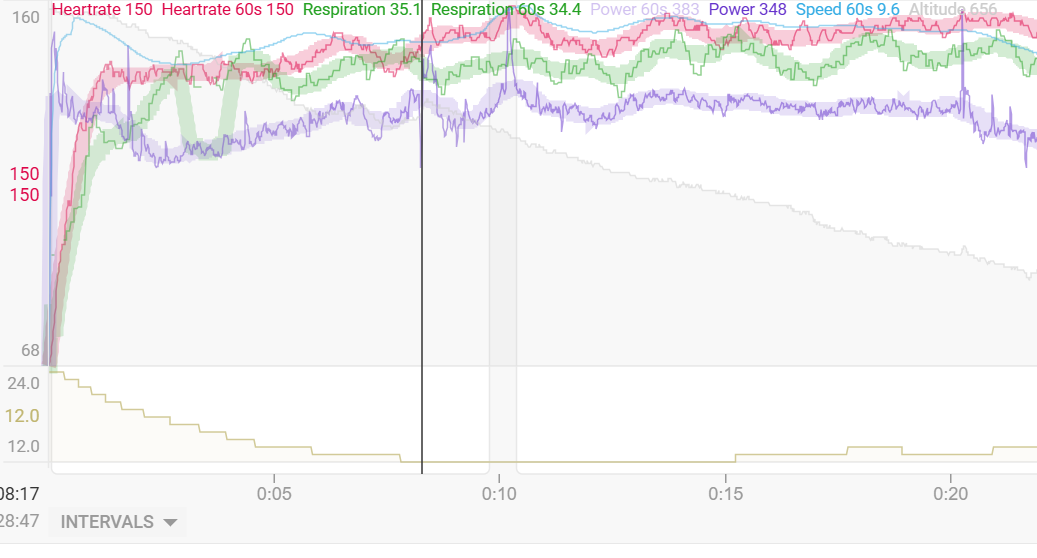
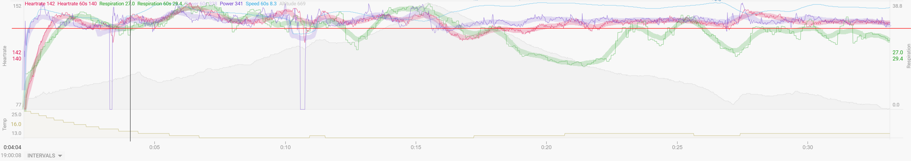
@Nik_Om_Cinderella_Ri - see Screen below … one can clearly see if an effort / pace / hr or whatever the graph is showing is above or below the currect part where you just move the mouse over it … over the whole activity timeline.
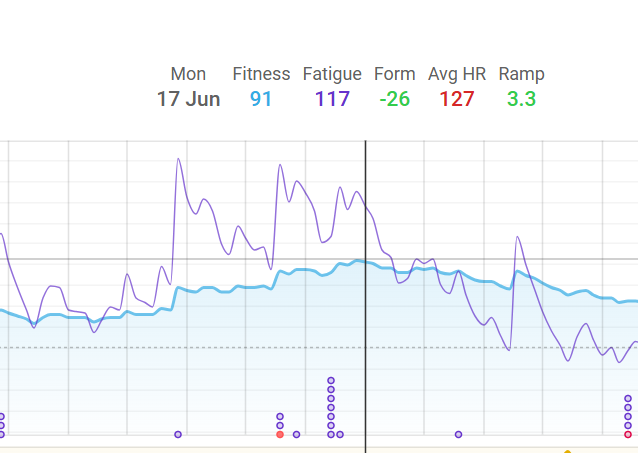
It’s would be excactly the same behaviour as we already have on the Fitness Graphs …

Activity Graphs (red line = example what wanted)

Fitness Graphs:
image

I see. Ur asking for crosshair. I get it. But I get it if it’s a one item on the left side. Like the fitness graph.

The chart you reference has multi lines. Which line does the horizontal line supposed to go to? If both / all woul be confusing no?

If you want a horizontal line at Y position to diff between say
min = y
Max = y + 50

I think these you set as a custom graph. I see many charts have these “zones” like separation. Some in color too.

Doesn’t matter if there’s one or ten metrics in the graph—the horizontal line should appear exactly where the mouse is pointing, like on the Fitness Page and like the vertical line already does. Not speaking about the static horizontal lines.
There is no linking to the underlying data :slight_smile:

1 Like

Simple crosshair indicating the mouse position.
On the Fitness page the horizontal line moves exactly with the mouse, but the vertical one snaps to a ‘date’. On the charts it could snap to a second by second position which will look as a continuous movement if the timeline is long enough.
Seems like a good idea to quickly visualize if a point is higher or lower then the mouse pointer.

2 Likes

sounds like a feature request to me… (that’s diff from this topic)
Either wait for mod to split the thread or you can create a new one I guess

I have added a horizontal marker to the activity timeline chart.

3 Likes

you are great!!! :partying_face:
thx

i just realised that that horizontal line doesn’t snap to the chart. eg:

The cross hair is on a diff point than the actual point on the graph, but the values are correct.

Is this intended? Was a bit disorienting until I understood
Screenshot 2025-03-23 at 4.07.03 PM

Yes the idea is to just track the cursor and not snap.

1 Like