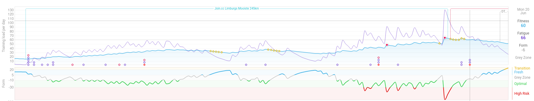
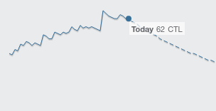
It would be awesome if there would be some sort of visual indicator that would allow us to easily distinguish between actually completed TSS and planned TSS on the /fitness page.
In the fitness chart itself this could perhaps be a dotted line for every point in time after today? Something like TrainingPeaks has for their events overview on their home screen.
I also have a custom bar chart showing the weekly TSS where this would be especially useful (at least for me). Especially in the current week it would be great to see the already completed TSS in a different color than the planned (future) TSS for the week.
I agree that this would be a really useful feature. I’ve just started using intervals to plan all of my training rather than simply recording what I’ve already done and being able to better distinguish between historical/future data points would be v.helpful….
I find the vertical line plenty distinction. And if there are any graphs with subjective wellness metrics, rHR or HRV data those stop at the current day, which also increases definition.
I generally find the current signs of “today” good, too.
However, having a weekly-TSS graph with different colors for planned and actually-performed TSS would be nice. As it is custom anyway, maybe we could get some stacking graph like the bike/run/swim or Z1+2/Z2+3/Z5+ graphs – this time with “performed TSS”/“unmatched planned TSS”.