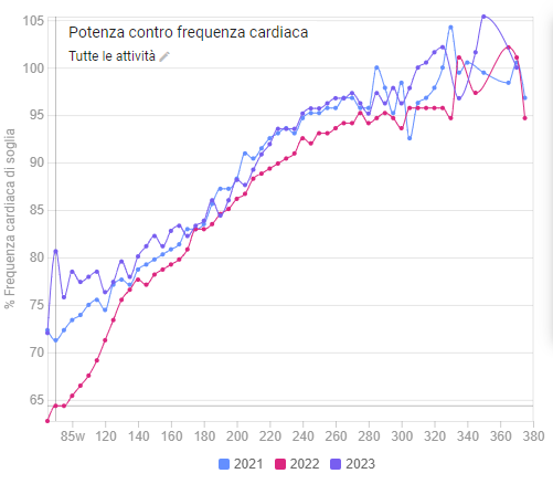
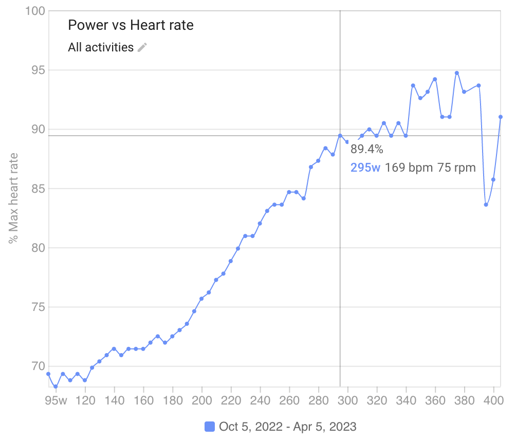
I have accumulated data from 4 seasons now and one of the features I love most about intervals - the %LTHR over power - now displays a pretty interesting behaviour (would be happy if anyone shared theirs to see if the same pattern emerges):
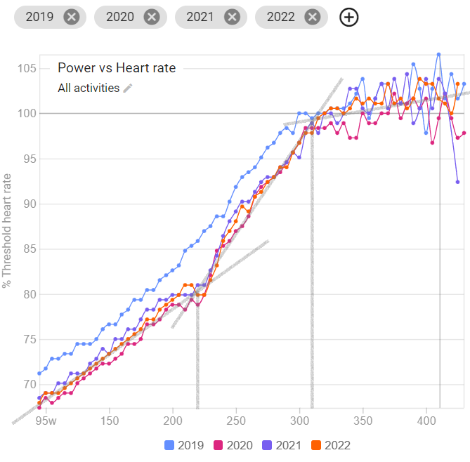
It consists of three almost linear segments (albeit with a lot of noise over threshold) which seem to correspond very well to both thresholds named in literature). I had a test once in a lab and my ventilatory threshold was determined at roughly 210-220W, which can be clearly seen here too. The diagram also looks very similar:
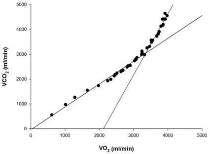
[Taken from Korkmaz Eryılmaz et al., 2018]
Maybe the data is clean enough to extract that point from it? It is definitely useful to know the high end of Z2 and this could be a viable method.
At the high end (where the curve becomes nearly horizontal) one could determine FTP (with all of its caveats, but my value of roughly 305 can be seen well here) as well as LTHR. Also, it would be interesting to devise some better filterin for the curve past that point.
And one small suggestion @david: is there a possibility to hide curves without deleting them? Somethng like: