We have already briefly discussed this subject but there were no closure so I wonder we could address this once again.
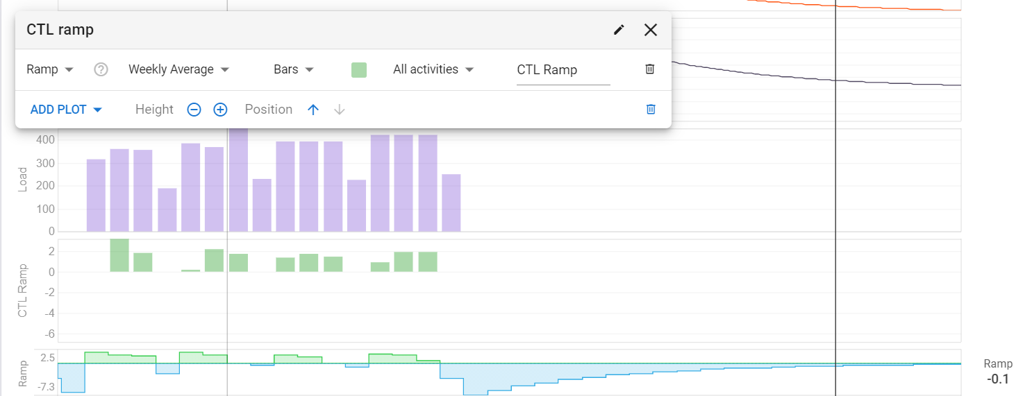
What kind (TSS ou Fitness) of ramp rate is the Intervals default one that I can no reproduce it in custom charts? I have tried all options avaiable.
The one that I’m after right know is Fitness ramp rate and the Weekly average seamed to better represent what I’m use to at Golden Cheetah but the chart is not showing the negative part.
The default one looks at your fitness on Monday and compares that to your fitness on the next Monday. The difference is the ramp rate for the week. I actually think the “Ramp” in the list of plots is better. That does fitness today - fitness 7 days ago.
You can’t reproduce the default one using the custom plots. I didn’t build it in because I think the simpler “fitness today” - “fitness 7d ago” is better.
Understood. You are looking to the future. had never saw that way before.
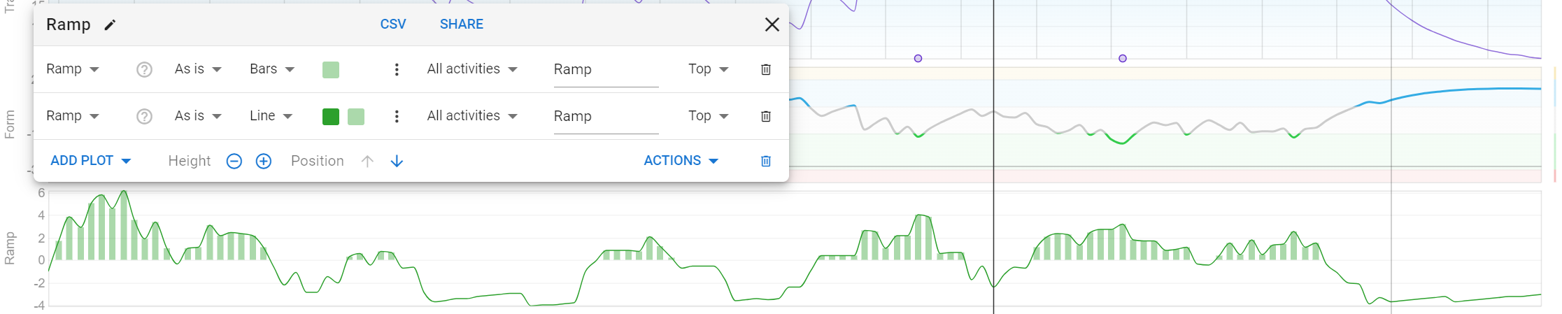
But I was referring to the type of the chart as a graph line (filled), bar, dots). So there is no options to fill a line type graph with a color?
This is an older thread and I’m late to the party so maybe there’s been a better implementation since.
But for ramp specifically if you make a custom plot using Bar graph AND Line graph you can get a sort of shaded graph effect while still showing negative numbers.