Custom charts on the activity timeline chart

This is really cool. Would it be possible to have average interval pace/gap/hr/cadence/power etc available for custom charts? It would also be nice to be able to change the colour of fields so that I can have colours match my custom charts.

Hi I was thinking of graphs like dc rainmakers:
https://analyze.dcrainmaker.com/#/public/5b747d65-6db7-438f-7b8d-c16dd4ead878

Obviously ha has to much info in this left/right graph in this specific case, but having one left/right source with absolute values.

I do have that on the todo list. You mean NP vs duration curve right?

I am not quite sure what you mean. The interval fields still work as normal?

I should be able to do that.

1 Like

So this is W Pace chart:


An Intervals Pace chart would look the same, with a straight line for each intervals average pace/gap/hr/cadence/power etc. I hope I’ve been able to explain it better.

Ok I get it now. I have added that to the todo list.

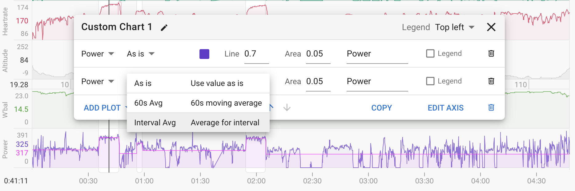
I added a new option “Interval Avg” which calculates the average for each interval for whatever the selected plot is:

1 Like

Wow that looks really cool, and great solution. I’ve got to get some workouts in Intervals and to check this out asap!

Hi David, it looks like charts interval avg pace is incorrectly calculated. For this activity, the pace is completely different than the intervals field pace. It should be the same?

Also, it is interesting how some interval field paces are similar to Polar/Strava and some are less so.

Charts Interval Avg Pace - Intervals Field Pace - Strava - Polar
07:22 07:03 07:00 07:01
06:49 06:37 06:25 06:29
07:42 07:26 07:22 07:20
05:00 04:47 04:46 04:46
10:15 12:22 11:42 09:49
06:48 06:32 06:30 06:31

https://intervals.icu/activities/6047936340

The Strava activity should be viewable and if needed I’ll send a link for Polar.

This is awesome! Can you maybe add a filter for each line, so that some can be toggled only on “work” intervals? Say, if I am plotting interval VAM, I wouldn’t want the additional clutter of meaningless VAM when riding to a hill for an hour.

I think I know what the problem is here. Intervals.icu clips the pace data to get rid of really slow pace (compared to avg for the activity) so this will cause the average to be higher. I need to find another way to do this e.g. keep data as is but clip on chart or something.

@Kosio_Varbenov Good idea, tx. I have added “Work Int Avg”

Wow, that was quick! Thanks!
Also a +1 for me on custom expressions/metrics, I think it will unlock the inner data analyst in many people :grinning:

Eccellente David

1 Like

One “hack” I discovered: you can show just a value you are interested in (which you don"t need plotted) by selecting it as a chart and setting the line and area to 0. For example, here I display the gradient of the hill an interval was on (work interval avg); it would hardly make sense to display a straight line, but the value is still useful. See example below:
chart

Also @david for all intervals where only work interval average are displayed, if “legend” is enabled, it shows 0 for all the recovery intervals (and is not hidden). Maybe that would be a cleaner default behaviour.

1 Like

The standard “Training Load per day” chart has both top values for the day in focus and values on the right for the current (most recent) day. However, custom charts only allow Top, Right, or Inline.

  1. Is there a way to have the same functionality as the standard Training Load chart?
  2. When choosing Right or Inline, the lables overlap the axis label. Is this a bug?

Cheers.

I am not quite sure what to do about the axis label problem, there just isn’t space. You can click the “Edit Axis” button and make the right hand label a single space to get rid of it.

You can build a training load chart using “Load” and “Fitness average” but it won’t look the same and unfortunately you can’t get the “today” numbers. Before Intervals.icu had custom charts the PMC and form charts were it so they have custom code.

Editing the axis works for me.
To be clear, I didn’t want both the auto label and end lables, just the latter.

When you say “single space”, what values are you referring to for Min/Max? I’ve played with it and I’m not clear on what you mean. Tnx!

It’s not accepting an empty field, simply type one space and that will make it look “empty”

2 Likes

Yes “empty” means “auto / use default” which is why you have to put in a space.

I have chart set up like Howie, but … How do I get values to show up? I just added the chart and rMSSD and SDNN, but no values and I have at least a week of values. I see the chart, but no values. What am I missing here? Where is the magic?

Can you post a screenshot of your custom chart settings?
Do you see the HRV values in the Activity Calendar in the Wellness section?