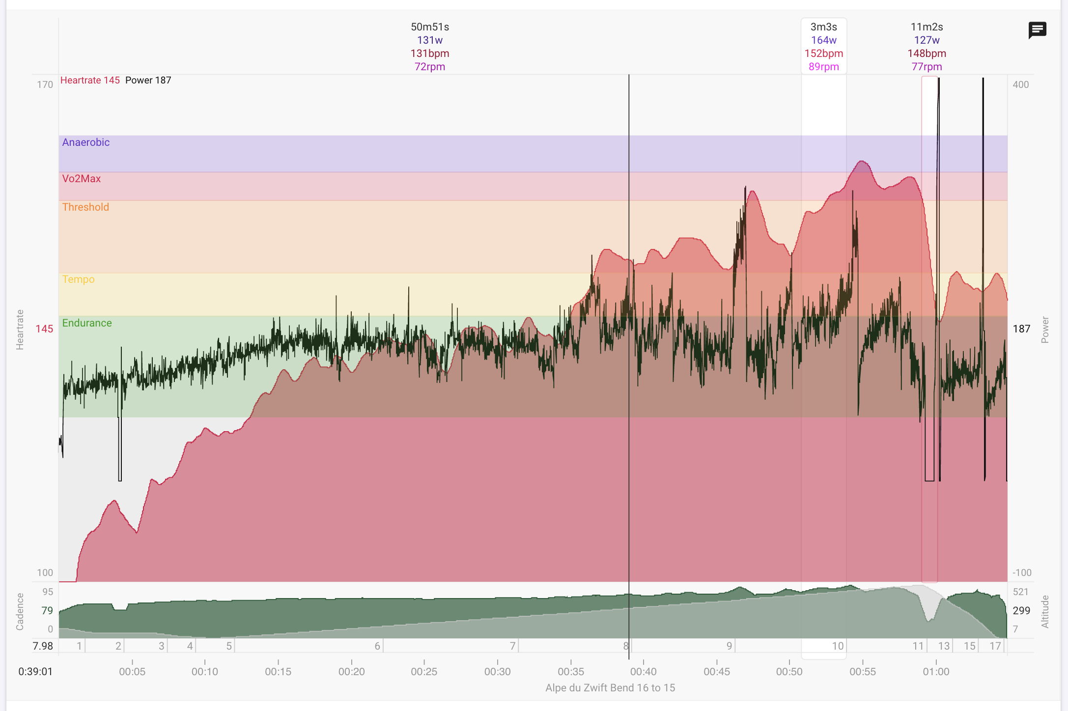
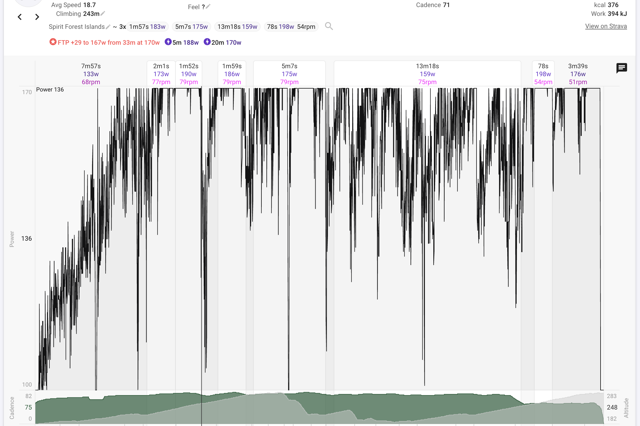
Gotta start with a big thanks for this awesome site! I built a custom chart with heart rate on the left axis and power on the right axis. Both axis have min/max defined: Heart rate 100 to 170 and power -100 to 400. I have done this so that every activity is consistent. However, some of my early activities did not have heart rate, and on those charts the power flips to the left, using the heart rate min/max. As a result these activities are not scaling correctly. Can we “lock” the plots to the left axis, right axis or “fit”?
@david
Hi David
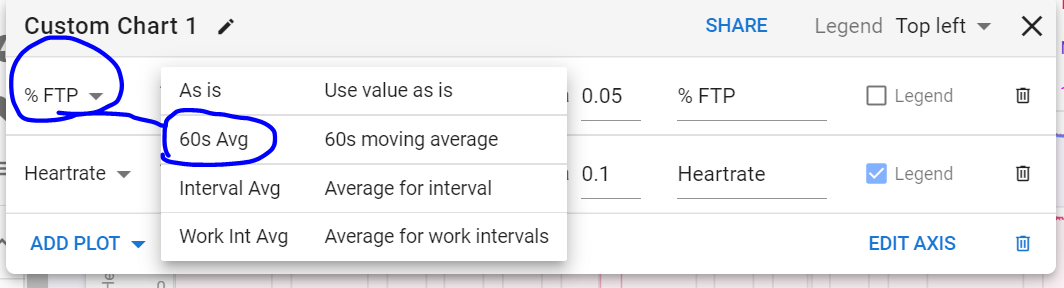
Would it be possible please to allow the user to choose their own moving average time rather than the default 60s when creating a custom chart with %FTP?
I wouldn’t mind the option of having a 30s rolling average instead of the 60s or a 3s smoothing rather than the ‘as is’?
Thanks
D
@david
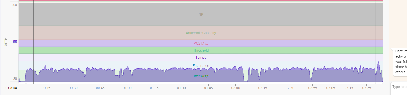
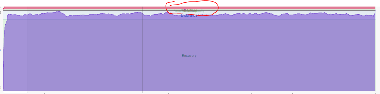
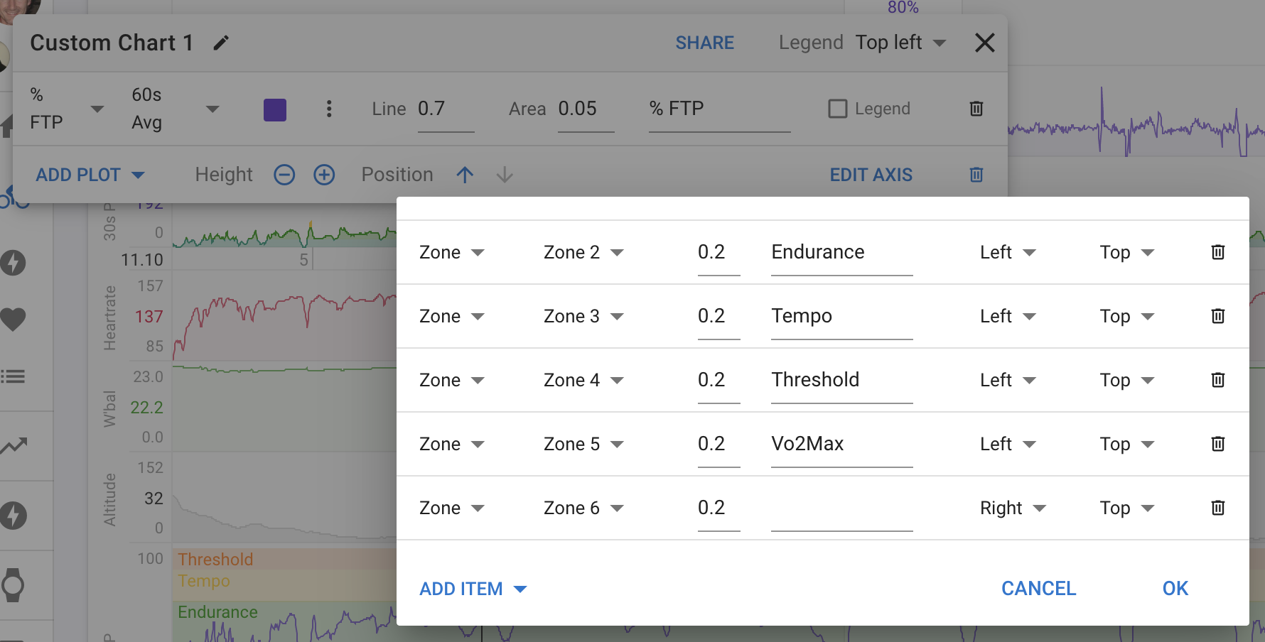
Hi David. I’m just wondering if there is a way to hide the upper zones from a chart if they weren’t hit during a session?
As in the screenshot below - Is there a way to hide NP, Anaerobic, VO2 Max etc if those zones weren’t reached in a session?
When I add in Neuromuscular Power into the chart, the huge band that NP creates pushes all the other bands into small strips (if that makes sense)
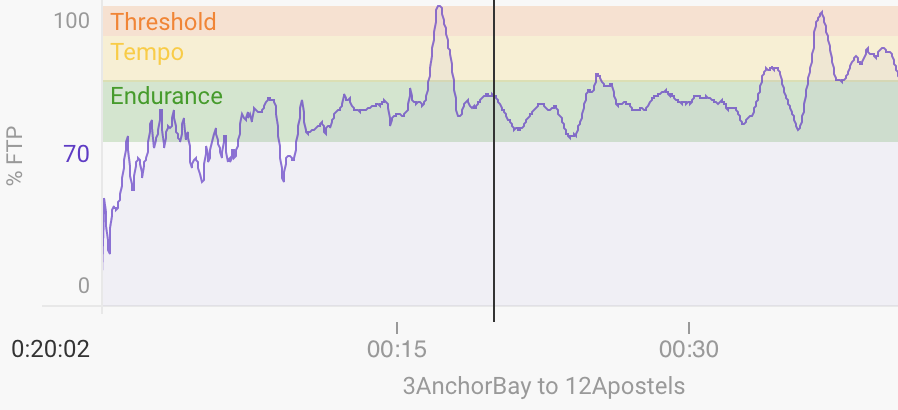
Thanks! Ya, that works, functionally at least, if not exactly a neat solution aesthetically.
Removing the max value causes the labels to bunch up on top of one another.
I noticed that you have manually added bars for the zones. You can actually add zone bars that will match the zones on the activity. Handy if you are viewing different athletes or when you own zones change.
Thanks for that fix David. Much appreciated.
As for the zones…that’s super. Never thought actually about the graph when my zones change. I will update my charts now to use zones instead of bars
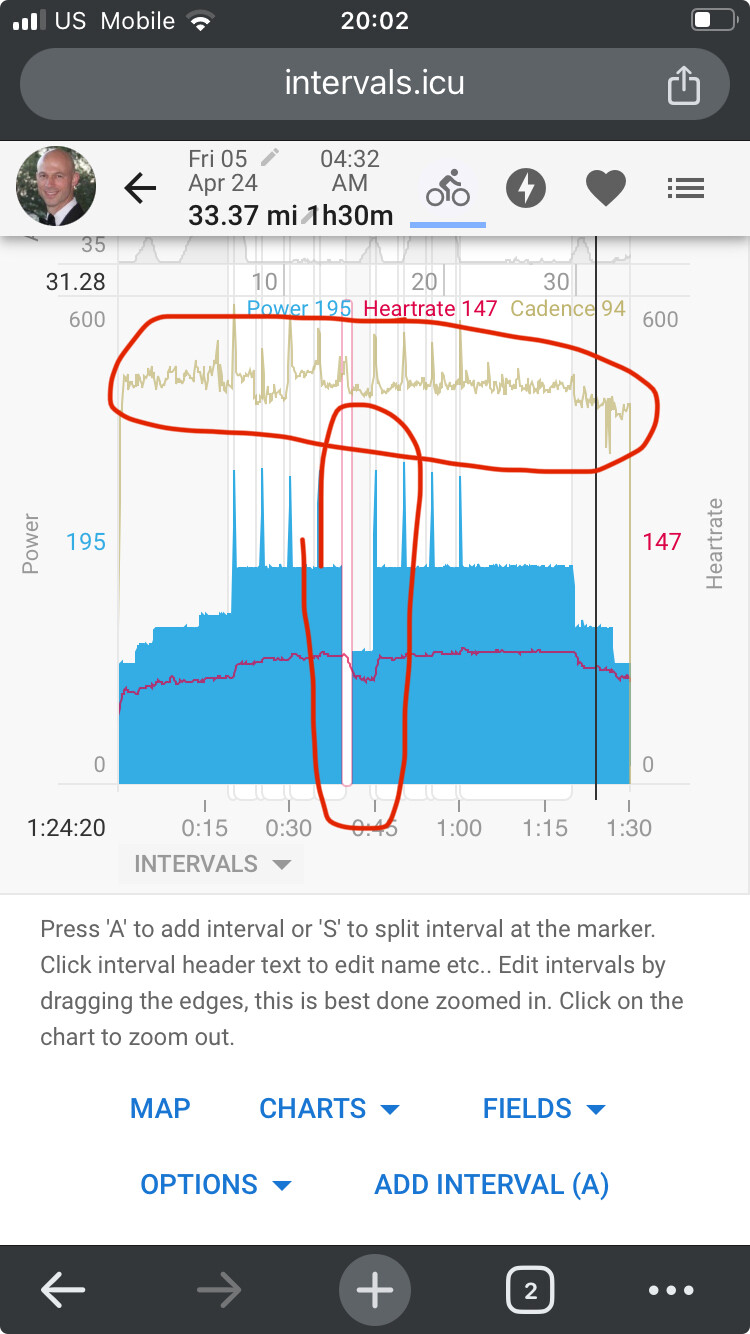
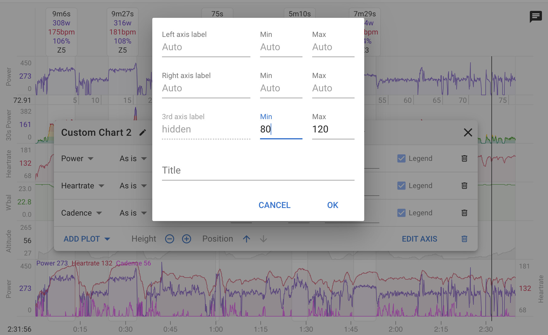
@david resurrecting an old thread. I have a custom graph with three fields - power, hr, and cadence. When I EDIT AXIS to set the left and right vertical axis ranges, only the first two plots adjust. The third plot (cadence, in this case) still seems to have the axis set to AUTO.
Additionally, is there a way to disable HRC on custom plots?
Also, having tabs like on the Fitness page but for Activities would be great!
Not quite sure what to do about the HRRc box on the HR plot. Some people might miss it if it goes away and it’s a bit warty to add an option somewhere just to control that.