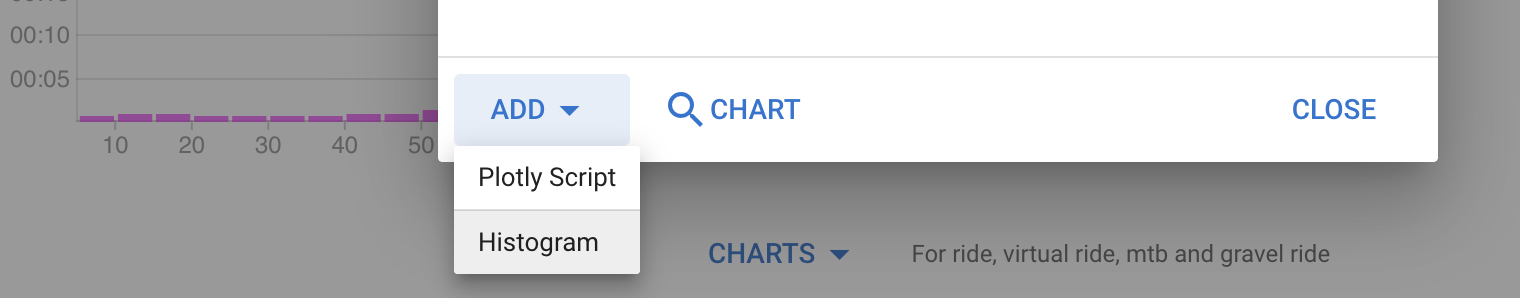
I have started working on custom activity histograms. It is possible to build these now using custom activity charts but you need to know Javascript and Plotly. This will be easier than that. Note that none of this is live yet. I am starting a thread so people interested in this can influence the development.
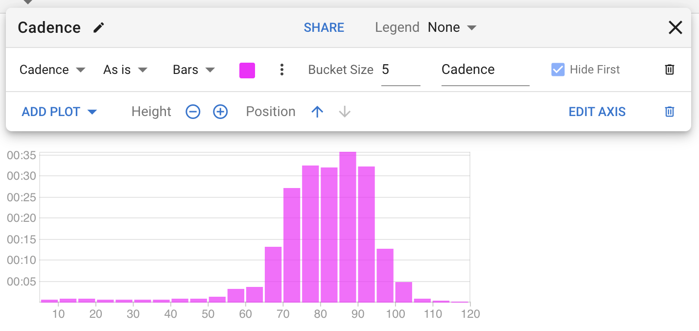
As you can see the configuration toolbar supports multiple plots. Is there a use-case for overlaying additional plots on top of the bars (as lines or dots)? If not I can simplify the UI by just allowing one plot.
Any other comments / things you want to be able to do here?
Would be nice to have a line showing the average of whatever is plotted on the graph, so in the example you’ve shown, the average cadence for the ride, oh and put the time/distance on the X axis and cadence itself on the Y axis
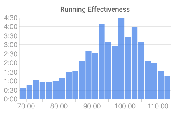
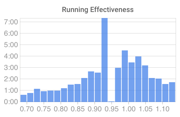
I may have found a bug with the histograms when you use fractional bucket sizes (i.e. <1). I have a custom stream for “running effectiveness” where numbers are between 0.5 and 1.5. When I make a histogram with bucket size of 0.02 I alway have one missing bucket in the resulting chart. However, if I calculate the stream differently and multiply by 100 to get numbers between 50 and 150, and set a bucket size of 2, the same doesn’t happen. See attached screenshots for the different outcomes.
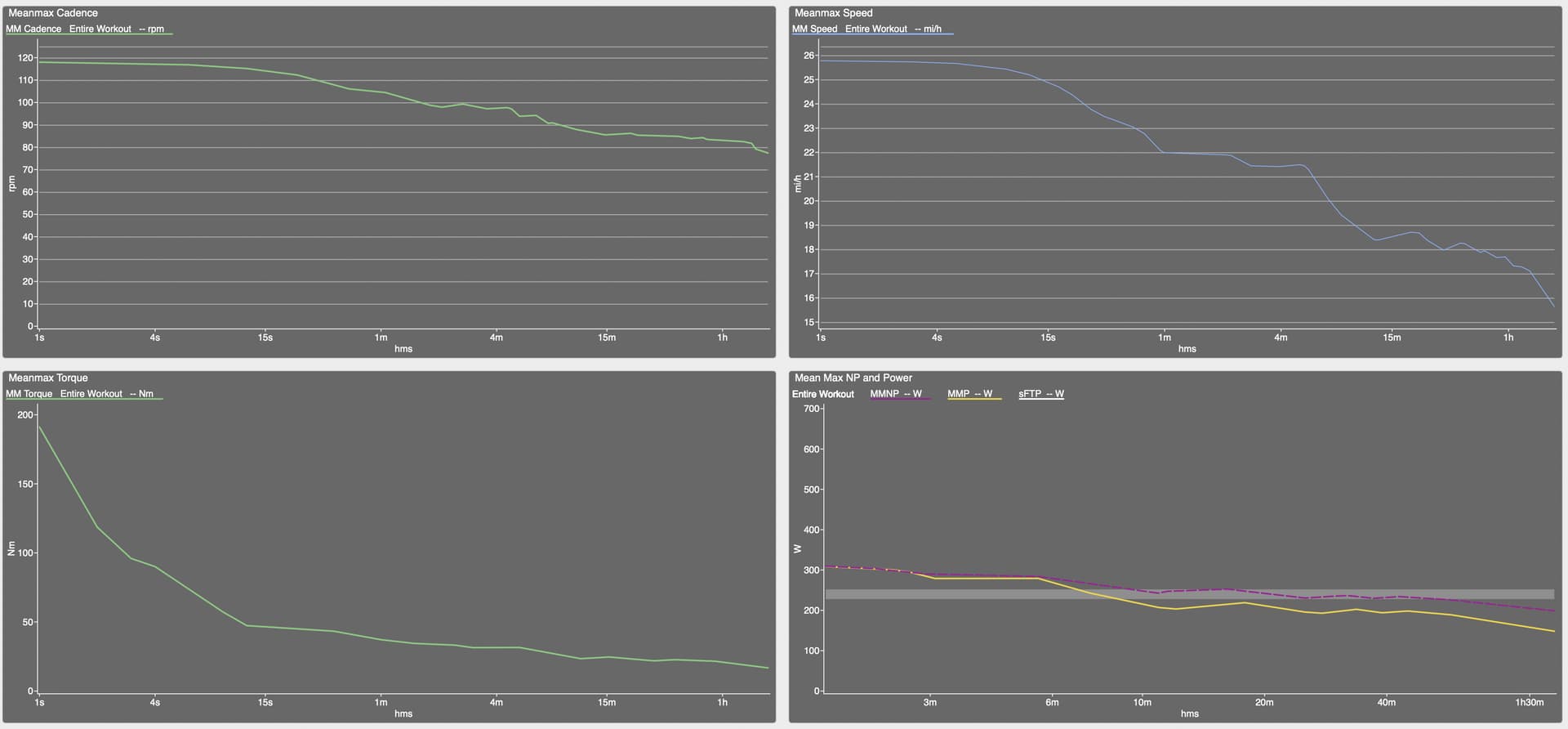
Meanmax function to plot Cadence Duration Curve. In WKO: meanmax(cadence). Basically the ability to look at activity and time ranges just like with power and heart rate. In WKO I also have a meanmax(speed) graph.
@david could we please get a meanmax function? You already have one for the power duration curve. This would satisfy recent requests for a torque duration curve. In addition I use speed and cadence duration curves to review workouts in WKO.
Sorry to be coming to this discussion late, but has the MeanMax function been implemented into intervals? If so, can someone point me to the location where it is implemented. thank you.