(Sorry if this has been asked before, the last post I could find was from Jan’22 and this hasn’t been implemented, so wanted to see if there was progress.)
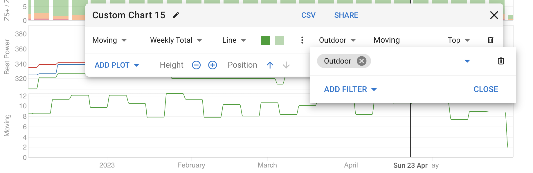
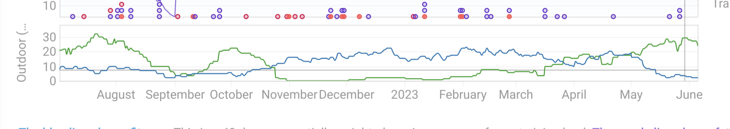
In the Compare tab, I created a few visuals that show Virtual elevation/miles/time, and 3 separate graphs for Outdoor (“Ride”) rides. This is interesting, but not useful, because it doesn’t give me the full context of my training. Specifically, I want to see both as separate lines in the same graph (Virtual as one color/line, Outdoor as the other). For example, I’d expect to see more progress on Virtual in the Winter/Fall, and Outdoor in the Spring/Summer, and it helps me stay on-track to ensure that I’m not over-indexing on one or the other in the “wrong season.”
Any suggestions? Is this on the roadmap or not possible? The only other way I can think of dealing with this is downloading Garmin’s export and doing this manually in Excel.
As always, great website - thanks!