The compare page is amazing. I use it to compare different time intervals all the time.
A small thing that is annoying is the fact that the intervals don’t keep their colors on different charts. So let’s say I have 5 charts and 3 intervals (Jan, Feb, March). Those intervals would be (red, green, blue) in the first chart and something else on the other charts (orange, purple, yellow). It would be amazing to be able to keep the colors across charts.
The other thing would be the option to track your estimated VO2 max from the power page. Haven’t found a way to do that
I have fixed this. Newly added charts use colours in the same way as the power vs hr chart. For existing charts you need to edit and pick the first colour in the list:
@david Excellent fix, thank you! But can you please also allow color selection on the power vs hr chart. The blue/pink/blue is very hard to distinguish when (even slightly) color impaired and I suspect almost impossible to distinguish when color blind…
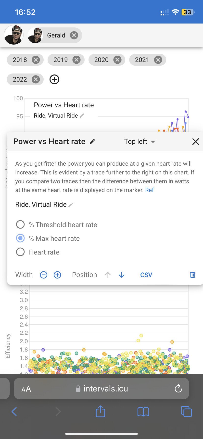
Also on the Compare Page graphs… does anyone know how I can change the title of a Custom Chart on a touch screen device? I have no problems doing it on my PC with a mouse, but can’t on either mu iPad or touch screen PC.
I think I have fixed this. It now works on my iPhone 8+. The button wasn’t working because the title bar is draggable. Some other similar widows had the same issue. Tx for the report.