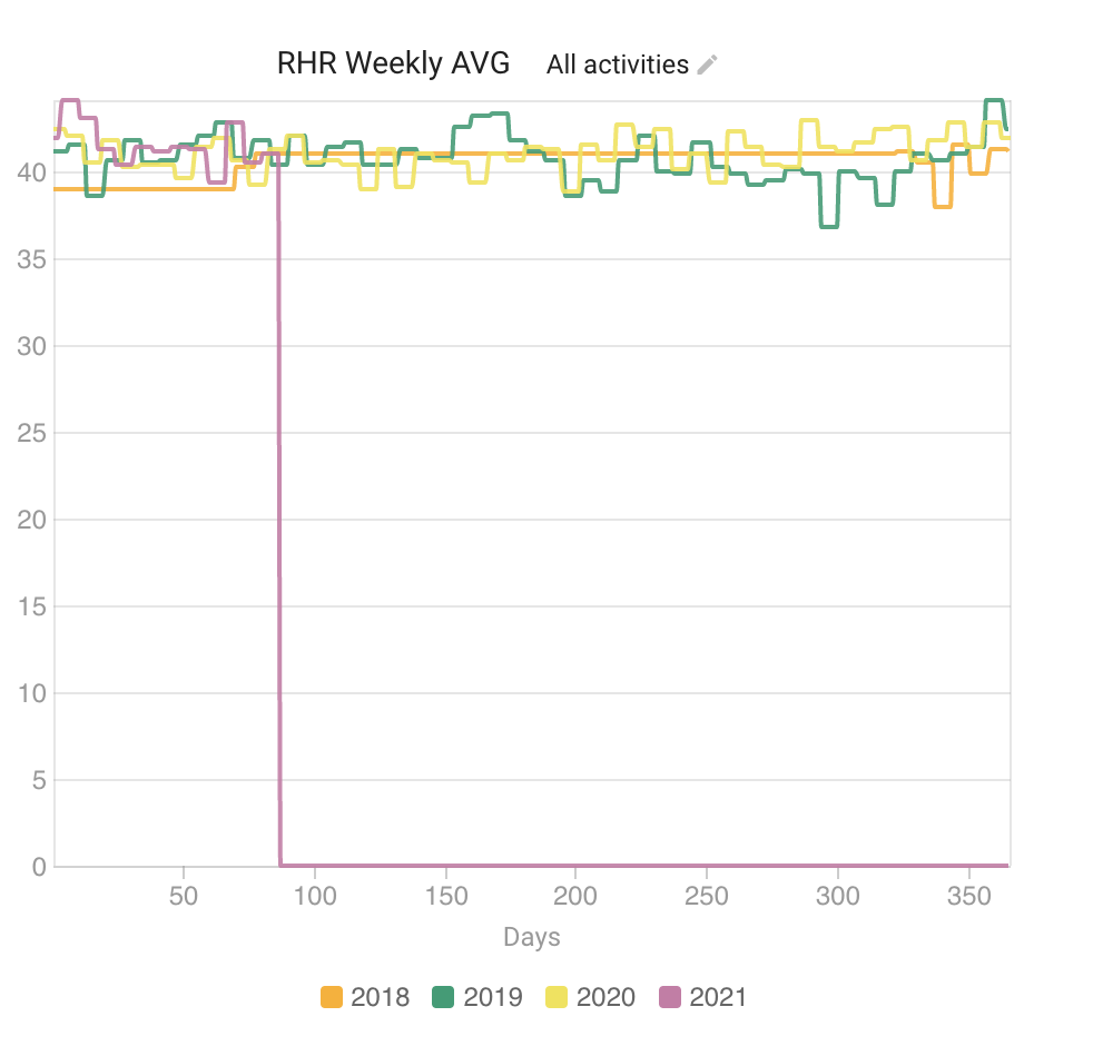
- Is there a way to prevent zeros from being plotted in the charts? For example, I didn’t start tracking weight until recently, so it shows it as zero for older seasons and throws the chart axis off. Same for RHR.
- On a related note, would be nice to be able to customize the axis interval (especially Y axis).
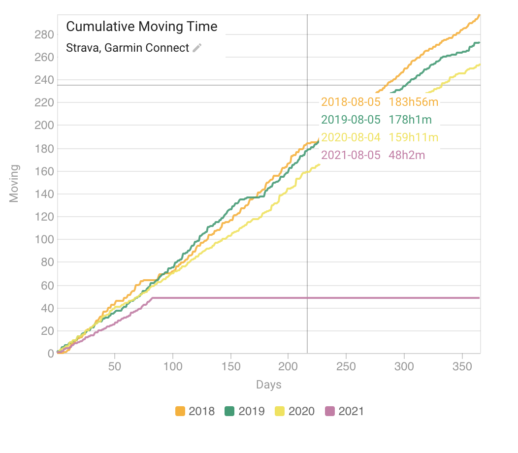
- Finally, on the cumulative moving time, it seems to be plotting the prediction from my calendar, instead of actuals. Is there a way to change that to only show completed workout?
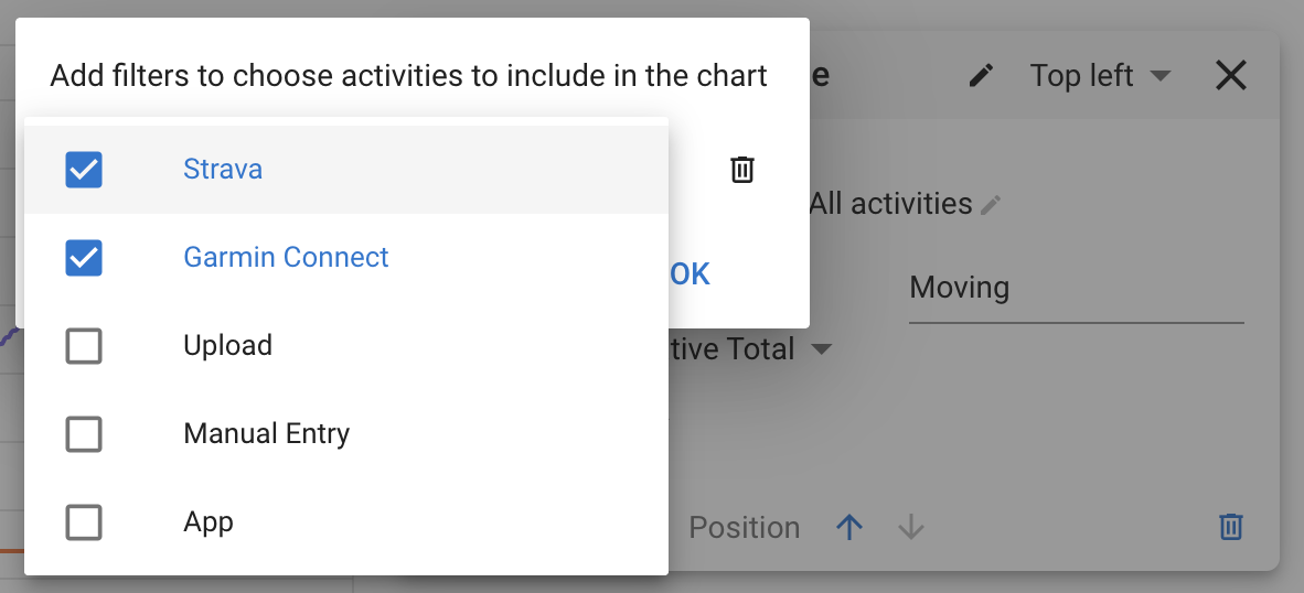
You can only show completed workouts by filtering by source and choosing where your completed workouts come from:
I am not seeing the same behaviour re zeros with weight or resting HR?
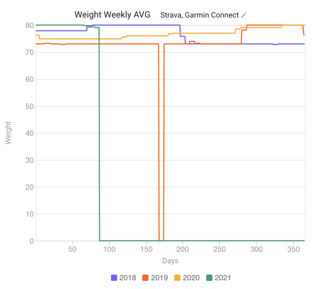
Aha. The problem was actually with the weekly average function. It was returning 0 for no data for the week instead of “no data”. Fixed now. Tx for the report.
Awesome! I can see it fixed for the weekly average, thank you very much. I noticed that for the weekly total/7 it is still using the zeros. Is that intended? By the way, is it a rolling weekly average or a pre-defined week?
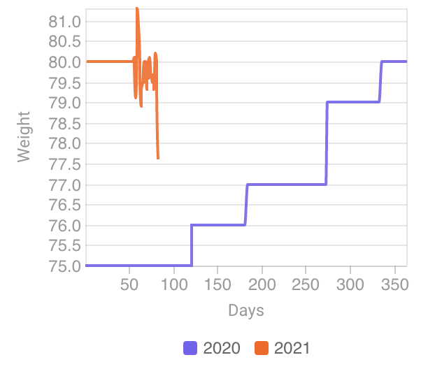
The cumulative total is still showing data for the whole year, which flattens out when I filter by completed workouts. Minor issue, but would look better if didn’t present the data for non-existing workouts. See below.
Yes I left that one as is. Its meant for “TSS/day for the week” bar plots where if you do nothing for the week (no data) then zero is the correct result. It is a pre-defined week starting on a Monday.
I agree that the cumulative chart would look better without the flat line if your filters excluded future planned workouts. Not so easy to implement though.
Thank you David. And thank you for an amazing product.
1 Like