Clip Chart Y-Axis?

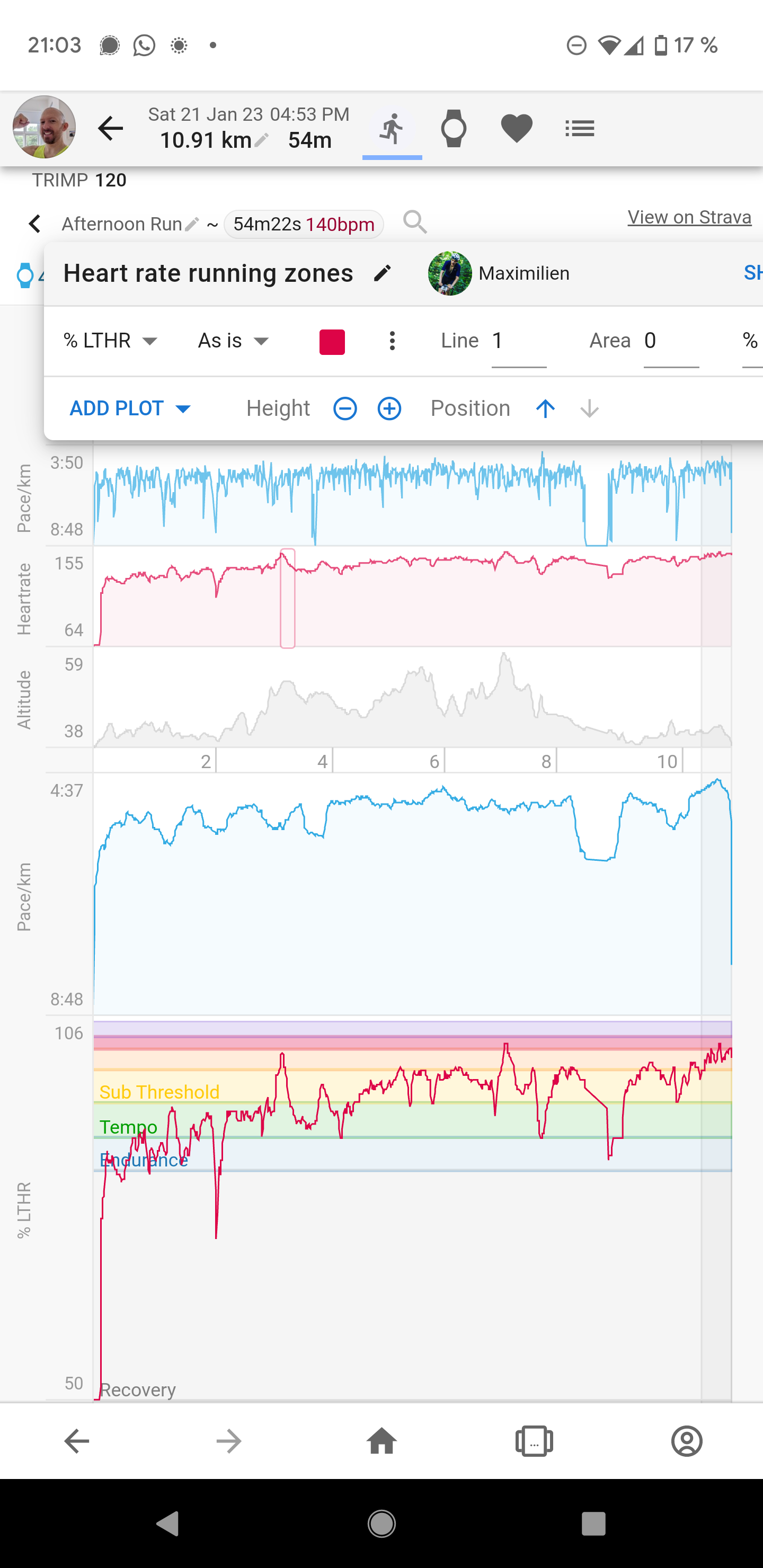
Is there a way to set the interval of the y-axis in the activity charts?

For instance in the screenshot below the heartrate graph starts at 50/60 even though it quickly goes up as I start the run. It would be much nicer to be able to clip the visible Y-axis to include only more relevant values and does see values spread out more.

The heart rate running zone chart by Maximilian does a nice job to be very high to provide the detail but also loses half the vertical height because the initial ramp is shown.

Feature suggestion: allow charts to have an interval range defined either absolutely or as quartile range (top 90% values for instance?)

This would be useful also for pace. Slowing down at a red light causes the chart to have a much too large vertical range.

1 Like

A couple of ideas:

  • There is an Axis option for Charts (which was cut off on mobile), which accepts absolute values. So it could be used to clip the chart if you know your max heart rate/pace etc. Maybe this could be extended to support simple math such as ‘90% * max’ to make the chart go up to the 90% of the highest value.

  • Maybe computed activity streams could be used to preprocess the data. I haven’t found a way to access the activity stream of pace to clip it.

  • As you said, you can set the min X-axis to achieve this. I have an absolute value of 100 here, because I cannot imagine how I can enter below this value on a normal workout. However, it could be a nice feature to be able to set a percentage of the max value.

  • Right now, you cannot use the computed fields on charts, however it is something that is already on the development kitchen.

2 Likes