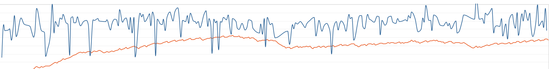
According to the description CIL should be calculated as 42d exponential average of Intensity.
If i put now my CIL with fitness average in the chart and the Intensity (As Is) in the same chart - my understanding would be that both lines should cross each other, but instead my chart shows CIL but Fitness is for sure more volatile but ALWAYS above the CIL line. BTW i use the new feature of syncing the axis - which is great.
Do i have a misunderstanding in my line of thought? Or could it be that there is something wrong with putting it in the chart - as CIL is already calculated as 42d weighted average and putting again 42d average on it - might this cause the issue?
When you add CIL it puts in “Fitness Average” by default which is correct. If you make that “As is” you get intensity. CIL might not cross intensity if you have days when you do not train. Hopefully I have it right …
Where I am struggle now - should the CIL line (red one) not cross the Intensity (blue one) in the 2nd half of the chart - if CIL ist „just“ a weighted average of Intensity (blue)?
So I am interested in the average intensity of my rides over a specific period (data showing volume in hours and intensity as the strongest predictors of fitness). Made a nice graph showing 30-day moving average. But assume this is a simple average, meaning that a 1 hour ride at 80% and 6-hour ride at 60% would lead to an average of 70% intensity. Is that correct and is it possible to do a time-weighted average instead?
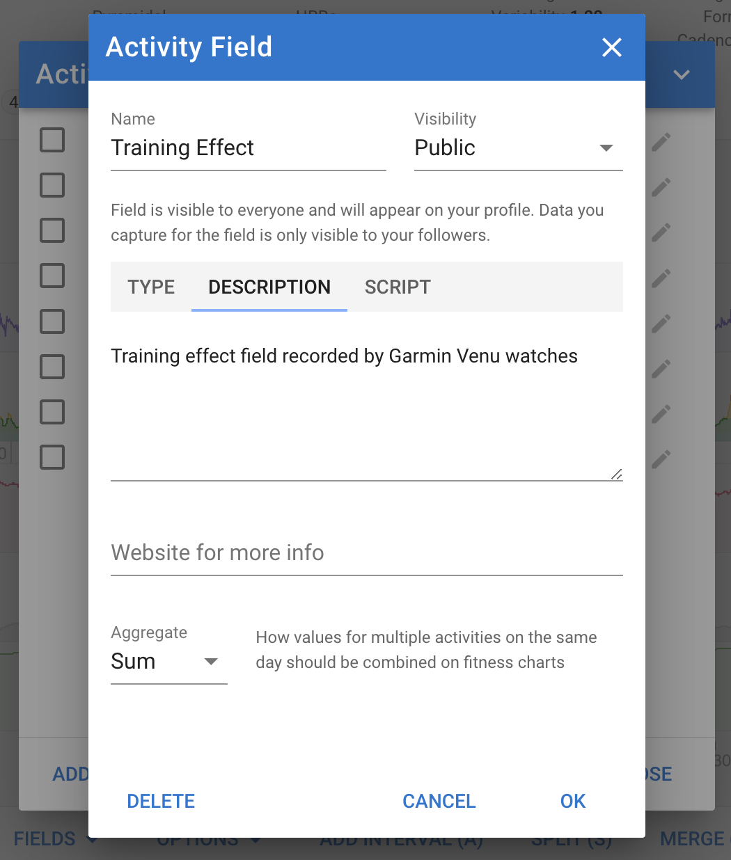
Oh wow, that opens a whole new world to me! Is it also possible to create (or use) a ‘custom activity field’ in the compare tab? That would allow me to code some variations on Fitness as function of time. Was digging around in the forum, but could not find that.
Yes you can plot custom activity fields on the compare page. When you create the field you need to specify how values from multiple activities on the same day are aggregated. This is used on the fitness and compare pages: