This may be due to my lack of understanding however there seems to be an inconsistency between the shared “Chronic Intensity Load + Work” chart and other charts I have which have “Load” or “Work” plotted.
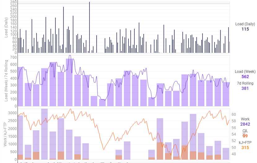
The chart at the top is daily TSS plotted. Then the next two both have Weekly TSS as the purple bar chart, with no other filters, however it seems with the “Chronic Intensity Load + Work” chart, there are gaps where there shouldn’t be. You can even see that the CIL line improves where the second gap is.
Any ideas on what would be causing this, and is it expected?