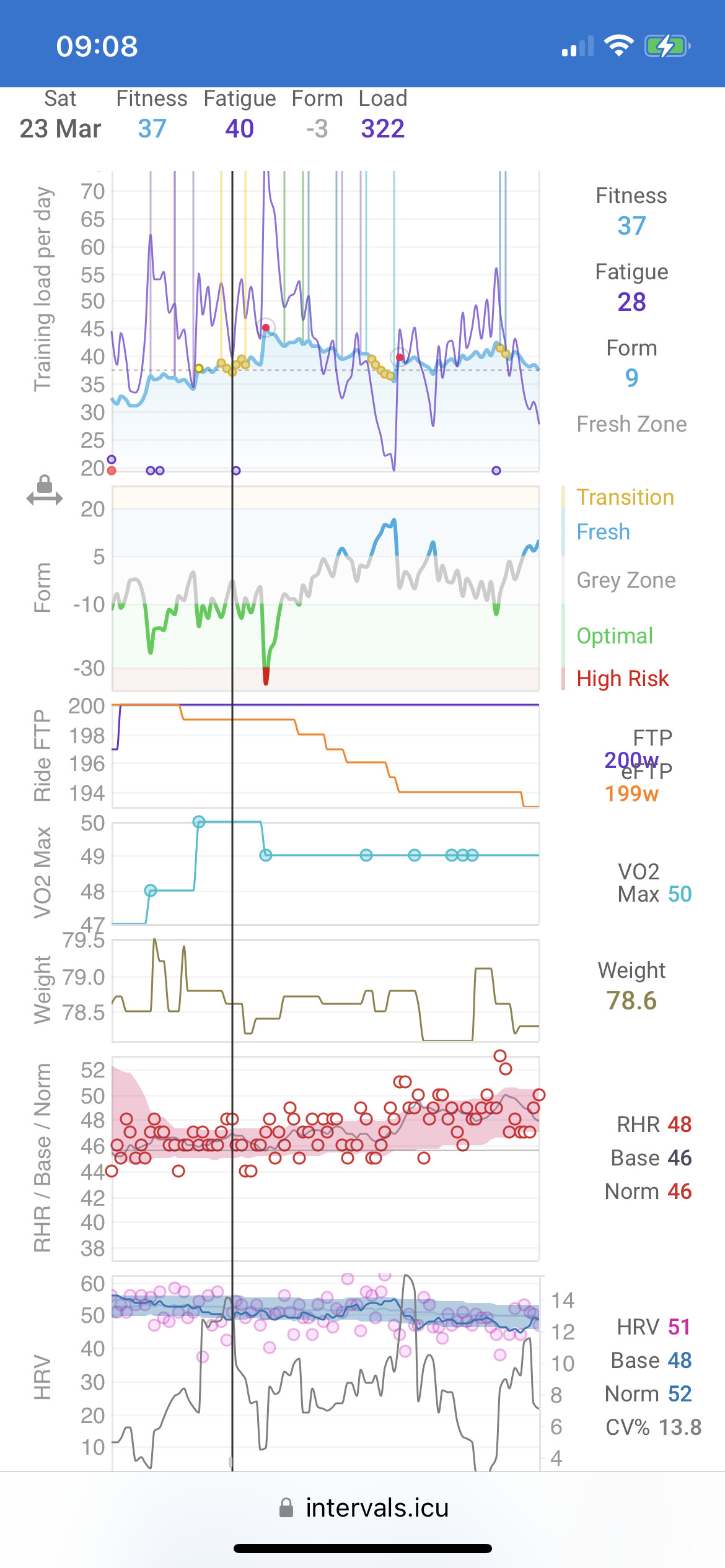
Would it be possible to make the plot type ‘dots’ smaller on custom charts on iPhone layout?
The ones shown on the fitness graph are ok, but when using custom charts they’re relatively big circles. Or maybe add another plot type which is actually a dot? See screenshot below.
I much prefer intervals on my laptop, and then my iPad, but inevitably I spend 90%+ of my time using my iPhone so that’s where I use it most. The graphing is obviously more restricted here space-wise but a few optimisations would definitely help. One would be to reduce the space taken by the values RHS - both dead space reduction and font reduction. And probably LHS too.
It’s better when you rotate but then you have to scroll more to see everything. I generally just keep my phone in portrait unless there’s a real need.
Thanks for the consideration!
In a related note I do think there are quite a few layout optimisations / improvements that could happen with intervals. From my POV most of the things I use are found within one or two tabs, some of it more hidden. Many of the main tabs are unused or irrelevant.
Also maybe controversial but I find the randomly selected coach icon at the top quite distracting. I would have thought someone either has a coach or they don’t, and if they wanted a coach they would seek it out. At some point will send a more detailed feedback as a newish user - many of the nuances I’ve worked my way through but it could definitely be more intuitive and less hidden in places, while still remaining clean and efficient.