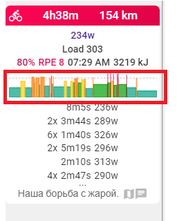
I think it would be nice to see this chart picture in
here
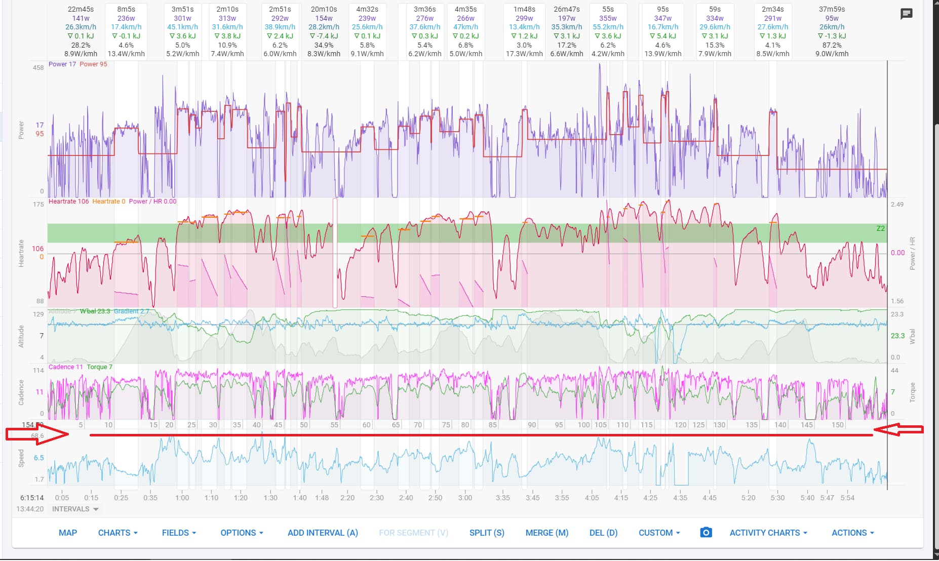
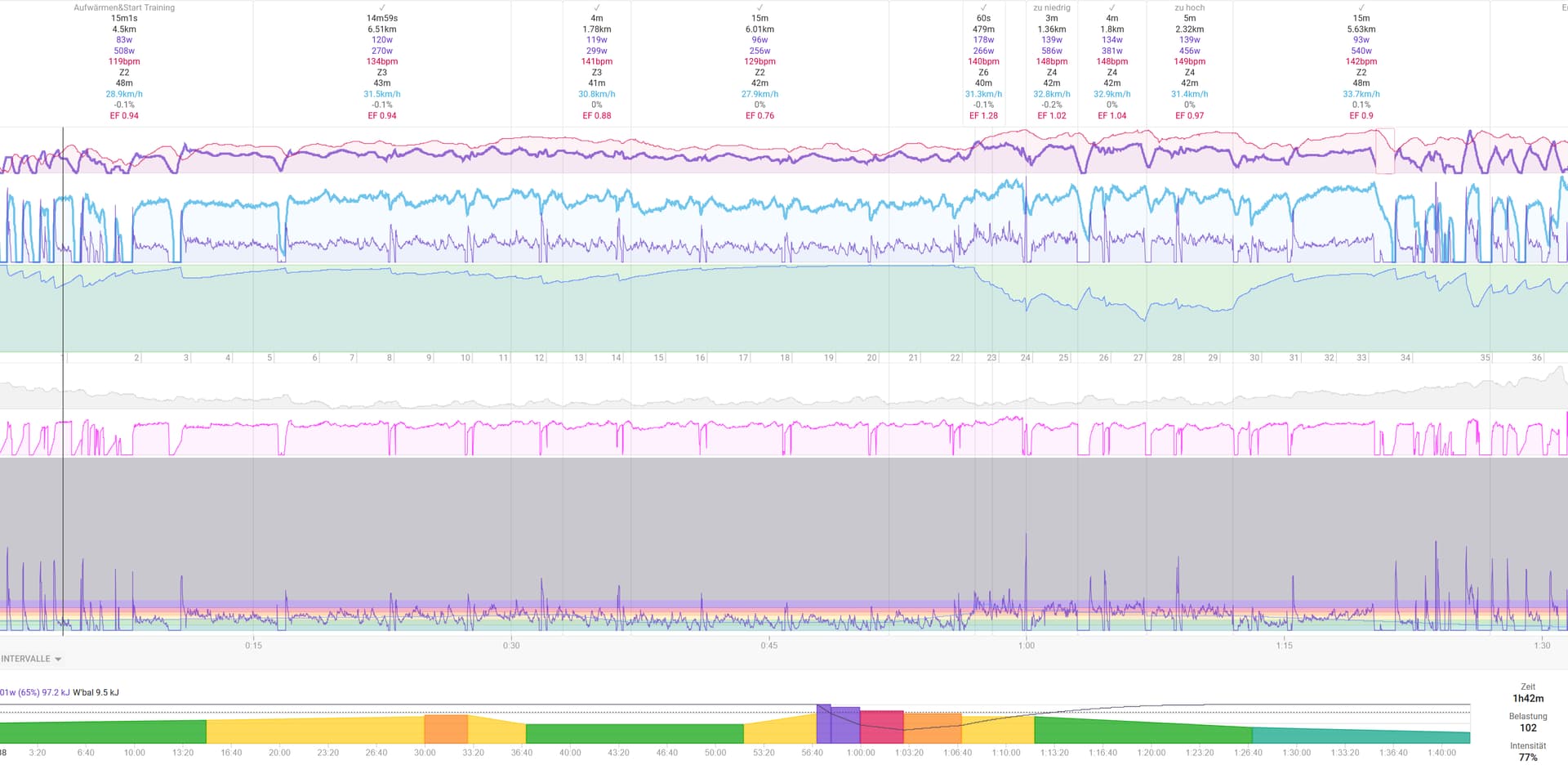
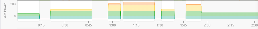
It can be approximated by a 30s power averaged over intervals.
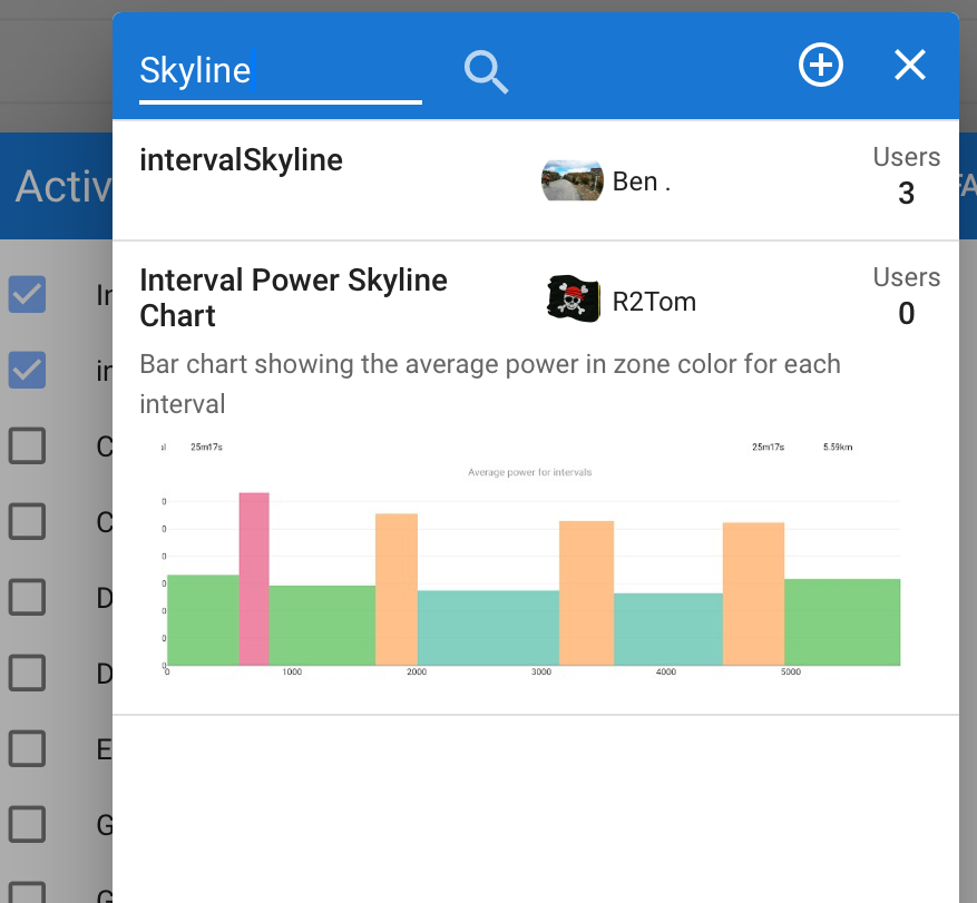
If you search for „Skyline“ in „Activity Chart“ you‘ll find two charts, which both do what you want I think
Thank’s everybody here!