Hi Intervals.icu team,
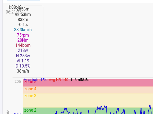
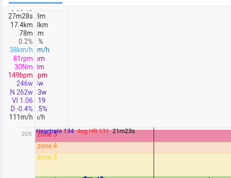
I’m seeing a rendering issue in the charts where the displayed intervals depend on the browser window width.
What happens (actual behavior):
With a “normal” / narrower window width, the intervals in the chart are displayed correctly.
When I make the browser window wider, the interval overlay/segment in the graph disappears, and the related values/markers jump to the far left edge of the chart (as if the x-position is miscalculated).
Expected behavior:
Intervals should remain correctly positioned and visible regardless of browser window width / responsive layout changes.
How to reproduce:
Open the activity page (where intervals are shown in the chart).
Resize the browser window from narrower to wider (or move the window to a larger monitor).
Observe that the interval display breaks at certain widths (interval disappears and values align on the left).
Notes:
This seems strongly tied to responsive resizing / chart reflow, not to the activity data itself.
I attached a short video showing the issue while resizing the window.
Improvements has been made! Do a reload on your browser and you should see better behaving data labels Thanks for the detailed bug report! It really speeds up the bug hunting.
thanks for the super quick response! Being a coder myself, I really appreciate how important detailed bug reports are — I’m guilty of reminding my coworkers about that often enough
Unfortunately it still doesn’t seem fully fixed on my end. Even after a dedicated cache flush (and with “Disable cache” enabled in DevTools), the last interval still disappears / the labels jump all the way to the left once I hit the breakpoint at 1340px window width.
@MedTechCD That must be it indeed. Since everything ended up overlapping, I hadn’t even noticed this new (and much anticipated) feature!
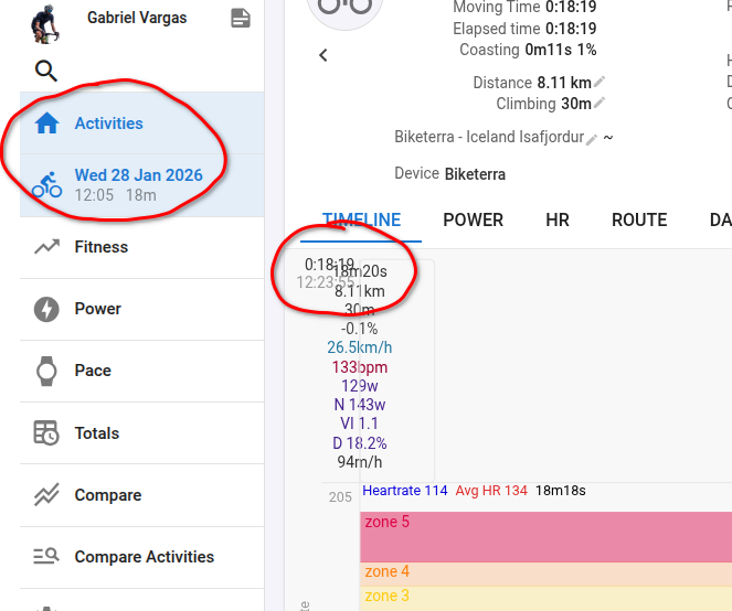
@Eva, in my case this can be observed in any activity. In addition, more than one button in the side menu remains highlighted at the same time. Below is a screenshot and a link:
Actually I have a working solution now, we need to push it to production still
You two had some custom charts that messed up with the data labels, I dont have them bugged so thats why I missed the bug in the first round. Hopefully all is sorted now (when we get the bug fix deployed).
Depends on the chart setup. If you have a left axis name that takes up enough space, the left grey part is a bit wider and it fits. A fix for this would be welcome.
 Thanks for the detailed bug report! It really speeds up the bug hunting.