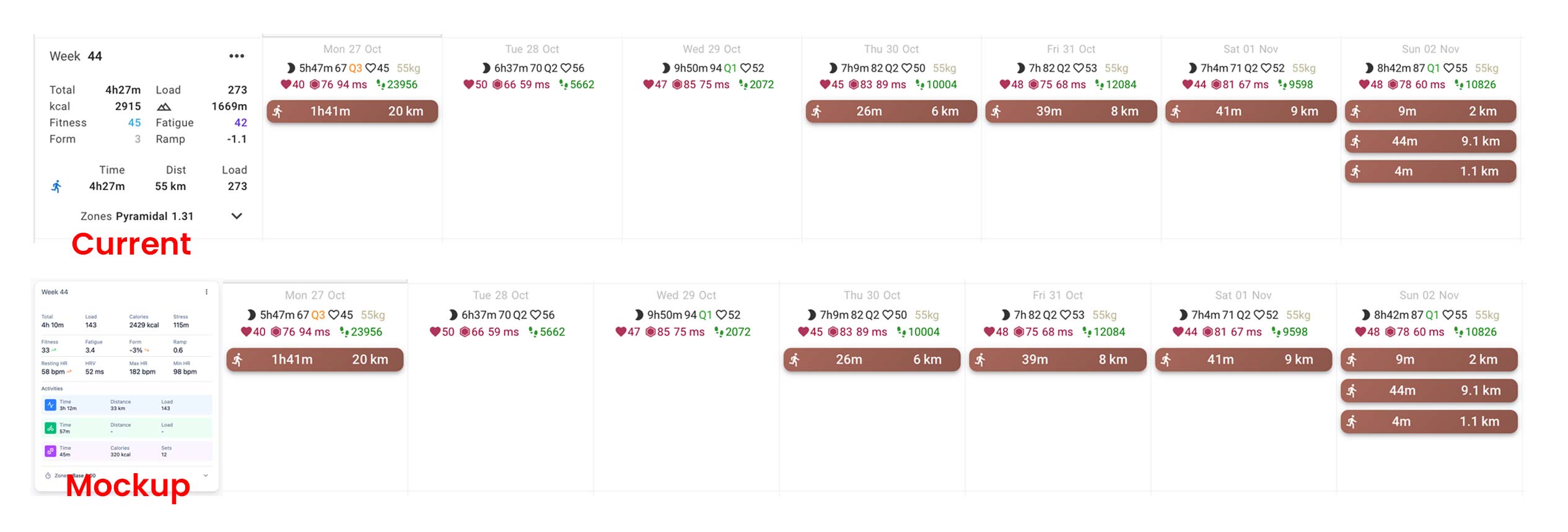
Hi all,
our current weekly planning view is hard to scan quickly. I’m not asking for design feedback now—just checking whether it’s possible to change it.
Attached: a quick mockup of a clearer summary layout.
Hi all,
our current weekly planning view is hard to scan quickly. I’m not asking for design feedback now—just checking whether it’s possible to change it.
Attached: a quick mockup of a clearer summary layout.
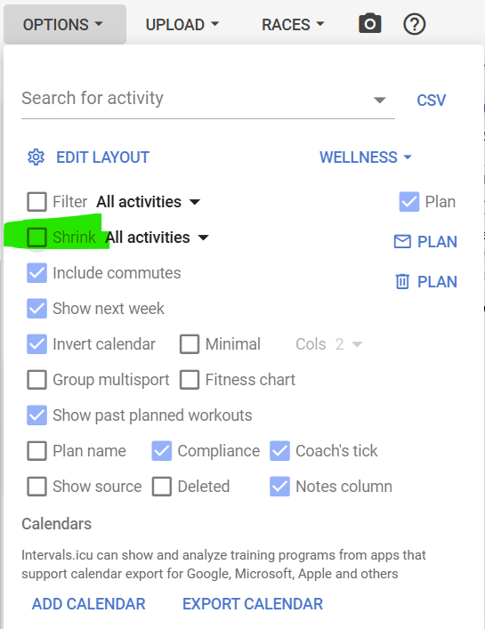
Nice suggestion, but it looks like you used wider weekly summary container?
i think the OP cooked with the design. Its hard to get all the info at first glance when you try to read the infobox to the left. The mockup makes it really easy