Me Too. I like to see next week to be able to plan and visualise next week’s workout and my (planned) progression.
I’m on a Laptop whenever I open intervals, so I don’t need to do any scrolling to see the current week. Is this different on a Mobile?
Edit: Just tried on mobile, doesn’t seem to change anything w/ “show next week” enabled or disabled. I still see this week only. (selecting/deselecting it on laptop will see immediate changes)
hi @david
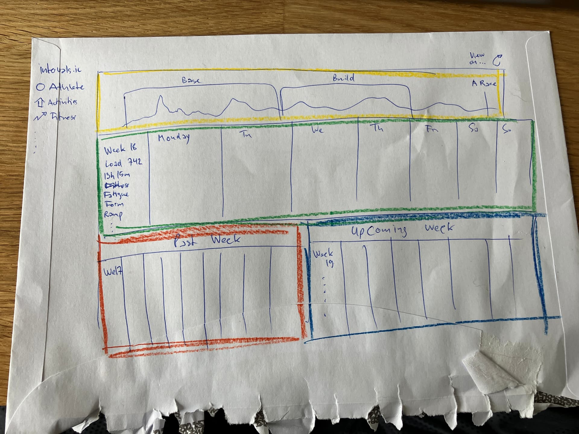
appreciate all you’ve put into intervals.icu and have been a supporter for some time now. I get good use out of your app and am spreading the word to fellow riders in the hope they sign up and become paid members as well. I know that you’re working on awesome features and I appreciate you and your work but I keep on stumbling over the calender/activities view and would love to see it a bit revised/updated. Here I did a quick sketch on what I’d like to see as a viewing option (not replacement of the calender) in the activities feed:
Up top is the fitness chart. After thinking about it a bit more it should only show a timeframe of the three weeks like down below it (past W17, present W18 and nextweek W19). So disregard the details I’ve drawn inside the yellow box. You could either integrate the weeks detail in the graph up top or leave it as is. (if anybody has input, please share so it could be improved).
Below the fitness chart (yellow box) follows the green box, or the current week (W18). I like the details I get right now with my RHR, HRV, sleepduration and quality, weather forecast and so on. Leave the details as is. I also like the colored workouts by intensity. Make current day (box around the field) more prominent. Maybe even with color and a shadow around the box. I don’t have other suggestion how the week view should be improved on, it’s good as it is. Maybe others can chime in?
Below the current week W18 (green box) are past week W17 (left) and upcoming week W19 (right). Not much to say there as I think it’s pretty straight forward.
SCROLLING: has already been discussed top bottom / bottom top whatever. For my suggested view-mode the only scrolling that makes sense (imho) is up to go back in time, down to go forward in time. Scrolling up puts the past week (W17) from red box in the green box, current week (W18) goes from green box to blue box and in the red box appears W16 and vice versa. Hope that is clear enough?
The fitness chart up top should update accordingly. I drew all the boxes pretty close together but think it would be better if they were a bit spaced out. Previous and Next week (red and blue boxes) wouldn’t have to take up so much space.
This is a suggestion not to replace the calender view, which lets you see much more than my suggested view but to add to intervals.icu.
Thank you for reading and I hope others chime in to this suggested view option.
Good legs and keep the rubber side down,
JJ
Thats quite neat, thanks. I do have showing fitness stuff on top on the todo list as a few people have asked for that. I am currently busy with a bunch of “not visible to users” back-end work to make the site scale better then I will be back on adding functionality. Still need to do some key things like custom activity traces from fit file with Javascript, longitudinal charts done with Javascript etc…
I appreciate you taking time to reply and understand that this is not the primary focus. I hope you can get something out of it and maybe use it or parts of it in a feature revised activities view. Anyway, have a great sunday and thank you again for all the work you put in intervals.icu! cheers
Really intriguing sketch/idea. I can see the appeal. In fact, now that the fitness page has tabs, your idea would be a super view for an alternate activities/calendar tab.