Hello,
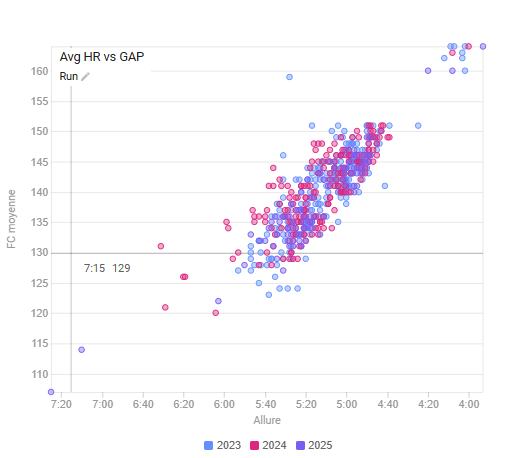
This graph is very useful for evaluating my progress in running.
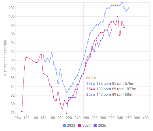
How can I build a similar graph showing % heart rate threshold versus running pace?
Thank you.
Best regards,
Hello,
This graph is very useful for evaluating my progress in running.
How can I build a similar graph showing % heart rate threshold versus running pace?
Thank you.
Best regards,
Did you have any luck with this?
Speaking from memory, maybe you can’t do that, but you can do HR vs speed?
I had this alternative, but it wasn’t very representative. ![]()