EDIT: Please note that this thread is NOT asking questions about how the chart works. The goal of the thread is simply to point out behavior in Intervals.icu which I believe shouldn’t happen, and discuss/suggest possible ways to improve the site functionality.
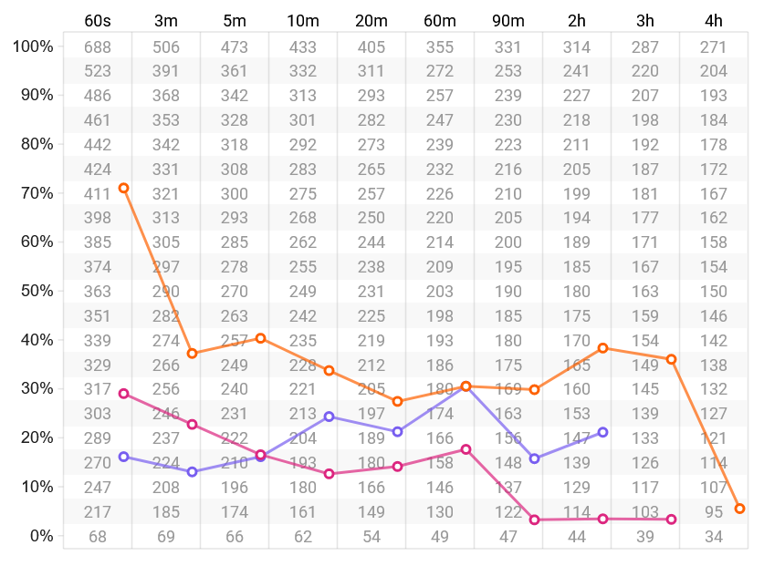
Good morning! I just noticed that my power CHART looks like this:
Orange is all-time best power.
Magenta is last season, 2022.
Blue is the current season, 2023.
There are no data points for four-hour power in either the current or last seasons, so IICU draws a straight line between the longest-duration data point and the eFTP data point. But this makes it look like my four-hour power for the current season is 121W, well above my actual all-time best power of 95W for that duration.
Is this deliberate, as though to somehow indicate the rider could hope to achieve those 121W, or is it just a display artifact? This is a minor issue, but it’s confusing.
I suggest that the other power curves should never exceed all-time best power. If there’s a missing data point AND the straight-line depiction would exceed best power, the curve should dip down to match all-time best power for that duration.
What is the legend? (time periods for each color line?)
Also this is not a PD curve. EDIT: LOOK AT THE POWER DURATION CURVE ABOVE THIS CHART. THE CHART YOU ARE LOOKING AT IS A COMPARISON OF YOUR POWER TO OTHERS IN A SPECIFIED GROUPING OF AGE AND/OR GENDER.
There does not appear to be a data point for 4 hrs in the purple or pink time period. So I’d assume you only have 4 hr data in the orange time period. The point where orange and pink go over the four hour values is insignificant without a data point, it’s only trying to reach the correct point on eFTP.
So it appears your all time (a season sometime before 2022) best 4 hr power is somewhere around 100 watts and you do not have a 4 hr ride in 2022 or 2023.
Yes, that’s correct. What you’ve described is what IICU does today… a given line skips over a missing data point and connects directly to the next data point. We agree that this is the current state.
Where I do NOT agree is that skipping over the four-hour value is “insignificant”. Displaying the data this way makes it look as though my four-hour power is, or should be, higher than my all-time best power.
Sure… there’s no data point. But that requires actually looking at/for the dot at four hours.
Also, IICU may actually be written to say “hey, you have no data point here, but this is the kind of power you might reasonably expect.”
Or it may be just an artifact of the display.
My point is that it’s confusing not to know which is the intended message, and that the current implementation is not what I’d suggest is best. But if #2 above is what David intended to convey, then it’s not a bug, it’s a feature.
See edit in my original reply. If you look at the PD curve you will see what you are looking for. The chart you are looking at now is not the PD curve but a comparison of you to others. I’m not trying to be obtuse, I’m just thinking you are using the wrong chart for the data you expect to see.
Yes, I understand it’s not a power duration curve, but rather a “personal-vs-population” power comparison chart. Or whatever you want to call it. What you’re saying is correct… but irrelevant to my point.
I find the current implementation of this chart to be potentially ambiguous and confusing where there’s a missing data point, and I’d like to clarify what David intended or if this is an unintended (though minor) bug in the chart. Either way, I’m suggesting that this should be clarified and/or improved.
My perception is that no other curve should exceed “all-time best power” for that duration.
In the options, uncheck eFTP and see what you get. Imagine if you never rode longer than a 2 hour ride and had eFTP checked for the last column. The line would still cross through the 3 and 4 hour columns but no actual data point is there.
Maybe this chart should only show the data points or be a bar chart rather than a line?
Now we’re talking about the same thing: what should the chart do, or how should it display, when there are missing data points… especially when a straight-line interpolation between existing points would exceed actual all-time best power for the missing duration.
One could perhaps refine my original post like this:
If there are one or more missing data points in a season, but the user has ridden longer durations during that particular season, it seems reasonable to use straight-line interpolation for the missing data points.
If there are one or more missing data points in a season because the user has never ridden that long during that particular season, the line should stop at the max duration available for that season and NOT continue to the right. If eFTP is selected, then it should be shown as a standalone dot then, not as part of the line.
I unchecked eFTP for a moment to see the line’s behavior, and the line behaves correctly (no extrapolation past max duration for that season) in that scenario:
So I go back to where I started: I think the current behavior is a bug, which apparently only happens when eFTP is selected and when the missing data points are at the max-duration side of the chart.
I think my #2 above would be the correct behavior.
I gave this a little more thought and played with configurations, and I think you’ve nailed it… eFTP shouldn’t be all the way to the right, but rather between the 20m and 60m columns. Optionally it could be shaded to show that it’s not an actual data point, but that’s not really a problem.
For now, I’m leaving eFTP off the chart. I’d rather not have the data, than see a visually-misleading representation due to the issue I mentioned. Hopefully @david either changes things as per my #2 above, or IMHO even better, moves eFTP to between 20m/60m as you suggested.
This has been mentioned previously, that the graph is not a power curve. It’s a representation of the respective power for each duration. The intention of this chart was to show riders their strengths and weaknesses (limitations).
Dr Andy Coggan, and Hunter Allen, (authors), developed this chart in the book Training and Racing with a Power Meter. Their work has often been taken out of context, and they will often mention that on podcasts that they appear in.
There were only 4 durations that were listed, and not the many durations that people like to see. You can read more about this in the link below, with the standout points being:
It is simply human nature to wonder how one compares with others for any measurement…
the best measure of a rider’s competitive ability relative to that of others is their actual race performance, not their power output;
identify a particular individual’s relative strengths and weaknesses based on their “power profile”;
Such information could be then used to help plan an individualized training program, evaluate the effectiveness thereof, and to possibly identify events where an individual might be expected to achieve the greatest success;
Index efforts of 5 s, 1 min, 5 min, and at functional threshold power were chosen as those best reflecting neuromuscular power, anaerobic capacity, maximal oxygen uptake (VO2max), and lactate threshold (LT), respectively;
While this is entirely true, please note that it’s also entirely irrelevant to the point of this thread, to wit: that when someone has not ridden for 3h, 4h, and so on, showing a line that connects their longest-duration data point to eFTP on the right (see below, and in the OP) is misleading and confusing.
In the image above, note that the blue line (2023) has a data point at 150W for two hours, and connects to eFTP at 190W… which makes it seem like I have a four-hour power output of roughly 121W when, in reality, the last time I rode for four hours was 2020 and my all-time best power (orange) for that duration is barely 98W.
The point is not what the chart is. The ONLY point of this thread is to help improve how it’s displayed to avoid confusing or misleading the user.
And those translate to a Sprinter type, a type with high anaerobic capacity/power that will do best in the spring classics like Tour Of Flanders (~1-2min steep hills), a high VO2max which will help a lot for races like Liège-Bastogne-Liège (~5-8 min climbs) and a high CP for TT’s and/or epic climbs if combined with a low body weight
Looks like Tadej is just a bit low on the sprint but excels in all the rest. Amazing what this guy is doing this spring.
I get that, and while it can be misleading, it’s not that difficult to understand. The lines are merely connecting dots and showing a profile shape. It’s the profile shape that key to using the specific chart.
The power duration curve (PDC) is for looking at power across duration, without selecting a specific duration.
Yes, what you say there is true, and thank you for taking the time to respond.
But I started this thread because, while I understand what’s going on, I think it’s a a BUG, an undesirable (and likely unintended) behavior, that it behaves the way it currently does, because some dots should NOT be connected. In the example given, two-hour power should not connect to eFTP on the right.
This thread is not a “please explain the concepts to me” thread. It’s simply a “hey @david, here’s some feedback which may improve the product” thread. And I think we’ve achieved that.