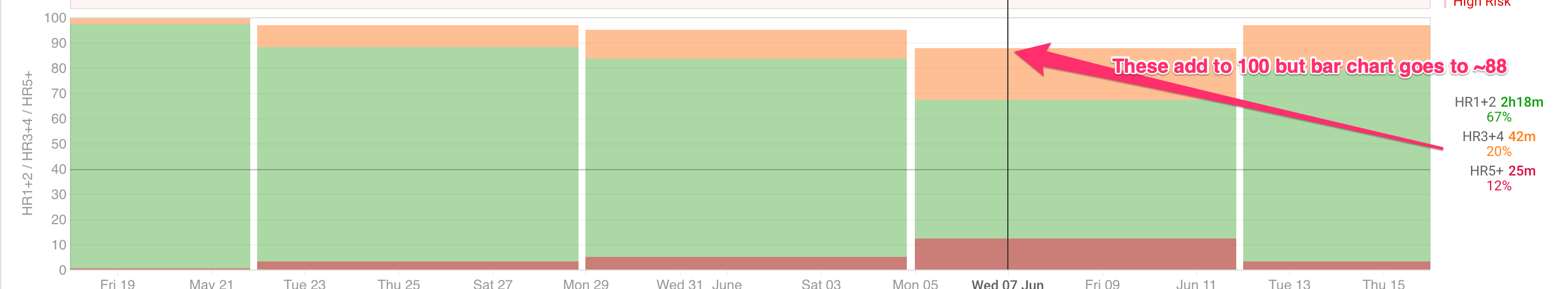
I have created a stacked bar chart of weekly time in HR zones on the Fitness page. I have selected “bars stack to 100%,” The data shows it broken down as a percentage of 100% but the chart doesn’t seem to reflect that (see attached image).
I re-built that chart on your profile (see “Tab 2” on the /fitness page) and now it works. Something might have got “kept” from a different sort of plot on the same chart (e.g. when changing the plot type using the plot drop down).