Are You Actually Progressing? Cross-Activity Interval Comparison Using the API

Are You Actually Progressing? Cross-Activity Interval Comparison Using the API

Hey everyone,

I’ve been experimenting with something that I think could benefit a lot of us, and I wanted to share the approach + results before making a proper feature request.

The Question

We all do recurring structured workouts — SweetSpot blocks, VO2max intervals, cadence drills. But how do you objectively answer: “Am I getting better at this specific effort over the past 8 weeks?”

Right now, you’d have to open each activity individually, find the matching interval, write down the numbers, and compare manually. Intervals.icu is amazing at per-activity analysis, but there’s no way to compare the same labeled interval across multiple sessions.

What I Did

Using Python + the Intervals.icu API, I built a simple workflow:

  1. Label intervals consistently across recurring workouts (e.g., “Set1 95rpm”, “Set2 SweetSpot”) — either at recording time or retroactively via PUT /api/v1/activity/{id}
  2. Query matching intervals across all activities of the same type
  3. Compute trends automatically (power, HR, decoupling, cadence delta)

That’s it. The magic is in the consistent labeling.

What It Revealed

SweetSpot blocks over 8 weeks (6 sessions):

  • Power: 195W → 201W (+3.2%) with HR basically flat (+2 bpm)
  • Decoupling: 4.48% → 3.36% (−25%) — aerobic efficiency improving
  • Min watts: 106W → 148W (+40%) — holding target much more consistently

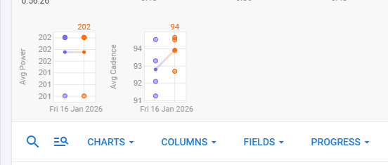
Cadence drills — “95rpm” blocks over 8 weeks (5 sessions):

  • Actual cadence: 79.9 rpm → 94.1 rpm — took 8 weeks to finally hit the target!
  • Power: 150W → 156W (+4%) at same HR — neuromuscular adaptation confirmed

These trends were invisible when looking at activities one by one. Seeing them lined up chronologically made the progression (and the problem areas) immediately obvious.

Where It Doesn’t Work

Pure endurance rides — no internal structure to compare, prescriptions vary by design, outdoor terrain adds noise. For those, whole-activity metrics (Pw:HR ratio, global decoupling) remain more useful.

The Feature Request

I think this could be incredibly powerful as a native feature:

  • “Compare Across Activities” — select a workout name pattern, pick a label, see a trend chart at interval granularity
  • Label templates in workouts — define semantic labels (“Set1 SweetSpot”, “Recovery”) in the workout builder that auto-apply on recording
  • Interval-level progression charts — a mini fitness chart scoped to a specific block type

For the Dev-Curious

Retroactive labeling works perfectly via the API — the stream data is already there, you’re just telling Intervals.icu how to slice it. Happy to share code snippets and more detailed methodology if there’s interest.


Has anyone else tried systematic interval comparison across workouts? Curious to hear other approaches, and whether this kind of feature would be useful to you.

Context: indoor trainer, FTP ~220W, structured training since mid-2023

1 Like

I tag my activities accordingly and can then easily find them on the compare activity page. I want to compare the entire activity, i.e., how I performed in all intervals, not just a single interval of an activity, which works relatively well.

Right — the Compare Activity page is great for whole-activity comparison. What I’m describing goes one level deeper: comparing a specific labeled interval (e.g., “Set2 95rpm”) across multiple activities over time.

For instance, in a Cadence Variation workout with 6 different blocks, I don’t care about the warmup or cooldown drifting — I want to see if my power at 95rpm is improving week over week while HR stays flat. That granularity isn’t available in Compare Activity today.

Do you find that whole-activity comparison gives you enough signal for structured workouts with mixed intensity blocks?

Yes, I completely agree with you that it is difficult to make a comparison at this level at the moment.

Personally, when looking back, I don’t look at individual intervals in detail in comparison with others, but rather consider the overall picture in terms of the activities and circumstances surrounding them.

One more thing: if you select Cadence and Power under Progress, for example, you can at least observe the development across all interval, each dot represents an interval (the small dots are the averages for all intervals):

Thanks for the tip on the Progress view with Cadence + Power dots — I tried to reproduce it but couldn’t find the setting that gives you that interval-level scatter plot. It’s not immediately obvious from the UI, which is already a minor friction point worth noting.

But even assuming I could reproduce it, I ran a concrete test using the API to compare my two CadenceVariations sessions (Feb 18 vs Feb 25), and it illustrates exactly why the dot view would be insufficient here.

The two sessions had very different internal structures: 36 labeled intervals in S081, 15 in S082. In a Progress scatter plot, all those points would land in the same cloud with no way to distinguish “Set1 95rpm” from “Set3 105rpm” from the warmup. You’d be looking at 51 mixed dots — different target cadences, different block durations (some blocks went from 119s to 180s between sessions), different physiological intents.

The only blocks I could meaningfully compare across both sessions were the ones sharing the same label. For “Set1 95rpm” specifically:

  • Power: 156W → 156W (stable)
  • Avg HR: 104 → 100 bpm (−3.8% — cardiac efficiency improving)
  • Decoupling: 3.82% → 2.12% (−44% — solid aerobic adaptation signal)

Those trends are real and actionable. But they’d be invisible in a global scatter, drowned out by the structural noise between sessions.

This is why I think label-scoped comparison needs to be a first-class feature — not a workaround through a whole-activity view. The signal is there in the data, it just needs the right filter to surface it.