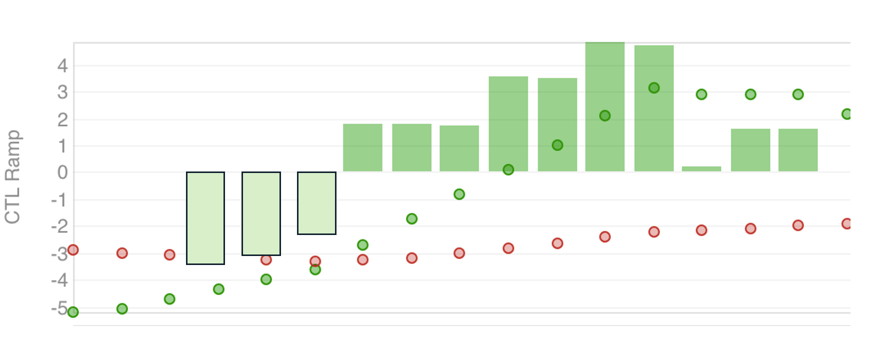
However, it does not plot negative values, i.e. when my ramp goes negative. I like to have this on top of my 7 day and 42 day ramp. Would also be nice for it to have a different colour when it goes negative.
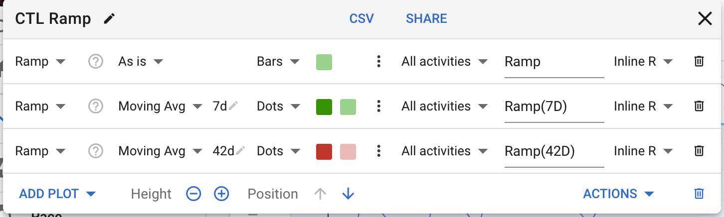
Hi, I didn’t see an update on this. Here is the graph example, it would be great for bars to show both positive and negative values and the bar having a different colour if going negative. Rough example below (bars to the left)